Products
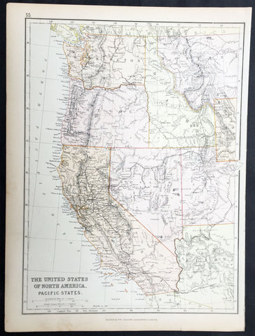
1870 Blackie & Son Antique Map The Western United States of America
- Title : The United States of North America Pacific States
- Ref #: 80560
- Size: 15in x 11in (380mm x 280mm)
- Date : 1870
- Condition: (A+) Fine Condition
Description:
This fine original antique lithograph map of the Western United States of America including Washington, Oregon, California, Arizona, Nevada, Idaho, Montana, Utah & part of Wyoming was engraved by Edward Weller andpublished by Blackie & Son of Glasgow in the1870 edition of the Geographical Atlas. (Ref: Tooley; M&B)
General Description:
Paper thickness and quality: - Heavy and stable
Paper colour: - off white
Age of map colour: - Original
Colours used: - Yellow, pink, green
General colour appearance: - Authentic
Paper size: - 15in x 11in (380mm x 280mm)
Margins: - min 1/2in (12mm)
Imperfections:
Margins: - None
Plate area: - None
Verso: - None
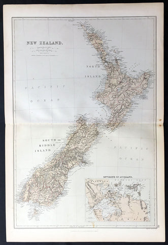
1870 Blackie & Son Large Antique Map of New Zealand w/ inset plan of Auckland
- Title : New Zealand
- Ref: 80571
- Size: 22in x 15in (560mm x 380mm)
- Date : 1870
- Condition: (A+) Fine Condition
Description:
This fine large, original antique map of New Zealand with an inset map of Auckland and its environs by John Bartholomew was published by Blackie & Son of Glasgow & London in the 1870 edition of the Geographical Atlas. (Ref: Tooley; M&B)
General Description:
Paper thickness and quality: - Heavy and stable
Paper colour: - off white
Age of map colour: - Original
Colours used: - Yellow, pink, green
General colour appearance: - Authentic
Paper size: - 22in x 15in (560mm x 380mm)
Margins: - min 1/2in (12mm)
Imperfections:
Margins: - None
Plate area: - None
Verso: - None
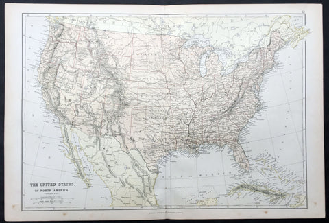
1870 Blackie & Son Large Antique Map of The United States of America
- Title : The United States of North America
- Ref #: 80558
- Size: 22in x 15in (560mm x 380mm)
- Date : 1870
- Condition: (A+) Fine Condition
Description:
This fine large original antique lithograph map of The United States of America was engraved by Edward Weller and published by Blackie & Son of Glasgow & London in the 1870 edition of the Geographical Atlas. (Ref: Tooley; M&B)
General Description:
Paper thickness and quality: - Heavy and stable
Paper colour: - off white
Age of map colour: - Original
Colours used: - Yellow, pink, green
General colour appearance: - Authentic
Paper size: - 22in x 15in (560mm x 380mm)
Margins: - min 1/4in (8mm)
Imperfections:
Margins: - None
Plate area: - None
Verso: - None
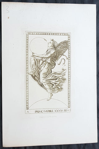
1870 Charles Amand-Durand after Johann Ladenspelder Antique Print #49 Tarot Card
- Title : Primo Mobile XXXXVIIII
- Date : 1870
- Condition: (A+) Fine Condition
- Ref: 22400
- Size: 13 1/2in x 9 1/2in (345mm x 240mm)
Description:
This fine, original antique Heliograph of card #49 of the Mantegna Tarocchi or Tarot Cards by the German engraver Johann Ladenspelder in the mid 16th century was re-engraved and published by Charles Amand-Durand in 1870.
These faithful re-engravings of classic and historical wood-cuts were faithfully re-issued by Amand-Durand in Paris in the mid to late 19th century. Such is the quality of his re-strikes that Durands prints are now in major institutional collections such a the Louvre, National Gallery, The Met and many other famous Galleries. Please see below for further background on Amand-Durand.
General Definitions:
Paper thickness and quality: - Heavy and stable
Paper color : - off white
Age of map color: -
Colors used: -
General color appearance: -
Paper size: - 13 1/2in x 9 1/2in (345mm x 240mm)
Plate size: - 8in x 6in (205mm x 1530mm)
Margins: - Min 1in (25mm)
Imperfections:
Margins: - None
Plate area: - None
Verso: - None
Background:
Johann (Hans) Ladenspelder 1512 - 1574 (aka Hans of Essen) was a german printmaker and engraver. He is particularly known for engraving a copy of a complete set (E series) of Mantegna Tarocchi cards, one of the earliest complete sets still extant.
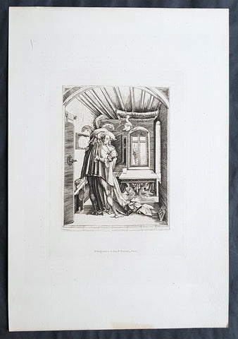
1870 Charles Amand-Durand after Mattaus Zaisinger Antique Print - The Embrace
- Title : The Embrace
- Date : 1870
- Condition: (A+) Fine Condition
- Ref: 22403-1
- Size: 13 1/2in x 9 1/2in (345mm x 240mm)
Description:
This fine, original antique Heliograph of The Embrace by Master M Z or Mattaus Zaisinger in 1503 was re-engraved and published by Charles Amand-Durand in 1870.
These faithful re-engravings of classic and historical wood-cuts were faithfully re-issued by Amand-Durand in Paris in the mid to late 19th century. Such is the quality of his re-strikes that Durands prints are now in major institutional collections such a the Louvre, National Gallery, The Met and many other famous Galleries. Please see below for further background on Amand-Durand.
General Definitions:
Paper thickness and quality: - Heavy and stable
Paper color : - off white
Age of map color: -
Colors used: -
General color appearance: -
Paper size: - 13 1/2in x 9 1/2in (345mm x 240mm)
Plate size: - 8in x 6in (205mm x 1530mm)
Margins: - Min 1in (25mm)
Imperfections:
Margins: - None
Plate area: - None
Verso: - None
Matthaus Zaisinger (aka Master M.Z.), German (1498 - 1555) was a German Goldsmith & Engraver who published twenty-two engravings with the signature initials MZ. Six are dated (1500, 1501, 1503). There are no later dated prints and it is believed that most of his work is concentrated around c1500. The prints are equally divided between religious and secular subjects, often a state of disquiet inhabits his figures, accompanied by eccentric use of perspective and abrupt changes in scale, as seen for example in The Embrace and Solomons Idolatry. Most of his works have landscape backgrounds executed with a delicate, atmospheric touch that suggests a precursor of Albrecht Altdorfer and other painters of the Danube school.
<b>The Embrace</b> contains all of the elements of an adulterous tryst with the stag horns on the chandelier being a common symbol of cuckoldry, but the woman seems an unenthusiastic participant.
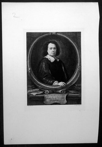
1870 Charles Murray after Bartolome Esteban Murillo Antique Print - Murillo Self Portrait
- Title : Bart Murillo seipsum depin gens. pro filorum votis acprecibus explendis
- Date : 1870
- Condition: (A+) Fine Condition
- Ref: 22446
- Size: 13 1/2in x 9 1/2in (350mm x 240mm)
Description:
This fine, original antique Heliograph self portrait of the Spanish artist Bartolome Esteban Murillo by the German engraver Heinrich Aldegrever or Aldegraf in the early 16th century was re-engraved and published by Charles Oliver Murray in 1870.
These faithful re-engravings of classic and historical wood-cuts were faithfully re-issued in the mid to late 19th century. Such is the quality of his re-strikes that many of these prints are now in major institutional collections such a the Louvre, National Gallery, The Met and many other famous Galleries. Please see below for further background.
The Latin inscription on the cartouche at the centre of the ledge explains that the self-portrait was made at the request of Murillo's children: 'Bart (olo) mé Murillo portraying himself to fulfil the wishes and prayers of his children - or sons'. Despite the unlined appearance of the face the painting is probably relatively late in date, of the early 1670s, when Murillo's children would have been of an age to take pride in their father's achievements. The composition is based on a formula that had been developed for portrait engravings used on the frontispiece of books. The sitter is shown in an oval frame and on the ledge below are the instruments of his profession, a palette and brushes on the right and a drawing and pencil on the left.
General Description:
Paper thickness and quality: - Heavy & stable
Paper color: - White
Age of map color: -
Colors used: - General color appearance: -
Paper size: - 13 1/2in x 9 1/2in (350mm x 240mm)
Margins: - Min 1/2in (12mm)
Imperfections:
Margins: - None
Plate area: - None
Verso: - None
Background:
Bartolomé Esteban Murillo (born late December 1617, died April 3, 1682) was a Spanish Baroque painter. Although he is best known for his religious works, Murillo also produced a considerable number of paintings of contemporary women and children. These lively, realist portraits of flower girls, street urchins, and beggars constitute an extensive and appealing record of the everyday life of his times.
Charles Oliver Murray (1842–1923) was a Scottish engraver. Born in Roxburghshire in 1842, Murray trained at the Trustees Academy in Edinburgh and moved to London by 1872. He was elected a Fellow of the Society of Painter-Etchers on 7 May 1881. He published widely in The Art Journal from the 1880s onwards and frequently exhibited at the Royal Academy. Murray died in London in 1923.(Ref: M&B; Tooley)

1870 Samuel Augustus Mitchell Antique County Map of Iowa and Missouri
- Title : County Map of the States of Iowa and Missouri....1870 by S. Augustus Mitchell
- Ref #: 35047
- Size: 15in x 12in (380mm x 300mm)
- Date : 1870
- Condition: (A+) Fine Condition
Description:
This beautifully hand coloured original antique map was published by Samuel Augustus Mitchell in the 1870 edition of his large New General Atlas - dated at the foot of the map.
These county, state, city & country maps are some of the most ornate and beautifully coloured maps published in the US in the 19th century. For over 50 years, Mitchell his son's and their successors were the most prominent cartographical publishers of maps and atlases in the United States.
General Description:
Paper thickness and quality: - Heavy & stable
Paper color: - White
Age of map color: - Original
Colors used: - Green, pink, yellow
General color appearance: - Authentic
Paper size: - 15in x 12in (380mm x 300mm)
Plate size: - 15in x 12in (380mm x 300mm)
Margins: - Min 1/2in (10mm)
Imperfections:
Margins: - None
Plate area: - None
Verso: - None
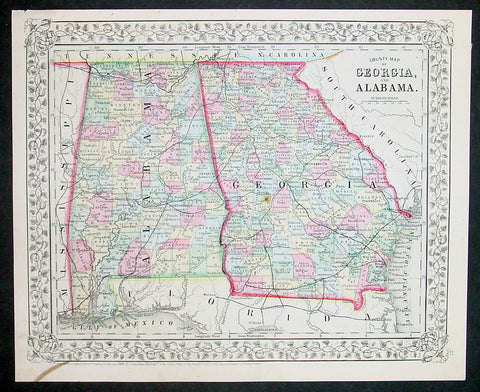
1870 Samuel Augustus Mitchell County Antique Map of Georgia and Alabama
- Title : County Map of Georgia and Alabama....1870 by S. Augustus Mitchell
- Ref #: 35038
- Size: 15in x 12in (380mm x 300mm)
- Date : 1870
- Condition: (A+) Fine Condition
Description:
This beautifully hand coloured original antique map was published by Samuel Augustus Mitchell in the 1870 edition of his large New General Atlas - dated at the foot of the map.
These county, state, city & country maps are some of the most ornate and beautifully coloured maps published in the US in the 19th century. For over 50 years, Mitchell his son's and their successors were the most prominent cartographical publishers of maps and atlases in the United States.
General Description:
Paper thickness and quality: - Heavy & stable
Paper color: - White
Age of map color: - Original
Colors used: - Green, pink, yellow
General color appearance: - Authentic
Paper size: - 15in x 12in (380mm x 300mm)
Plate size: - 15in x 12in (380mm x 300mm)
Margins: - Min 1/2in (10mm)
Imperfections:
Margins: - None
Plate area: - None
Verso: - None
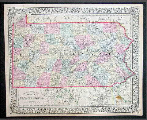
1870 Samuel Augustus Mitchell County Antique Map of the State of Pennsylvania
- Title : County Map of Florida, Mobile....1870 by S. Augustus Mitchell
- Ref #: 35051
- Size: 15in x 12in (380mm x 300mm)
- Date : 1870
- Condition: (A+) Fine Condition
Description:
This beautifully hand coloured original antique map was published by Samuel Augustus Mitchell in the 1870 edition of his large New General Atlas - dated at the foot of the map.
These county, state, city & country maps are some of the most ornate and beautifully coloured maps published in the US in the 19th century. For over 50 years, Mitchell his son's and their successors were the most prominent cartographical publishers of maps and atlases in the United States.
General Description:
Paper thickness and quality: - Heavy & stable
Paper color: - White
Age of map color: - Original
Colors used: - Green, pink, yellow
General color appearance: - Authentic
Paper size: - 15in x 12in (380mm x 300mm)
Plate size: - 15in x 12in (380mm x 300mm)
Margins: - Min 1/2in (10mm)
Imperfections:
Margins: - None
Plate area: - None
Verso: - None

1870 Samuel Augustus Mitchell County Antique Map of Virginia & West Virginia
- Title : County Map of Virginia and West Virginia....1870 by S. Augustus Mitchell
- Ref #: 35036
- Size: 15in x 12in (380mm x 300mm)
- Date : 1870
- Condition: (A+) Fine Condition
Description:
This beautifully hand coloured original antique map was published by Samuel Augustus Mitchell in the 1870 edition of his large New General Atlas - dated at the foot of the map.
These county, state, city & country maps are some of the most ornate and beautifully coloured maps published in the US in the 19th century. For over 50 years, Mitchell his son's and their successors were the most prominent cartographical publishers of maps and atlases in the United States.
General Description:
Paper thickness and quality: - Heavy & stable
Paper color: - White
Age of map color: - Original
Colors used: - Green, pink, yellow
General color appearance: - Authentic
Paper size: - 15in x 12in (380mm x 300mm)
Plate size: - 15in x 12in (380mm x 300mm)
Margins: - Min 1/2in (10mm)
Imperfections:
Margins: - None
Plate area: - None
Verso: - None
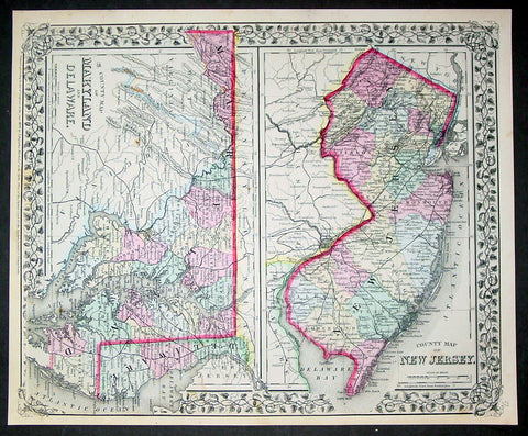
1870 Samuel Augustus Mitchell County Antique Maps New Jersey, Maryland, Delaware
- Title : County Map of New Jersey; County Map of Maryland and Delaware....1870 by S. Augustus Mitchell
- Ref #: 35033
- Size: 15in x 12in (380mm x 300mm)
- Date : 1870
- Condition: (A+) Fine Condition
Description:
This beautifully hand coloured original antique map was published by Samuel Augustus Mitchell in the 1870 edition of his large New General Atlas - dated at the foot of the map.
These county, state, city & country maps are some of the most ornate and beautifully coloured maps published in the US in the 19th century. For over 50 years, Mitchell his son's and their successors were the most prominent cartographical publishers of maps and atlases in the United States.
General Description:
Paper thickness and quality: - Heavy & stable
Paper color: - White
Age of map color: - Original
Colors used: - Green, pink, yellow
General color appearance: - Authentic
Paper size: - 15in x 12in (380mm x 300mm)
Plate size: - 15in x 12in (380mm x 300mm)
Margins: - Min 1/2in (10mm)
Imperfections:
Margins: - None
Plate area: - None
Verso: - None
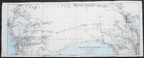
1876 Petermann Antique Map Expedition Ernest Giles Western & South Australia, 1875
- Title : Thomas Elders Expedition durch Inner-Australien vom Beltana im Osten bis Perth im Westen, Ausgefuhrt Durch E. Giles Mai - Nov 1875
- Size: 27in x 11in (285mm x 280mm)
- Condition: (A+) Fine Condition
- Date : 1876
- Ref #: 82054
Description:
This early folding original antique lithograph map of Western & South Australia - from Perth to Lake Torrens South Australia covering the 3rd & 4th expedition of the explorer Ernest Giles in 1875 by Augustus Heinrich Petermann was engraved in 1877 - dated - and was published by Justus Perthes, Gotha Germany.
General Definitions:
Paper thickness and quality: - Heavy and stable
Paper color : - off white
Age of map color: - Original
Colors used: - Blue, red, yellow
General color appearance: - Authentic
Paper size: - 27in x 11in (285mm x 280mm)
Plate size: - 27in x 11in (285mm x 280mm)
Margins: - Min 1/2in (12mm)
Imperfections:
Margins: - None
Plate area: - Folds as issued
Verso: - None
Background:
William Ernest Powell Giles 1835 – 1897 best known as Ernest Giles, was an Australian explorer who led five major expeditions in central Australia.
Giles did not attempt an organised expedition until 1872, when with two other men he left Chambers Pillar, South Australia (now in the Northern Territory), on 22 August and traversed much previously untrodden country to the north-west and west. Finding their way barred by Lake Amadeus and that their horses were getting very weak, a return was made to the Finke River and then to Charlotte Waters and Adelaide, where Giles arrived in January 1873. Giles looked upon his expedition as a failure, but he had done well considering the size and equipment of his party.
Giles friend Baron von Mueller raised a subscription so that a new expedition could be made. The services of William Tietkens as first assistant were obtained, and with two other men a start was made on 4 August 1873. The journey began considerably south from the previous expedition and from the Alberga River a generally western course was traversed. A month later in the Musgrave Ranges a fine running river was found and named the Ferdinand and by 3 October 1873 the party was approaching longitude 128 East. The country was extremely dry and though tested in various directions it was a constant struggle to get enough water to keep the horses going. Early in November, having passed longitude 126, a partial return was made and on 20 December 1873 the neighbourhood of Mount Scott was reached. A turn to the north and then west was made and the farthest westerly point was reached on 23 April 1874. Giles and one of the men, Alfred Gibson, had been scouting ahead when the latter\'s horse died. Giles gave him his own horse with instructions to follow their tracks back and obtain assistance. Giles made his way back to their depot on foot in eight days, almost completely exhausted, to find that Gibson had not reached the camp. A search was made for him for several days without success. The stores were almost finished, nothing further could be done, and on 21 May 1874 the return journey began. Giles named the desert Gibson Desert after his companion. On 24 June 1874 they were on a good track to the Finke River and on 13 July 1874 Charlotte Waters was reached. Giles had again failed to cross the continent, but in the circumstances all had been done that was possible.
Giles was the first European to see the rock formations of The Olgas, now known by their Aboriginal name of Kata Tjuta, and Lake Amadeus. He had wanted to name these Mt Mueller and Lake Ferdinand respectively, to honour his benefactor Baron Ferdinand von Mueller, however Mueller prevailed on him to instead honour the King Amadeus of Spain and Queen Olga of Württemberg. Giles supposedly discovered Uluru (formerly Ayers Rock), but was beaten to the claim by a competing explorer, William Gosse.
Early in 1875 Giles prepared his diaries for publication under the title Geographic Travels in Central Australia, and on 13 March 1875, with the generous help of Sir Thomas Elder, he began his third expedition. Proceeding considerably to the north from Fowler\'s Bay the country was found to be very dry. Retracing his steps Giles turned east, and eventually going round the north side of Lake Torrens reached Elder\'s station at Beltana. There the preparations for his fourth journey were made, and with Tietkens again his lieutenant, and with what Giles had always wanted, a caravan of camels, a start was made on 6 May. Port Augusta was reached on 23 May and, after taking a northerly course to clear the lakes, a generally westerly course was followed. Some water was carried, and the party was saved the continual excursions in search of water for horses that had caused so much difficulty during previous expeditions. Towards the end of September over 323 miles (520 km) had been covered in 17 days without finding water, when on 25 September the native Tommy found an abundant supply in a small hollow between sand dunes at Queen Victoria Spring, and the party was saved. After a rest of nine days the journey was resumed on 6 October the course being still west. Ten days later the expedition was attacked by a large body of aborigines and Giles was compelled to fire on them. On 4 November they met a white stockman at Tootra out-camp, east of Bindi Bindi. Their course was west to Walebing Station, then south-west and on 11 November they arrived at New Norcia where they were welcomed by Bishop Salvado. On 17 November 1875 the party arrived at Guildford and Perth the next day, where they received an enthusiastic reception.
Giles stayed for two months at Perth. Tietkens and Jess Young, another member of the expedition, went back to Adelaide by sea, and on 13 January 1876 Giles began the return journey taking a course generally about 400 miles north of the last journey. He arrived at Adelaide in September 1876 after a good journey during which the camels were found to be invaluable.
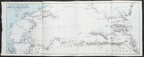
1876 Petermann Antique Map Western & South Australia - Warburton, Giles, Forrest
- Title : Die Neuesten Entdeckungsreisen im Inner-Australien von Warburton, Giles, Forrest, April 1873 - Sept 1874
- Size: 27in x 11in (285mm x 280mm)
- Condition: (A+) Fine Condition
- Date : 1876
- Ref #: 82055
Description:
This early folding original antique lithograph map of Western & South Australia and Alexandria land (Northern Territory) with the tracks of 3 explorers - in 1873 & 1874 - Peter Egerton-Warburton, Ernest Giles & Alexander Forrest by Augustus Heinrich Petermann was engraved in 1876 - dated - and was published by Justus Perthes, Gotha Germany.
General Definitions:
Paper thickness and quality: - Heavy and stable
Paper color : - off white
Age of map color: - Original
Colors used: - Blue, red, yellow
General color appearance: - Authentic
Paper size: - 27in x 11in (285mm x 280mm)
Plate size: - 27in x 11in (285mm x 280mm)
Margins: - Min 1/2in (12mm)
Imperfections:
Margins: - None
Plate area: - Folds as issued
Verso: - None
Background:
Colonel Peter Egerton-Warburton CMG (1813–1889), was a British military officer, Commissioner of Police for South Australia, and an Australian explorer. In 1872 he sealed his legacy through a particularly epic expedition from Adelaide crossing the arid centre of Australia to the coast of Western Australia via Alice Springs.
William Ernest Powell Giles (1835 – 1897) best known as Ernest Giles, was an Australian explorer who led five major expeditions in central Australia.
Alexander Forrest CMG (1849 – 1901) was an explorer and surveyor of Western Australia, and later also a member of parliament.
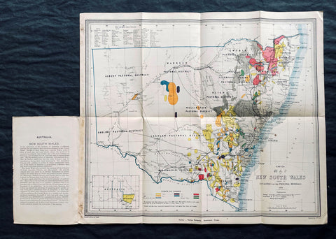
1876 Thomas & Tayler Scarce Antique Goldfields & Minerals Map of New South Wales
Antique Map
- Title : Sketch Map of New South Wales showing the Localities of the Principal Minerals 1876
- Ref #: 27011
-
Condition: (A+) Fine Condition
- Size: 18in x 15 1/2in (455mm x 400mm)
- Date : 1876
Description:
This original, incredibly scarce & important, antique lithograph map of New South Wales, illustrating the location of the Principle Minerals of that state, was drawn by John Tayler, engraved by G W Sharp and published by Thomas Richards in 1876 - dated, Sydney
General Definitions:
Paper thickness and quality: - Heavy and stable
Paper color : - off white
Age of map color: - Original
Colors used: - Yellow, green, blue, pink
General color appearance: - Authentic
Paper size: - 18in x 15 1/2in (455mm x 400mm)
Plate size: - 18in x 15 1/2in (455mm x 400mm)
Margins: - Min 1/2in (12mm)
Imperfections:
Margins: - Folds as issued
Plate area: - Folds as issued
Verso: - Folds as issued
Background:
The map shows New South Wales' new (and current) boundaries, with the state's 'Pastoral Districts' delineated; railways from Ports Hunter and Jackson are shown, along with their proposed extensions inland. Roads and telegraph lines are also indicated. Relief is shown by hachure. An inset map in the lower left shows the state's location on the Australian continent. These features are shared by the authors' other maps of New South Wales, the 1871 Map of New South Wales and the 1878 Sketch map of New South Wales showing the principal agricultural districts. Specific to this map, areas printed in color show the regions understood to be rich in minerals: Kerosene shale, coal, tin, iron, silver, copper, gold and 'diamonds and other gems.' The data on the map reflects the experience of some twenty years of prospecting in New South Wales, but predate the first systematic geological survey of the state, which would not be completed until 1880. The map specifies that the gold fields are 'proclaimed' gold fields, that is to say, permissible for prospectors. No prospector's claim was valid unless it fell within the limits of a 'proclaimed' field, which was officially recognized by the state and administered by a commissioner. The earlier 1873 edition of this map distinguishes between 'proclaimed' and 'unproclaimed' fields; in the present edition, the 'unproclaimed' fields have disappeared entirely. By 1876, control of gold mining in the state had passed from the Department of Lands to a new administration, the Department of Mines; in conjunction with this, mining had become less of a prospector-driven, 'gold rush' affair and more the province of mining companies employing more sophisticated processes, capable of extracting wealth from existing claims in which lower-capitalized operations were ineffective.
John Tayler 1861 - 1875 was an Australian cartographer and draftsman, employed by the NSW Surveyor Generals Office. His 1871 Map of New South Wales appears to have provided the basis for the bulk of the maps of the state produced prior to the Geological survey of 1880.
Richards, Thomas (1831 - 1898)
Thomas Richards, government printer, was born on 21 December 1831 in Pitt Street, Sydney, son of James Richards, builder, and his wife Mary, née OBrien. He was baptized a Catholic. His parents died in his infancy and he was reared by his aunt, the daughter of a sergeant-major in the First Fleet, and educated at Ebenezer on the Hawkesbury River. Having answered an advertisement for an intelligent youth, on 1 January 1845 he was engaged as an apprentice in the Government Printing Office, where he advanced as clerk, proof-reader, compositor, pressman, overseer and, in 1854, superintendent. In June 1859 he became government printer and inspector of stamps at a salary of £500, which had been reduced from his predecessors £850, but was raised to £600 in 1863; he had a staff of seventy. As he lacked London experience his appointment was unpopular. From 1 July 1879 he was also registrar of copyright.
During Richardss innovative administration, with increasing volume of work, the office expanded its functions and techniques. In 1863 he introduced photo-lithography and, after he had observed plant in Victoria in 1864, he added stereo-typing and electro-typing. In 1868 following the establishment of extra branches a new fast process of photo-lithography was invented by John Sharkey whose experiments were encouraged and assisted by Richards. The Sydney Morning Herald praised the gems of photo-lithographic art the Printing Office displayed at the 1870 Intercolonial Exhibition at Sydney. Later Richards initiated helio-type or photo-mechanical printing, introduced a perforating machine and invented a method of drying stamps with heat from gas. He devised an arithmotype bars system for numbering debentures which was adopted in all the colonies and England; he alleged the Bank of England took the patent without acknowledgment.
Frequently working long hours, Richards was criticized by some politicians for his administration and his publication of documents of allegedly limited public interest. He defended himself adequately before the 1870 select committee on the Government Printing Office, resisting suggestions of reductions in salaries and praising his men for the finest examples of the modern technique of photo-lithography seen in the colonies; and he admitted ambitions to produce an Australian geography and natural history, a year-book and dictionary of names for New South Wales. Looking back in 1891 he wrote, I had opposed to me a truculent minister, a truculent under-secretary and a truculent newspaper proprietor … I beat them but came out of the fray wounded in mind body and estate. He also had trouble with trade unions in difficult industrial times for heads of government departments and in 1875 antagonized the Trades and Labor Council by threatening to close the Office against all union men.
In 1877 Richards represented the government on an English committee to celebrate the quatercentenary of Caxtons introduction of printing. With twelve months leave he also studied advanced methods and bought new machinery. At the 1878 Paris Universal Exhibition he won a silver and two bronze medals and at the 1880 Melbourne International Exhibition he won five high diplomas for printing, bookbinding and photography. The 1883 Amsterdam Exhibition awarded him a gold and a silver medal, and the Printing Office was commended at other important exhibitions from 1862 to 1886. In 1882 Richards compiled, edited and printed the highly regarded New South Wales in 1881, which was translated into French; next year the office produced An Epitome of the Official History of New South Wales.
On 23 April 1861 Richards had joined the Volunteer Rifles as a second lieutenant. A good shot and member of the New South Wales Rifle Association, in 1885 he became lieutenant-colonel of the first regiment, Volunteer Infantry; he resigned next year. In November 1886, because of rapidly failing eyesight, Richards retired as government printer on a pension of £480; he left a staff of 400 and an office with sixty-one new departments. On 31 August 1898 he died at Manly and was buried in the Anglican cemetery there. On 29 January 1865, with Anglican rites, he had married Zara Bell, by whom he had three daughters and two sons who survived him.
Please note all items auctioned are genuine, we do not sell reproductions. A Certificate of Authenticity (COA) can be issued on request.
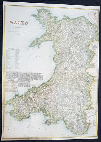
1878 Edward Weller Large Antique Map of Wales
Antique Map
- Title : Wales by Edward Weller FRGS
- Size: 34 1/2in x 24 1/2in (880m x 620mm)
- Condition: (A) Very Good Condition
- Date : 1878
- Ref #: 70570
Description:
This very large original hand coloured steel plate engraved antique map of Wales by Edward Weller was published by Cassell, Petter & Galpin.
General Definitions:
Paper thickness and quality: - Heavy and stable
Paper color : - off white
Age of map color: - Original
Colors used: - Yellow, green, blue, pink
General color appearance: - Authentic
Paper size: - 34 1/2in x 24 1/2in (880m x 620mm)
Plate size: - 34 1/2in x 24 1/2in (880m x 620mm)
Margins: - Min 1/2in (12mm)
Imperfections:
Margins: - Light soiling
Plate area: - 13in repair to bottom left sheet, no loss
Verso: - Repair as noted
Background:
Cassell & Co is a British book publishing house, founded in 1848 by John Cassell (1817–1865), which became in the 1890s an international publishing group company.
John Cassell (1817–1865), who was in turn a carpenter, temperance preacher, tea and coffee merchant, finally turned to publishing. His first publication was on 1 July 1848, a weekly newspaper called The Standard of Freedomadvocating religious, political, and commercial freedom. The Working Man\\\\\\\'s Friend became another popular publication. In 1849 Cassell was dividing his time between his publishing and his grocery business. In 1851 his expanding interests led to his renting part of La Belle Sauvage, a London inn which had been a playhouse in Elizabethan times. The former inn was demolished in 1873 to make way for a railway viaduct, with the company building new premises behind. La Belle Sauvage was destroyed in 1941 by WWII bombing as well as many archives.
Thomas Dixon Galpin who came from Dorchester in Dorset and George William Petter who was born in Barnstaplein Devon were partners in a printing firm and on John Cassell\\\\\\\'s bankruptcy in June 1855 acquired the publishing company and Cassell\\\\\\\'s debts. Between 1855 and 1858 the printing firm operated as Petter and Galpin and their work was published by W. Kent & Co.
John Cassell was relegated to being a junior partner after becoming insolvent in 1858, the firm being known as Cassell, Petter & Galpin. With the arrival of a new partner, Robert Turner, in 1878, it became Cassell, Petter, Galpin & Company. Galpin was the astute business manager. George Lock, the founder of Ward Lock, another publishing house, was Galpin\\\\\\\'s first cousin. Petter resigned in 1883 as a result of disagreement over publishing fiction, and in 1888 the company name was changed to Cassell & Co, Ltd, following Galpin\\\\\\\'s retirement and Petters death.
Weller, Edward 1819 – 1884
Weller was a British engraver and cartographer who was one of the first to produce maps using lithography. He was a London-based working from offices in Red Lion Square and later, Bloomsbury.
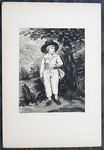
1878 Leon Richeton after Gainsborough Antique Print of a Young Gentleman, William III
- Title : A Young Gentleman
- Date : 1878
- Condition: (A+) Fine Condition
- Ref: 22407
- Size: 14in x 9 1/2in (350mm x 240mm)
Description:
This fine, original antique print of a young gentleman - possibly William III - by the master etcher Leon Richeton - signature engraved at the base of the print - was published in the 1878 edition of The Portfolio.
These faithful re-engravings of classic and historical wood-cuts were faithfully re-issued by in the mid to late 19th century. Such is the quality of his re-strikes these prints are now in major institutional collections such a the Louvre, National Gallery, The Met and many other famous Galleries. Please see below for further background.
General Description:
Paper thickness and quality: - Heavy & stable
Paper color: - Off white
Age of map color: -
Colors used: -
General color appearance: -
Paper size: - 14in x 9 1/2in (350mm x 240mm)
Margins: - Min 1in (25mm)
Imperfections:
Margins: - None
Plate area: - None
Verso: - None
Background:
Leon Richeton (1854 - 1934) was an etcher, etched landscapes, and copied works by other artists, such as Sir Thomas Lawrence and Gainsborough. He published etchings in The Portfolio, and etched illustrations for Alfred Egmont Hake's Paris Originals..., London, 1878.
Thomas Gainsborough FRSA (1727 – 1788) was an English portrait and landscape painter, draughtsman, and printmaker. He surpassed his rival Sir Joshua Reynolds to become the dominant British portraitist of the second half of the 18th century. He painted quickly, and the works of his maturity are characterised by a light palette and easy strokes. He preferred landscapes to portraits, and is credited (with Richard Wilson) as the originator of the 18th-century British landscape school. Gainsborough was a founding member of the Royal Academy.
1878 Leon Richeton after Rembrandt of an Antique Print - Portrait of a Boy
- Title : Portrait of a Boy
- Date : 1878
- Condition: (A+) Fine Condition
- Ref: 22405
- Size: 14in x 9 1/2in (350mm x 240mm)
Description:
This fine, original antique print the Portrait of a Boy by Rembrandt Harmenszoon Van Rijn in the mid 17th century was re-engraved by Leon Richeton and published in the 1878 edition of The Portfolio.
These faithful re-engravings of classic and historical wood-cuts were faithfully re-issued by in the mid to late 19th century. Such is the quality of his re-strikes these prints are now in major institutional collections such a the Louvre, National Gallery, The Met and many other famous Galleries. Please see below for further background.
General Description:
Paper thickness and quality: - Heavy & stable
Paper color: - Off white
Age of map color: -
Colors used: -
General color appearance: -
Paper size: - 14in x 9 1/2in (350mm x 240mm)
Margins: - Min 1in (25mm)
Imperfections:
Margins: - None
Plate area: - None
Verso: - None
Rembrandt Harmenszoon Van Rijn (1606-1669) was a Dutch draughtsman, painter, and printmaker. An innovative and prolific master in three media, he is generally considered one of the greatest visual artists in the history of art and the most important in Dutch art history. Unlike most Dutch masters of the 17th century, Rembrandt's works depict a wide range of style and subject matter, from portraits and self-portraits to landscapes, genre scenes, allegorical and hCharles Amand Durandistorical scenes, biblical and mythological themes as well as animal studies. His contributions to art came in a period of great wealth and cultural achievement that historians call the Dutch Golden Age, when Dutch art (especially Dutch painting), although in many ways antithetical to the Baroque style that dominated Europe, was extremely prolific and innovative, and gave rise to important new genres. Like many artists of the Dutch Golden Age, such as Jan Vermeer of Delft, Rembrandt was also an avid art collector and dealer.
Leon Richeton (1854 - 1934) was an etcher, etched landscapes, and copied works by other artists, such as Sir Thomas Lawrence, Gainsborough & Rembrandt and others. He published etchings in The Portfolio, and etched illustrations for Alfred Egmont Hake's Paris Originals..., London, 1878.
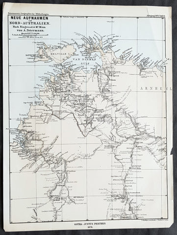
1878 Petermann Antique Map of Northern Territory Australia - William McMinn 1876
- Title : Neue Aufnahmen in Nord-Australien Nach. Ringwood & Mc Minn...Gotha: Justus Perthes 1878
- 10 1/2in x 8 1/2in (265mm x 215mm)
- Condition: (A+) Fine Condition
- Date : 1878
- Ref #: 82058
Description:
This scarce original antique lithograph map of north-west Northern Territory, Australia showing Palmerston at Port Darwin, place names and exploration routes, including that of William McMinn in 1876, by Augustus Heinrich Petermann was engraved in 1878 - dated - and was published by Justus Perthes, Gotha Germany.
General Definitions:
Paper thickness and quality: - Heavy and stable
Paper color : - off white
Age of map color: - Original
Colors used: - Yellow, blue
General color appearance: - Authentic
Paper size: - 10 1/2in x 8 1/2in (265mm x 215mm)
Plate size: - 10 1/2in x 8 1/2in (265mm x 215mm)
Margins: - Min 1/2in (12mm)
Imperfections:
Margins: - None
Plate area: - None
Verso: - None
Background:
William McMinn (1844 – 14 February 1884) was an Australian surveyor and architect, based in Adelaide.
He was born in Newry, County Down, Ireland, a son of Joseph McMinn and his wife Martha McMinn (née Hamill), who with their large family emigrated to Adelaide on the Albatross, arriving in September 1850.
After completing school, he was apprenticed to the architect James Macgeorge, but first practiced as a surveyor. He was involved in Boyle Travers Finniss\'s ill-fated 1865 expedition to Northern Australia surveying the area around the Adelaide River. Following the desertion of a majority of the party to Singapore, McMinn and 5 others purchased a 23-foot open boat which they named the Forlorn Hope and sailed it 2,000 miles (3,200 km) to Champion Bay, Geraldton, Western Australia. He was later involved in the 1872 surveying of the Overland Telegraph from Port Augusta to Darwin.
McMinn began practising as an architect in 1867, briefly in partnership with Daniel Garlick, and later with some others, but usually independently. He designed many grand private residences, but also designed or assisted in the design of many of Adelaide\'s grand public buildings. Whilst in partnership with Edward John Woods, he designed the original Venetian Gothic building of the University of Adelaide, considered his greatest work.
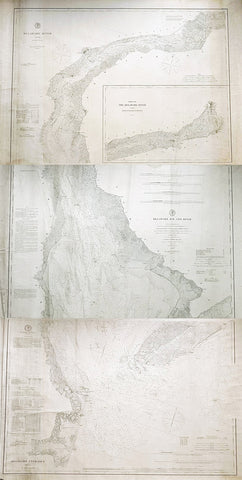
1878-88 US Coast Survey 3 x Sheet Very Large Antique Map of The Delaware River
Antique Map
- Title : Delaware River..Issued in June 1881 CP Paterson; Delaware Bay and River..under the direction of FR Hassler and AD Bache...April 1878 CP Patterson; Delaware Entrance aids to navigation to 1887
- Size: 42in x 29in (1.07m x 735mm) each sheet
- Condition: (B) Good Condition
- Date : 178-88
- Ref #: 93111
Description:
Original scarce very large (78in x 36in when joined) antique three sheet map, on very heavy paper, of the Delaware River and Harbour. The map follows the river bordering the States of New Jersey, Delaware & Pennsylvania, from the river mouth to Philadelphia PA, by AD Bache and FR Hassler and was first issued by the US Coast Survey in 1848. These 3 sheets were issued, updated in 1887, 1881 & 1887 respectively.
General Definitions:
Paper thickness and quality: - Heavy and stable
Paper color : - off white
Age of map color: -
Colors used: -
General color appearance: -
Paper size: - 42in x 29in (1.07m x 735mm) each sheet (approx)
Plate size: - 42in x 29in (1.07m x 735mm) each sheet (approx)
Margins: - Min 1/2in (12mm)
Imperfections:
Margins: - Soiling and creasing
Plate area: - Soiling and vertical creasing
Verso: - Soiling and vertical creasing
Background:
While these maps appear together occasionally on the market, and can be found bound into early US Coast Survey volumes, the thin paper and browned folds invariably leaves it in problematic condition. The present example is a separately issued example on very heavy paper. Many of the coast survey maps were issued in very limited numbers on heavy paper for presentation purposes or use at sea, making any example of these three maps together rare.
U.S. Coast Survey (Office of Coast Survey)
The Office of Coast Survey is the official chart-maker of the United States. Set up in 1807, it is one of the U.S. governments oldest scientific organizations. In 1878 it was given the name of Coast and Geodetic Survey (C&GS). In 1970 it became part of the National Oceanic and Atmospheric Administration (NOAA).
The agency was established in 1807 when President Thomas Jefferson signed the document entitled An act to provide for surveying the coasts of the United States. While the bills objective was specific—to produce nautical charts—it reflected larger issues of concern to the new nation: national boundaries, commerce, and defence.
The early years were difficult. Ferdinand Rudolph Hassler, who was eventually to become the agencys first superintendent, went to England to collect scientific instruments but was unable to return through the duration of the War of 1812. After his return, he worked on a survey of the New York Harbor in 1817, but Congress stepped in to suspend the work because of tensions between civilian and military control of the agency. After several years under the control of the U.S. Army, the Survey of the Coast was reestablished in 1832, and President Andrew Jackson appointed Hassler as superintendent.
The U.S. Coast Survey was a civilian agency but, from the beginning, members of the Navy and Army were detailed to service with the Survey, and Navy ships were also detailed to its use. In general, army officers worked on topographic surveys on the land and maps based on the surveys, while navy officers worked on hydrographic surveys in coastal waters.
Alexander Dallas Bache, great-grandson of Benjamin Franklin, was the second Coast Survey superintendent. Bache was a physicist, scientist, and surveyor who established the first magnetic observatory and served as the first president of the National Academy of Sciences. Under Bache, Coast Survey quickly applied its resources to the Union cause during the Civil War. In addition to setting up additional lithographic presses to produce the thousands of charts required by the Navy and other vessels, Bache made a critical decision to send Coast Survey parties to work with blockading squadrons and armies in the field, producing hundreds of maps and charts. Bache detailed these activities in his annual reports to Congress.
Coast Survey cartographer Edwin Hergesheimer created the map showing the density of the slave population in the Southern states.
Bache was also one of four members of the governments Blockade Strategy Board, planning strategy to essentially strangle the South, economically and militarily. On April 16, 1861, President Lincoln issued a proclamation declaring the blockade of ports from South Carolina to Texas. Baches Notes on the Coast provided valuable information for Union naval forces.
Maps were of paramount importance in wartime:
It is certain that accurate maps must form the basis of well-conducted military operations, and that the best time to procure them is not when an attack is impending, or when the army waits, but when there is no hindrance to, or pressure upon, the surveyors. That no coast can be effectively attacked, defended, or blockaded without accurate maps and charts, has been fully proved by the events of the last two years, if, indeed, such a proposition required practical proof.
— Alexander Dallas Bache, 1862 report.
Coast Survey attracted some of the best and brightest scientists and naturalists. It commissioned the naturalist Louis Agassiz to conduct the first scientific study of the Florida reef system. James McNeill Whistler, who went on to paint the iconic Whistlers Mother, was a Coast Survey engraver. The naturalist John Muir was a guide and artist on Survey of the 39th Parallel across the Great Basin of Nevada and Utah.
The agencys men and women (women professionals were hired as early as 1845) led scientific and engineering activities through the decades. In 1926, they started production of aeronautical charts. During the height of the Great Depression, Coast and Geodetic Survey organized surveying parties and field offices that employed over 10,000 people, including many out-of-work engineers.
In World War II, C&GS sent over 1,000 civilian members and more than half of its commissioned officers to serve as hydrographers, artillery surveyors, cartographers, army engineers, intelligence officers, and geophysicists in all theaters of the war. Civilians on the home front produced over 100 million maps and charts for the Allied Forces. Eleven members of the C&GS gave their lives during the war.
Alexander Dallas Bache 1806 – 1867 was an American physicist, scientist, and surveyor who erected coastal fortifications and conducted a detailed survey to map the mid-eastern United States coastline. Originally an army engineer, he later became Superintendent of the U.S. Coast Survey, and built it into the foremost scientific institution in the country before the Civil War.
Alexander Bache was born in Philadelphia, the son of Richard Bache, Jr., and Sophia Burrell Dallas Bache. He came from a prominent family as he was the nephew of Vice-President George M. Dallas and naval hero Alexander J. Dallas. He was the grandson of Secretary of the Treasury Alexander Dallas and was the great-grandson of Benjamin Franklin.
Bache was a professor of natural philosophy and chemistry at the University of Pennsylvania from 1828 to 1841 and again from 1842 to 1843. He spent 1836–1838 in Europe on behalf of the trustees of what became Girard College; he was named president of the college after his return. Abroad, he examined European education systems, and on his return he published a valuable report. From 1839 to 1842, he served as the first president of Central High School of Philadelphia, one of the oldest public high schools in the United States.
In 1843, on the death of Professor Ferdinand Rudolph Hassler, Bache was appointed superintendent of the United States Coast Survey. He convinced the United States Congress of the value of this work and, by means of the liberal aid it granted, he completed the mapping of the whole coast by a skillful division of labor and the erection of numerous observing stations. In addition, magnetic and meteorological data were collected. Bache served as head of the Coast Survey for 24 years (until his death).
Please note all items auctioned are genuine, we do not sell reproductions. A Certificate of Authenticity (COA) can be issued on request.

1879 Lorenz Large Antique Map Coal Seams Schuylkill County, Pennsylvania Reading
Antique Map
- Title : Map Showing Coal Laterals of the Philadelphia & Reading Rail Raod company William Lorenz Chief Eng. 1879
- Date : 1879
- Size: 29in x 19 1/2in (735mm x 495mm)
- Condition: (A) Very Good Condition
- Ref: 93520
Description:
This original, large folding rare lithograph map of the Coal Fields of Schuylkill County, Pennsylvania, owned at the time by the Pennsylvania & Reading Railroad Company by William Lorenz was engraved and published in 1879 - dated.
The Definition of a Coalseam lateral is any system of development in coal seams or thick orebodies in which headings are driven horizontally across the coal or ore and connected to main haulage drifts, entries, or shafts. There are many variations and modifications depending on the thickness, shape, and inclination of the deposit.(Ref Tooley M&B)
General Definitions:
Paper thickness and quality: - Heavy and stable
Paper color : - off white
Age of map color: - Original
Colors used: - Pink, blue
General color appearance: - Authentic
Paper size: - 29in x 19 1/2in (735mm x 495mm)
Plate size: - 29in x 19 1/2in (735mm x 495mm)
Margins: - Min 1/2in (12mm)
Imperfections:
Margins: - Chipping to map edges not affecting the image
Plate area: - Light wear along sectioned edges
Verso: - Backed in linen
Background:
Schuylkill is a county in the Commonwealth of Pennsylvania. It is located in the heart of Pennsylvanias Coal Region and is part of Northeastern Pennsylvania. As of the 2020 census, the population was 143,049. The county seat is Pottsville.
The county was created on March 1, 1811, from parts of Berks and Northampton counties and named for the Schuylkill River, which originates in the county. On March 3, 1818, additional territory in its northeast was added from Columbia and Luzerne counties. The county is part of the Pottsville, Pennsylvania Micropolitan Statistical Area.
The lands that today constitute Schuylkill County were acquired by William Penns proprietors by treaty executed August 22, 1749, with representatives of the Six Nations and the Delaware, Shamokin and Shawnee, who received 500 pounds lawful money of Pennsylvania. The territory described included all of Schuylkill County except the northern part of Union Township, which was included in the purchase of 1768.
In the year 1754, the area that would become Schuylkill County along with the areas that today are Berks, Dauphin, Lebanon, and Lehigh counties were settled by German immigrants. The earliest settlers in southeastern Schuylkill County, which was then part of Northampton County, were primarily Moravian missionaries from Saxony. Other early settlers in southern Schuylkill County were German Palatines.
An early mill in the county was built in 1744 by John Finscher, but it later burned down. The first log church in the county was built in 1755. Native American massacres were commonplace in Schuylkill County between 1755 and 1765. Warrant for tracts of land in the vicinity of McKeansburg were in existence as early as 1750. Found by Sammy Hepler in 1789.
Anthracite coal (then called stone coal) was discovered by Necho Allen near the area where Pottsville was ultimately developed in 1790. In 1795, a blacksmith in Schuylkill County named Whetstone learned how to use the coal successfully for smithing purposes. In 1806 coal was found while the tail-race was cut of the Valley (Iron) Forge, on the Schuylkill. Daniel Berlin, another blacksmith, also used it successfully, and smiths in the neighborhood adopted using the coal.
Schuylkill County was created via an Act of Assembly on March 1, 1811, from portions of Berks and Northampton counties. More land was added to the county in 1818, from Columbia and Luzerne counties. At the time of its creation, the county had a population of about 6,000. An early book of Schuylkill County history was written by Daniel Deibert in 1802.
Orwisgsburg was the first community in Schuylkill County to be laid out. During the early years of Schuylkill County, there was an attempt to make McKeansburg the county seat; Orwigsburg was also a contender. Orwigsburg was agreed upon to be the county seat, as it was deemed to be well-suited for industries. Beginning in 1831, sentiment began to rise for moving the county seat to Pottsville. In 1846, the Legislature passed an Act that was approved by Governor Francis R. Shunk on March 13, submitting the question to the voters. The change was desired principally because the railroad and canal connections with Orwigsburg were problematic to transport the public to that town without losing valuable time while Pottsville had such facilities and was within easy access from all parts of the county.
In 1812, George Shoemaker who, with Necho Allen, had discovered stone coal at Centerville in Schuylkill County, personally delivered some coal to Philadelphia. He gave away most of the coal, intending to encourage individuals to find ways to use it. Most of the experiments failed and though Shoemaker was nearly run out of town and called an imposter, Mellon and Bishop of Delaware County successfully used it in their rolling mill. When other rolling mills also adopted the fuel, a large industrial market and demand developed.
The Schuylkill Navigation Company was chartered in 1815 to build a series of navigation improvements in the Schuylkill River. This was during a period when the much larger Erie Canal along the Mohawk River in New York also was being developed. It was well ahead of other key canals fueling the Industrial Revolution, such as the Delaware and Hudson, the Lehigh, the Chesapeake and Ohio, Delaware and Raritan, and Morris canals. The originators of the project did not count upon the coal trade to promote the success of the undertaking. They looked forward mainly to transporting the agricultural products being produced below the mountains, the lumber of Schuylkill County, and the grain and other products of the counties between the Susquehanna and Schuylkill rivers. The first shipments of coal by canal were made in 1822 when 1,480 tons were sent down the line.
With a regular supply of anthracite coal ensured, the southern anthracite coal field in Schuylkill County attracted speculators and fortune hunters. They were inspired by dreams of becoming millionaires. This was the first speculative era of the Schuylkill coal trade. Pottsville became the center of the movement. The more successful explorers revealed numerous veins of coal, extending over a vast stretch of county and with a seemingly inexhaustible quantity of coal. These discoveries brought excitement and speculation; lands were bought (and sold); roads were laid out in the forest, mines were opened and railroads projected, and innumerable town plots planned. The demand for houses was so great that the lumber for many was framed in Philadelphia and sent by canal to the burgeoning coal region.
At this stage, coal-mining firms were small and family owned. The residents and entrepreneurs of the Schuylkill region opposed the entry here of incorporated coal companies. In these years, coal mining operations in the Schuylkill region were conducted with economy, and relatively little capital was required. As the workings were all above the water level, no machinery was required for water drainage or for hoisting coal to the surface. Coal breakers and other expensive fixtures and appliances for the preparation of coal had not then been introduced. Numerous operators produced from five to six thousand tons for market annually (which was then considered a respectable business), who had never committed thousands of dollars to their enterprises, including their first land purchases of coal mines. It was commonly asserted that coal land could be bought and mines opened for less capital than the purchase and stocking of a decent farm. Such mines could be worked for less capital than that required to establish a line of stagecoaches or transportation wagons.
Eventually, railroads replaced the canals as the primary means of transporting coal to markets. Mining was taken over by major corporate business, especially after the Civil War. As a result, the Middle Coal Field was developed in the 1860s and the Philadelphia and Reading Railroad created a subsidiary (Philadelphia and Reading Coal and Iron Company) to buy or lease, and develop the expanding industrial coal trade. Consumption of coal along the Schuylkill above Philadelphia in 1839 was 30,290 tons when the Pioneer at Pottsville, the first anthracite furnace in the United States, became operational. By 1849, consumption had increased to 239,290 tons, to 554,774 tons in 1859, and to 1,787,205 tons in 1873.
The numerous jobs in the mining industry comprised a catalyst for mass immigration to Schuylkill County from the British Isles and Europe in the 19th and 20th centuries. As mines became more numerous (by 1846 there were 110 operators in the region and 142 collieries in Schuylkill County) and more complex (in 1846 there were 35 collieries below water level), mechanical breakers, steam locomotive, it became more labor-intensive both for accomplishing mining tasks and supporting minings peripheral industries. Such industries included manufacturing of explosives, metal screens, pump components, piping, and timber for support. This led to an influx of population into Schuylkill and other anthracite counties to fill these jobs. Beginning with the Irish immigration in the 1840s (fueled by the Great Famine), after the Civil War, beginning in the 1870s, newcomers arrived from Eastern Europe. Poles, Hungarians, Lithuanians, Slovaks, Rusyns and Ukrainians (Ruthenians), often from the Austro-Hungarian monarchy settled in the villages of Schuylkill County and took their place among the laborers in the coal mines. By the 1880s and 1890s, thousands of Italians immigrated for jobs related to mining.
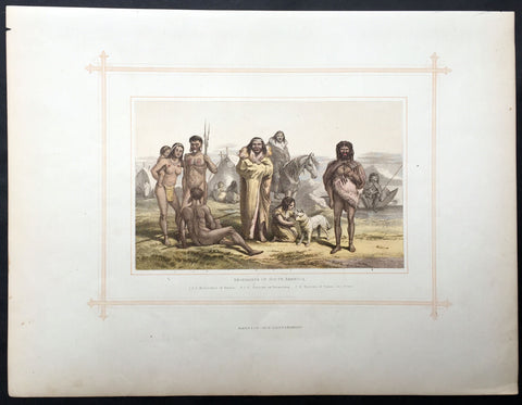
1880 Blackie & Son Antique Print South American Indians
- Title : Aborigines of South America
- Ref #: 80519
- Size: 15in x 11in (380mm x 280mm)
- Date : 1880
- Condition: (A+) Fine Condition
Description:
This beautifully coloured large original antique lithograph print was published by Blackie & Son of Glasgow in the 1880 edition of Geographical Atlas. (Ref: Tooley; M&B)
General Description:
Paper thickness and quality: - Heavy and stable
Paper colour: - off white
Age of map colour: - Original
Colours used: - Brown, blue, green
General colour appearance: - Authentic
Paper size: - 15in x 11in (380mm x 280mm)
Margins: - min 12in (25mm)
Imperfections:
Margins: - Light soiling
Plate area: - None
Verso: - None
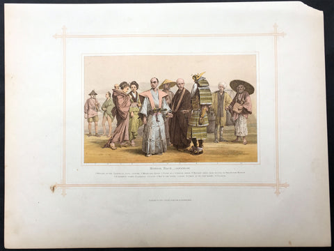
1880 Blackie & Son Antique Print the Japanese Peoples
- Title : Mongol Race - Japanese
- Ref #: 80515
- Size: 15in x 11in (380mm x 280mm)
- Date : 1880
- Condition: (A+) Fine Condition
Description:
This beautifully coloured large original antique lithograph print was published by Blackie & Son of Glasgow in the 1880 edition of Geographical Atlas. (Ref: Tooley; M&B)
General Description:
Paper thickness and quality: - Heavy and stable
Paper colour: - off white
Age of map colour: - Original
Colours used: - Brown, blue, green
General colour appearance: - Authentic
Paper size: - 15in x 11in (380mm x 280mm)
Margins: - min 12in (25mm)
Imperfections:
Margins: - Light soiling
Plate area: - None
Verso: - None
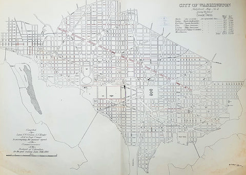
1880 F V Greene Large Antique Map Lines of Planted Trees in Washington DC
- Title : City of Washington Statistical Map No 4 showing the lines of Shade Trees.....Compiled by Lieut. F V Greene, US Engrs. Asst to the Engr. Commr. to accompany the annual report of the Commissioners of the District of Columbia for the year ending June 30th 1880
- Size: 30in x 23in (767mm x 585mm)
- Condition: (A) Very Good Condition
- Date : 1880
- Ref #: 16266
Description:
This large original lithograph map, a city plan of Washington DC, showing the lines of Trees planted very early in the cities growth, by Lieutenant Francis Vinton Greene, was published in June 1880, dated.
General Definitions:
Paper thickness and quality: - Heavy and stable
Paper color : - off white
Age of map color: - Original
Colors used: - Blue, pink, red, green, yellow
General color appearance: - Authentic
Paper size: - 30in x 23in (767mm x 585mm)
Plate size: - 30in x 23in (767mm x 585mm)
Margins: - Min 1/2in (12mm)
Imperfections:
Margins: - Light soiling L&R bottom corners
Plate area: - None
Verso: - Bottom L&R bottom corner backing canvas loose
Background:
The history of Washington, D.C. is tied to its role as the capital of the United States. Originally inhabited by an Algonquian-speaking people known as the Nacotchtank. the site of the District of Columbia along the Potomac River was first selected by President George Washington. The city came under attack during the War of 1812 in an episode known as the Burning of Washington. Upon the government\'s return to the capital, it had to manage reconstruction of numerous public buildings, including the White House and the United States Capitol.
By 1870, the District\'s population had grown 75% from the previous census to nearly 132,000 residents. Despite the citys growth, Washington still had dirt roads and lacked basic sanitation. The situation was so bad that some members of Congress suggested moving the capital further west, but President Ulysses S. Grant refused to consider such a proposal.
In response to the poor conditions in the capital, Congress passed the Organic Act of 1871, which revoked the individual charters of the cities of Washington and Georgetown, and created a new territorial government for the whole District of Columbia. The act provided for a governor appointed by the President, a legislative assembly with an upper-house composed of eleven appointed council members and a 22-member house of delegates elected by residents of the District, as well as an appointed Board of Public Works charged with modernizing the city.
President Grant appointed Alexander Robey Shepherd, an influential member of the Board of Public Works, to the post of governor in 1873. Shepherd authorized large-scale municipal projects, which greatly modernized Washington. However, the governor spent three times the money that had been budgeted for capital improvements and ultimately bankrupted the city. In 1874, Congress abolished the Districts territorial government and replaced it with a three-member Board of Commissioners appointed by the President, of which one was a representative from the United States Army Corps of Engineers. The three Commissioners would then elect one of themselves to be president of the commission.
An additional act of Congress in 1878 made the three-member Board of Commissioners the permanent government of the District of Columbia. The act also had the effect of eliminating any remaining local institutions such as the boards on schools, health, and police. The Commissioners would maintain this form of direct rule for nearly a century.
Greene, Francis Vinton 1850–1921
Greene was a United States Army officer who fought in the Spanish–American War. He came from the Greene family of Rhode Island, noted for its long line of participants in American military history.
Greene was born in Providence, Rhode Island on June 27, 1850. He attended the United States Military Academy at West Point and graduated in 1870. He first served in the U.S. artillery and then transferred to the Corps of Engineers in 1872. He next served as an attaché from the War Department to the U.S. legation in St. Petersburg, Russia. While there he served in the Russian army during its war with Turkey. He was promoted to first lieutenant in 1874 and captiain in 1883. He returned to the U.S. and was a civil engineer to the city of Washington, D.C. and was a professor of artillery at West Point before resigning from the Army on December 31, 1886.
When the Spanish–American War broke out he raised the 7th New York Volunteer Infantry and was commissoned as it colonel on May 2, 1898. He was quickly promoted to brigadier general of Volunteers on May 27, 1898. He commanded the second Philippine Expeditionary Force which became the 2nd Brigade, 2nd Division, VIII Corps. Greene took a prominent part in the Battle of Manila in 1898. He assisted in the surrender negotiations for Manila. In August 1898 he was promoted major general of Volunteers and resigned on February 28, 1899.
After the war, he pursued a variety of occupations. He was a delegate to the Republican National Convention in 1900. He served as the New York City Police Commissioner from 1903 to 1904. He was president of the Niagara-Lockport and Ontario Power Company, along with other business ventures with Buffalo businessman John J. Albright. He died on May 13, 1921 in New York City.
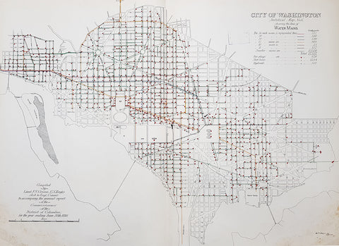
1880 F V Greene Large Antique Map Location of the Water Mains in Washington DC
- Title : City of Washington Statistical Map No 6 showing the lines of Water Mains...Compiled by Lieut. F V Greene, US Engrs. Asst to the Engr. Commr. to accompany the annual report of the Commissioners of the District of Columbia for the year ending June 30th 1880
- Size: 30in x 23in (767mm x 585mm)
- Condition: (A) Very Good Condition
- Date : 1880
- Ref #: 16263
Description:
This large original lithograph map, a city plan of Washington DC, showing the location of the Water Mains very early in the cities growth, by Lieutenant Francis Vinton Greene, was published in June 1880, dated.
General Definitions:
Paper thickness and quality: - Heavy and stable
Paper color : - off white
Age of map color: - Original
Colors used: - Blue, pink, red, green, yellow
General color appearance: - Authentic
Paper size: - 30in x 23in (767mm x 585mm)
Plate size: - 30in x 23in (767mm x 585mm)
Margins: - Min 1/2in (12mm)
Imperfections:
Margins: - Light soiling L&R bottom corners
Plate area: - None
Verso: - Bottom L&R bottom corner backing canvas loose
Background:
The history of Washington, D.C. is tied to its role as the capital of the United States. Originally inhabited by an Algonquian-speaking people known as the Nacotchtank. the site of the District of Columbia along the Potomac River was first selected by President George Washington. The city came under attack during the War of 1812 in an episode known as the Burning of Washington. Upon the government\'s return to the capital, it had to manage reconstruction of numerous public buildings, including the White House and the United States Capitol.
By 1870, the District\'s population had grown 75% from the previous census to nearly 132,000 residents. Despite the citys growth, Washington still had dirt roads and lacked basic sanitation. The situation was so bad that some members of Congress suggested moving the capital further west, but President Ulysses S. Grant refused to consider such a proposal.
In response to the poor conditions in the capital, Congress passed the Organic Act of 1871, which revoked the individual charters of the cities of Washington and Georgetown, and created a new territorial government for the whole District of Columbia. The act provided for a governor appointed by the President, a legislative assembly with an upper-house composed of eleven appointed council members and a 22-member house of delegates elected by residents of the District, as well as an appointed Board of Public Works charged with modernizing the city.
President Grant appointed Alexander Robey Shepherd, an influential member of the Board of Public Works, to the post of governor in 1873. Shepherd authorized large-scale municipal projects, which greatly modernized Washington. However, the governor spent three times the money that had been budgeted for capital improvements and ultimately bankrupted the city. In 1874, Congress abolished the Districts territorial government and replaced it with a three-member Board of Commissioners appointed by the President, of which one was a representative from the United States Army Corps of Engineers. The three Commissioners would then elect one of themselves to be president of the commission.
An additional act of Congress in 1878 made the three-member Board of Commissioners the permanent government of the District of Columbia. The act also had the effect of eliminating any remaining local institutions such as the boards on schools, health, and police. The Commissioners would maintain this form of direct rule for nearly a century.
Greene, Francis Vinton 1850–1921
Greene was a United States Army officer who fought in the Spanish–American War. He came from the Greene family of Rhode Island, noted for its long line of participants in American military history.
Greene was born in Providence, Rhode Island on June 27, 1850. He attended the United States Military Academy at West Point and graduated in 1870. He first served in the U.S. artillery and then transferred to the Corps of Engineers in 1872. He next served as an attaché from the War Department to the U.S. legation in St. Petersburg, Russia. While there he served in the Russian army during its war with Turkey. He was promoted to first lieutenant in 1874 and captiain in 1883. He returned to the U.S. and was a civil engineer to the city of Washington, D.C. and was a professor of artillery at West Point before resigning from the Army on December 31, 1886.
When the Spanish–American War broke out he raised the 7th New York Volunteer Infantry and was commissoned as it colonel on May 2, 1898. He was quickly promoted to brigadier general of Volunteers on May 27, 1898. He commanded the second Philippine Expeditionary Force which became the 2nd Brigade, 2nd Division, VIII Corps. Greene took a prominent part in the Battle of Manila in 1898. He assisted in the surrender negotiations for Manila. In August 1898 he was promoted major general of Volunteers and resigned on February 28, 1899.
After the war, he pursued a variety of occupations. He was a delegate to the Republican National Convention in 1900. He served as the New York City Police Commissioner from 1903 to 1904. He was president of the Niagara-Lockport and Ontario Power Company, along with other business ventures with Buffalo businessman John J. Albright. He died on May 13, 1921 in New York City.
1882 Edward Stanford Large Folding Antique Map Eastern Australia, QLD, NSW, Vic
Antique Map
- Title : Queensland & New South Wales....London Published by Edward Stanford ...March 20th 1882
- Ref : 17064
- Size: 26 1/2in x 22in (680mm x 570mm)
- Date : 1882.
- Condition: (A+) Fine Condition
Description:
This large original hand coloured folding canvas backed antique map of Vicoria, New South Wales & Queensland in Eastern Australia, illustrating Tracks of Travellers, Roads, Railways & Telegraph was published by Edward Stanford, London in 1882, dated at the foot of the map. (Ref: Tooley; M&B)
General Definitions:
Paper thickness and quality: - Heavy and stable
Paper color : - off white
Age of map color: - Original
Colors used: - Blue, yellow, red, green
General color appearance: - Authentic
Paper size: - 26 1/2in x 22in (680mm x 570mm)
Plate size: - 26 1/2in x 22in (680mm x 570mm)
Margins: - Min 1/2in (12mm)
Imperfections:
Margins: - None
Plate area: - None
Verso: - None
Stanford, Edward 1827-1904
Stanford was a prominent British mapmaker and publisher. A native of Holborn in the heart of London, Edward was apprenticed to a printer and stationer at the age of 14. After his first master died, he worked with several others, including Trelawny W. Saunders of Charing Cross. Saunders oversaw young Edward’s early career, ensuring that he became a Fellow of the Royal Geographical Society. Associations with the Society eventually brought Sanders much business and gave him a reputation as a publisher of explorers. As testament to this reputation, the Stanford Range in British Columbia was named for him by John Palliser.
Stanford briefly partnered with Saunders in 1852 before striking out on his own in 1853. He was an agent for the Ordnance Survey, the Admiralty, the Geological Survey, the Trigonometrical Survey of India, and the India Office. He also controlled the maps of the Society for the Diffusion of Useful Knowledge, another lucrative source of income. In 1857, Stanford founded his namesake Geographical Establishment, with Saunders and A. K. Johnston as engravers. Thereafter, Stanford was known for his library maps, particularly those of Africa and Asia.
Although he had authored many maps, the Harrow Atlas of Modern Geography and a similar volume on classical geography, Stanford is better remembered today as the leader of a successful map business. Ever in search of more inventory, he acquired the plates and stock of John Arrowsmith, heir of the Arrowmsith family firm, in 1874. By 1881 he employed 87 people at his premises at 6 Charing Cross Road, Saunders’ old address. As he aged, he phased in his son Edward Jr. to run the business. He died in 1904. The business survived him, and the Stanford’s shop is still a prominent London landmark today.
Stanford premises were located in the Strand, London from 1853 to 1884 and then Cockspur St from 1885 to 1901 locating to its present location in Covent Garden.
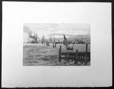
1886 Pic. Australasia Large Antique Print View of Wellington, New Zealand
- Title : Wellington Harbour
- Ref : 92196
- Size: 17in x 13in (430mm x 330mm)
- Date : 1886
- Condition: (A+) Fine Condition
Description:
This fine large original antique lithograph print was published in the extremely significant Australian & New Zealand publication The Picturesque Atlas of Australasia between 1886-88.
The Picturesque Atlas of Australasia was published in Sydney between 1886-88. Many of its over 700 wood-engraved illustrations were specially commissioned works by leading Australian artists. It was released in 42 separate editions usually bound into three large volumes and sold a remarkable 50,000 copies. (Ref: M&B; Tooley)
General Description:
Paper thickness and quality: - Light & stable
Paper color: - White
Age of map color: - Original
Colors used: - Pink, green, yellow, orange
General color appearance: - Authentic
Paper size: - 17in x 13in (430mm x 330mm)
Margins: - Min 1/2in (10mm)
Imperfections:
Margins: - None
Plate area: - None
Verso: - None
1886 Picturesque Atlas Large Antique Rainfall Map of New South Wales, Australia
- Title : Map of New South Wales showing Average Annual Rainfall
- Ref : 50340
- Size: 26in x 18in (660mm x 446mm)
- Date : 1886
- Condition: (A+) Fine Condition
Description:
This large fine lithograph layered coloured original map was published in the extremely significant Australian & New Zealand Australian & New Zealand publication The Picturesque Atlas of Australasia between 1886-88.
The Picturesque Atlas of Australasia was published in Sydney between 1886-88. Many of its over 700 wood-engraved illustrations were specially commissioned works by leading Australian artists. It was released in 42 separate editions usually bound into three large volumes and sold a remarkable 50,000 copies. (Ref: M&B; Tooley)
General Description:
Paper thickness and quality: - Light & stable
Paper color: - White
Age of map color: - Original
Colors used: - Blue, yellow, pink, green
General color appearance: - Authentic
Paper size: - 26in x 18in (660mm x 446mm)
Margins: - Min 1in (25mm)
Imperfections:
Margins: - None
Plate area: - None
Verso: - None
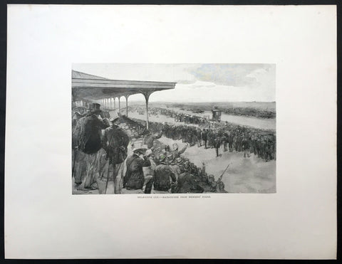
1886 Picturesque Atlas of Australasia Large Antique Print of The Melbourne Cup
- Title : Melbourne Cup - Race Course From Members Stand
- Ref #: 92164
- Size: 17 1/2in x 13 1/2in (440mm x 340mm)
- Date : 1886
- Condition: (A+) Fine Condition
Description:
This fine large original antique lithograph print was published in the extremely significant Australian & New Zealand publication The Picturesque Atlas of Australasia between 1886-88.
The Picturesque Atlas of Australasia was published in Sydney between 1886-88. Many of its over 700 wood-engraved illustrations were specially commissioned works by leading Australian artists. It was released in 42 separate editions usually bound into three large volumes and sold a remarkable 50,000 copies. (Ref: M&B; Tooley)
General Description:
Paper thickness and quality: - Light & stable
Paper color: - White
Age of map color: - Original
Colors used: - Pink, green, yellow, orange
General color appearance: - Authentic
Paper size: - 17 1/2in x 13 1/2in (440mm x 340mm)
Margins: - Min 2in (50mm)
Imperfections:
Margins: - None
Plate area: - None
Verso: - None
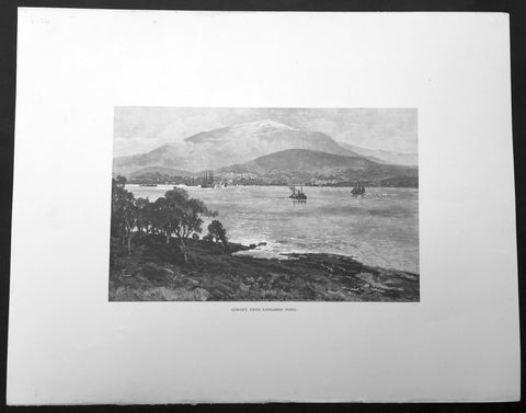
1886 Picturesque Australasia Large Antique Print View of Hobart, Tasmania
- Title : Hobart from Kangaroo Point
- Ref : 92112
- Size: 17in x 13in (430mm x 330mm)
- Date : 1886
- Condition: (A+) Fine Condition
Description:
This fine large original antique lithograph print was published in the extremely significant Australian & New Zealand publication The Picturesque Atlas of Australasia between 1886-88.
The Picturesque Atlas of Australasia was published in Sydney between 1886-88. Many of its over 700 wood-engraved illustrations were specially commissioned works by leading Australian artists. It was released in 42 separate editions usually bound into three large volumes and sold a remarkable 50,000 copies. (Ref: M&B; Tooley)
General Description:
Paper thickness and quality: - Light & stable
Paper color: - White
Age of map color: - Original
Colors used: - Pink, green, yellow, orange
General color appearance: - Authentic
Paper size: - 17in x 13in (430mm x 330mm)
Margins: - Min 1/2in (10mm)
Imperfections:
Margins: - None
Plate area: - None
Verso: - None
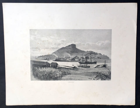
1886 Picturesque Australasia Large Antique Print View of Townsville, Queensland
- Title : Townsville
- Ref : 92149
- Size: 17in x 13in (430mm x 330mm)
- Date : 1886
- Condition: (A+) Fine Condition
Description:
This fine large original antique lithograph print was published in the extremely significant Australian & New Zealand publication The Picturesque Atlas of Australasia between 1886-88.
The Picturesque Atlas of Australasia was published in Sydney between 1886-88. Many of its over 700 wood-engraved illustrations were specially commissioned works by leading Australian artists. It was released in 42 separate editions usually bound into three large volumes and sold a remarkable 50,000 copies. (Ref: M&B; Tooley)
General Description:
Paper thickness and quality: - Light & stable
Paper color: - White
Age of map color: - Original
Colors used: - Pink, green, yellow, orange
General color appearance: - Authentic
Paper size: - 17in x 13in (430mm x 330mm)
Margins: - Min 1/2in (10mm)
Imperfections:
Margins: - None
Plate area: - None
Verso: - Light soiling
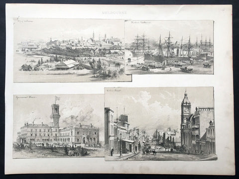
1888 Large Antique Print Views of Melbourne, Australia
- Title : Melbourne
- Date : 1888
- Condition: (A+) Fine Condition
- Ref: 33074
- Size: 14 1/2in x 11in (370mm x 280mm)
Description:
This fine original antique lithograph print four views Melbourne, The City, Harbour, Gov. House & Collins St, was published in ca 1888. (Ref: M&B; Tooley)
General Description:
Paper thickness and quality: - Heavy & stable
Paper color: - White
Age of map color: -
Colors used: -
General color appearance: -
Paper size: - 14 1/2in x 11in (370mm x 280mm)
Plate size: - 14 1/2in x 11in (370mm x 280mm)
Margins: - Min 1/2in (10mm)
Imperfections:
Margins: - Light soiling
Plate area: - None
Verso: - None
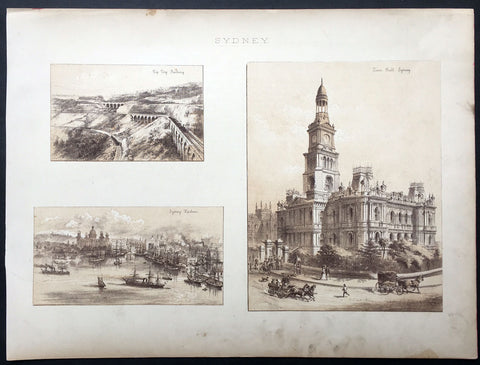
1888 Large Antique Print Views of Sydney Australia
- Title : Sydney
- Date : 1888
- Condition: (A+) Fine Condition
- Ref: 33075
- Size: 14 1/2in x 11in (370mm x 280mm)
Description:
This fine original antique lithograph print three views Sydney - The Zig Zag Railway, Sydney Harbour & the Sydney Town Hall - was published in ca 1888. (Ref: M&B; Tooley)
General Description:
Paper thickness and quality: - Heavy & stable
Paper color: - White
Age of map color: -
Colors used: -
General color appearance: -
Paper size: - 14 1/2in x 11in (370mm x 280mm)
Plate size: - 14 1/2in x 11in (370mm x 280mm)
Margins: - Min 1/2in (10mm)
Imperfections:
Margins: - Light soiling
Plate area: - None
Verso: - None
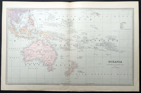
1888 Large Pic Atlas Large Antique Map Oceania Australia, New Zealand
- Title : Oceania
- Ref : 40969
- Size: 26in x 18in (660mm x 446mm)
- Date : 1886
- Condition: (A+) Fine Condition
Description:
This large fine lithograph layered coloured original map was published in the extremely significant Australian & New Zealand Australian & New Zealand publication The Picturesque Atlas of Australasia between 1886-88.
The Picturesque Atlas of Australasia was published in Sydney between 1886-88. Many of its over 700 wood-engraved illustrations were specially commissioned works by leading Australian artists. It was released in 42 separate editions usually bound into three large volumes and sold a remarkable 50,000 copies. (Ref: M&B; Tooley)
General Description:
Paper thickness and quality: - Light & stable
Paper color: - White
Age of map color: - Original
Colors used: - Blue, yellow, pink, green
General color appearance: - Authentic
Paper size: - 26in x 18in (660mm x 446mm)
Margins: - Min 1in (25mm)
Imperfections:
Margins: - None
Plate area: - None
Verso: - None
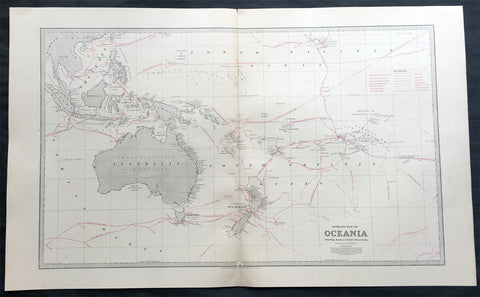
1888 Large Pic Atlas Large Antique Map Oceania Australia, New Zealand
- Title : Oceania, showing the route of the earlier discoverers
- Ref : 50342
- Size: 26in x 18in (660mm x 446mm)
- Date : 1886
- Condition: (A+) Fine Condition
Description:
This large fine lithograph layered coloured original map was published in the extremely significant Australian & New Zealand Australian & New Zealand publication The Picturesque Atlas of Australasia between 1886-88.
The Picturesque Atlas of Australasia was published in Sydney between 1886-88. Many of its over 700 wood-engraved illustrations were specially commissioned works by leading Australian artists. It was released in 42 separate editions usually bound into three large volumes and sold a remarkable 50,000 copies. (Ref: M&B; Tooley)
General Description:
Paper thickness and quality: - Light & stable
Paper color: - White
Age of map color: - Original
Colors used: - Blue, yellow, pink, green
General color appearance: - Authentic
Paper size: - 26in x 18in (660mm x 446mm)
Margins: - Min 1in (25mm)
Imperfections:
Margins: - None
Plate area: - Small repair to bottom centerfold
Verso: - None
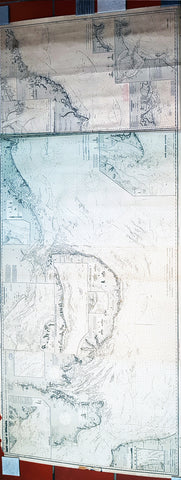
1888 Norie & Wilson Large Blue Back Map of East England - London to Newcastle
Antique Map
- Title : East Coast of England from Dugrness to Newcastle in Four Sheets...Charles Wilson )Late Norie & Wilson) London...1887, 1888 Drawn by J. S. Hobb Hydrographer
- Size: 94in x 34 1/2in (2.39m x 875mm)
- Condition: (A+) Fine Condition
- Date : 1887/88
- Ref #: 93113
Description:
This is a very large, extremely rare, blueback Nautical Map a chart of the East Coast of England, in 4 sheets joined, from Hastings in Kent to Newcastle, Durham was published by Norie & Wilson in 1887, with updates to 1888.
This extremely large blueback working map is extremely detailed with much detail of the Thames Estuary to London, with depth soundings, detailed surveys and many insert maps of Harwich, Lynn & Boston, France & Calais, Lowestaff & Yarmouth Roads, River Humber Entrance, South & North Shields, Seaham, Scarborough, Tees Bay & Sunderland Port. As stated these original blueback working maps are rare and scarce to the market. I have been unable to find this map available to purchase.
This rare Blueback map, a method of mounting working sea charts that was begun by Robert Sayer in the late 18th century. These working maps were extremely expensive to buy and labour intensive to put together so only a limited number were published and sold and even fewer have survived. I have found no other examples of this map either commercially or in other map collections.
General Definitions:
Paper thickness and quality: - Heavy and stable
Paper color : - off white
Age of map color: -
Colors used: -
General color appearance: -
Paper size: - 94in x 34 1/2in (2.39m x 875mm)
Plate size: - 94in x 34 1/2in (2.39m x 875mm)
Margins: - Min 1/2in (12mm)
Imperfections:
Margins: - Small uplift off the blue back, not affecting the map
Plate area: - None
Verso: - Small repair right end of blueback
Background:
Blueback nautical charts began appearing in London in the late 18th century. Bluebacks, as they came to be called, were privately published large format nautical charts known for their distinctive blue paper backing. The backing, a commonly available blue manila paper traditionally used by publishers to warp unbound pamphlets, was adopted as a practical way to reinforce the low-quality paper used by private chart publishers in an effort to cut costs. The earliest known Blueback charts include a 1760 chart issued by Mount and Page, and a 1787 chart issued by Robert Sayer. The tradition took off in the early 19th century, when British publishers like John Hamilton Moore, Robert Blachford, James Imray, William Heather, John William Norie, Charles Wilson, David Steel, R. H. Laurie, and John Hobbs, among others, rose to dominate the chart trade. Bluebacks became so popular that the convention was embraced by chartmakers outside of England, including Americans Edmund March Blunt and George Eldridge, as well as Scandinavian, French, German, Russian, and Spanish chartmakers. Blueback charts remained popular until the late 19th century, when government subsidized organizations like the British Admiralty Hydrographic Office and the United States Coast Survey, began issuing their own superior charts on high quality paper that did not require reinforcement.
Norie, John William 1772–1843
John William Norie was an important hydrographer, chartmaker and publisher, as also a writer on navigation and publisher of nautical manuals, as well as selling globes and all manner of nautical instruments. He was agent for the sale of Admiralty charts, and chart seller to the East India Company and Trinity House. He was born in London of Scottish parent, and apprenticed to William Heather, a noted chartmaker, as a draughtsman, and his first charts appear under the Heather imprint from 1795 onwards.
In 1813 he bought William Heathers business, in partnership with Charles Wilson; the partnership lasted until 1840, when Heather sold his share of the business to Wilson and retired. Wilson continued to trade as Norie and Wilson; the firm merged with J. Imray and Son in 1899, and survives to the present as Imray, Laurie, Norie and Wilson Ltd.
Norie had a prolific output of charts, reissuing Heathers stock and adding new charts of his own making of all parts of the world, these too many to list. Important publications include his A new and complete epitome of practical navigation (1805); A complete pilot for the south coasts of England and Ireland (1817); The new Mediterranean pilot, containing sailing directions for the coasts of France, Spain, and Portugal, from Ushant to Gibraltar (1817) and Nories set of celestial maps for finding the principal stars in the heavens (1825).
1888 Paul Planat Lithograph Antique Hotel Architectural Print, France
- Title : Habitations Particulieres
- Date : 1888
- Condition: (A+) Fine Condition
- Ref: 70543
- Size: 18in x 13 1/2in (460mm x 345mm)
Description:
This finely engraved original antique print of a French Hotel was published by Paul Planat (1839 - 1911) in the 1888 edition of Encyclopédie de l'architecture et de la construction.
Published between 1888 - 1892 this monumental 13 volume work on Architecture and construction by Planat was a leap forward in both the understanding and representation of architecture at the end of the 19th century. (Ref: M&B; Tooley)
General Description:
Paper thickness and quality: - Heavy & stable
Paper color: - White
Age of map color: - Original
Colors used: - Green, yellow, blue, brown
General color appearance: - Authentic
Paper size: - 18in x 13 1/2in (460mm x 345mm)
Margins: - Min 1in (25mm)
Imperfections:
Margins: - None
Plate area: - None
Verso: - None
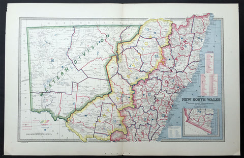
1888 Pic Atlas Large Antique Map of NSW, Australia Political & Local Borders
- Title : Map of New South Wales Showing Territorial Divisions, Land Board Districts and Land Districts
- Ref : 50337
- Size: 26in x 18in (660mm x 446mm)
- Date : 1886
- Condition: (A+) Fine Condition
Description:
This large fine lithograph layered coloured original map was published in the extremely significant Australian & New Zealand Australian & New Zealand publication The Picturesque Atlas of Australasia between 1886-88.
The Picturesque Atlas of Australasia was published in Sydney between 1886-88. Many of its over 700 wood-engraved illustrations were specially commissioned works by leading Australian artists. It was released in 42 separate editions usually bound into three large volumes and sold a remarkable 50,000 copies. (Ref: M&B; Tooley)
General Description:
Paper thickness and quality: - Light & stable
Paper color: - White
Age of map color: - Original
Colors used: - Blue, yellow, pink, green
General color appearance: - Authentic
Paper size: - 26in x 18in (660mm x 446mm)
Margins: - Min 1in (25mm)
Imperfections:
Margins: - None
Plate area: - None
Verso: - None
1888 Pic Atlas Large Antique Map of the North Island of New Zealand
- Title : General Map of The North Island of New Zealand
- Ref #: 50321
- Size: 28in x 18in (710mm x 460mm)
- Date : 1888
- Condition: (A+) Fine Condition
Description:
This large original antique map of the North Island of New Zealand was engraved in 1888 - the date is engraved at the foot of the map - by Alex J Scally and was published in the extremely significant Australian & New Zealand publicationThe Picturesque Atlas of Australasia between 1886-88. Also includes an index to the map on the verso giving names and locations of places on the map.
These maps were some of the best maps published at the time in the "Modern" look. The colour is bright, the engraving extremely fine and the paper heavy and stable.
The Picturesque Atlas of Australasia was published in Sydney between 1886-88. Many of its over 700 wood-engraved illustrations were specially commissioned works by leading Australian artists.
It was released in 42 separate editions usually bound into three large volumes and sold a remarkable 50,000 copies.
Its publication was one of the most significant cultural projects in nineteenth-century Australia. Writers, artists, academics and politicians came together to prepare a book of unprecedented grandeur and ambition, and a publishing company was established to produce and publish it. The seven hundred engravings on steel and wood contained in the Picturesque Atlas were among the finest engravings to be found anywhere in the world at this time.
The Atlas was a collegial project, staffed by a large number of artists and garnering an unusual number of contributors for one work. Lightly supervised by the former Sydney Morning Herald editor Andrew Garran it was lavishly produced at the Wynyard Square headquarters of the Atlas company. It had the services of the Melburnian journalist and public figure James Smith who wrote much of the Victorian and Tasmanian material, and W.H. Traill wrote extensively about Queensland. It was not, of course, an Atlas is the usual sense of the word, maps playing a comparatively minor role. But use of Atlas in the title, Hughes-d'Aeth notes, gave a sense of the scale of the publication both in terms of comprehensiveness and format. As the author points out, calling it an Atlas carries a promise of the exactitude of the relationship between the subject and its representation, and also bears a sense of the acquisitiveness that shadows the imperial phase of cartography.
There were only thirty maps in the Atlas's 800 pages, but there were hundreds of pictures. This is where much of the ideological work of the Atlas was completed and this is where Paper Nation concentrates its analysis. Its first task is to unravel the linguistic ball of string that is the word 'picturesque'. Though Humphrey Repton and Uvedale Price had their opinions, Hughes-d'Aeth is quite right to pick William Gilpin out of the line-up of suspicious aesthetes, for it was he who really popularised the idea of travelling in search of picturesque views. Paper Nation's dissection of the term picturesque is particularly aware of the term's adaptation to colonial usage, and its mutations through time. The picturesque took on an increasingly acquisitive edge, as admiration of the beauty of the land was joined by a concern to exploit it. A 'deep reverence for production' can be seen in the Picturesque Atlas's many illustrations of mines, factories and agricultural processes. The slag heaps of a mine were now as 'picturesque' as a fern-filled valley, but this does mean that the term was evacuated of all meaning. Rather the aesthetic appropriation of the land and its material exploitation were part of a continuum of colonial attitudes, and it was the duty of the Picturesque Atlas to affirm and re-affirm the rightness of European habitation and progress. (Ref: M&B; Tooley)
General Description:
Paper thickness and quality: - Light & stable
Paper color: - White
Age of map color: - Original
Colors used: - Pink, yellow, green, blue
General color appearance: - Authentic
Paper size: - 28in x 18in (710mm x 460mm)
Plate size: - 28in x 18in (710mm x 460mm)
Margins: - Min 1in (25mm)
Imperfections:
Margins: - None
Plate area: - None
Verso: - None
1888 Pic Atlas Scally Large Antique Map of Australia
- Title : Australia
- Date : 1888
- Condition: (A+) Fine Condition
- Ref: 31986
- Size: 25 1/2in x 17in (650mm x 430mm)
Description:
This large steel-plate engraved original antique lithograph map of Australia - engraved by Alex J Scally in 1888, dated at the foot of the map - was published in The Picturesque Atlas of Australasia, 1886-88. A beautiful large pre-federation antique map of Australia, highly detailed in fine condition.
General Description:
Paper thickness and quality: - Light & stable
Paper color: - White
Age of map color: - Original
Colors used: - Yellow, pink, green, blue
General color appearance: - Authentic
Paper size: - 25 1/2in x 17in (650mm x 430mm)
Margins: - Min 1in (25mm)
Imperfections:
Margins: - None
Plate area: - None
Verso: - None
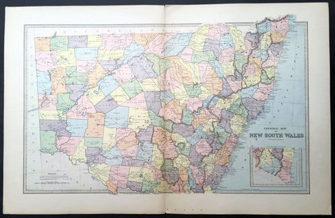
1888 Picturesque Atlas Large Antique Map of New South Wales, Australia
- Title : General Map of New South Wales
- Ref : 50339
- Size: 26in x 18in (660mm x 446mm)
- Date : 1886
- Condition: (A+) Fine Condition
Description:
This large fine lithograph layered coloured original map was published in the extremely significant Australian & New Zealand Australian & New Zealand publication The Picturesque Atlas of Australasia between 1886-88.
The Picturesque Atlas of Australasia was published in Sydney between 1886-88. Many of its over 700 wood-engraved illustrations were specially commissioned works by leading Australian artists. It was released in 42 separate editions usually bound into three large volumes and sold a remarkable 50,000 copies. (Ref: M&B; Tooley)
General Description:
Paper thickness and quality: - Light & stable
Paper color: - White
Age of map color: -
Colors used: -
General color appearance: -
Paper size: - 26in x 18in (660mm x 446mm)
Plate size: - 26in x 18in (660mm x 446mm)
Margins: - Min 1in (25mm)
Imperfections:
Margins: - None
Plate area: - None
Verso: - None
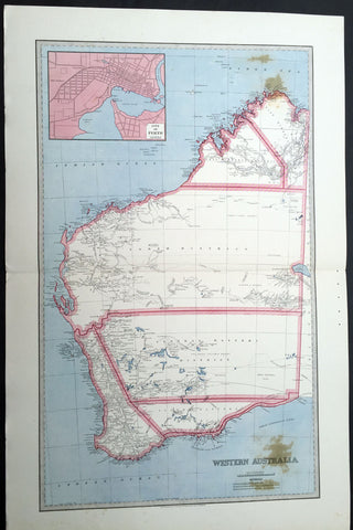
1888 Picturesque Atlas Large Antique Map of Western Australia
- Title : Map of New South Wales Showing Territorial Divisions, Land Board Districts and Land Districts
- Ref : 50337
- Size: 26in x 18in (660mm x 446mm)
- Date : 1886
- Condition: (A+) Fine Condition
Description:
This large fine lithograph layered coloured original map was published in the extremely significant Australian & New Zealand Australian & New Zealand publication The Picturesque Atlas of Australasia between 1886-88.
The Picturesque Atlas of Australasia was published in Sydney between 1886-88. Many of its over 700 wood-engraved illustrations were specially commissioned works by leading Australian artists. It was released in 42 separate editions usually bound into three large volumes and sold a remarkable 50,000 copies. (Ref: M&B; Tooley)
General Description:
Paper thickness and quality: - Light & stable
Paper color: - White
Age of map color: - Original
Colors used: - Blue, yellow, pink, green
General color appearance: - Authentic
Paper size: - 26in x 18in (660mm x 446mm)
Margins: - Min 1in (25mm)
Imperfections:
Margins: - None
Plate area: - None
Verso: - None
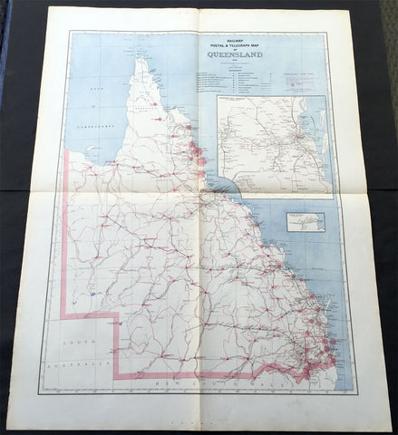
1888 Picturesque Atlas of Australia Large Antique Railway Map of Queensland
- Title : Railway Postal & Telegraph Map of Queensland
- Ref #: 50329
- Size: 34in x 26in (865mm x 660mm)
- Date : 1888
- Condition: (A+) Fine Condition
Description:
This very large fine original antique lithograph layered coloured map of Queensland showing the extent of Railway and postal lines, was engraved in 1888 - the date is engraved in the title - with index page - by Alex J Scally - was published in the extremely significant Australian & New Zealand publication The Picturesque Atlas of Australasia between 1886-88.
These maps were some of the best maps published at the time in the "Modern" look. The colour is bright, the engraving extremely fine and the paper heavy and stable.
General Description:
Paper thickness and quality: - Light & stable
Paper color: - White
Age of map color: - Original
Colors used: - Blue, red
General color appearance: - Authentic
Paper size: - 34in x 26in (865mm x 660mm)
Plate size: - 34in x 26in (865mm x 660mm)
Margins: - Min 1in (25mm)
Imperfections:
Margins: - None
Plate area: - Folds as issued
Verso: - None
1889 Ernst Wasmuth Antique Print Lithograph of Neo-classical European Decoration
- Title : Moebel Im Empire-Stil
- Date : 1889
- Condition: (A+) Fine Condition
- Ref: 70536
- Size: 19in x 12 1/2in (485mm x 320mm)
Description:
This finely engraved coloured original antique lithograph print of neo-classical European decoration was published by Ernst Wasmuth in the 1889 edition of Farbige Decorationen, Berlin.
Farbige Decorationen, was published in two volumes between 1889 & 1896 . the volumes contained 121 coloured plates lithographed by Ernst Wasmuth, illustrating contemporary architectural and decoration.
Ernst Wasmuth - a very influential publisher who is famous for a book on the architect Frank Lloyd Wright entitled Studies and Executed Buildings of Frank Lloyd Wright, published in Germany in 1910. This two-volume work, which contains more than 100 lithographs of Wright’s designs, is commonly known as the Wasmuth Portfolio.(Ref: M&B; Tooley)
General Description:
Paper thickness and quality: - Heavy & stable
Paper color: - White
Age of map color: - Original
Colors used: - Brown
General color appearance: - Authentic
Paper size: - 19in x 12 1/2in (485mm x 320mm)
Margins: - Min 1in (25m)
Imperfections:
Margins: - None
Plate area: - None
Verso: - None
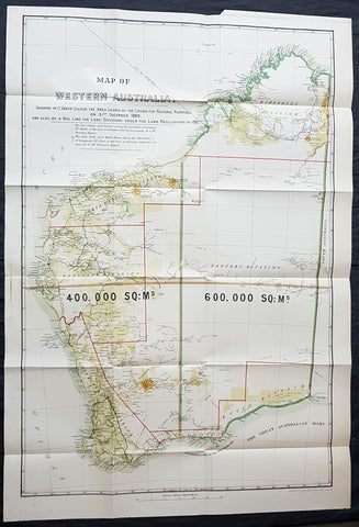
1890 John Forrest Large Antique Map Western Australia Pastoral Leases, Explorers
- Title : MAP OF WESTERN AUSTRALIA. SHOWING IN LT GREEN COLOUR THE AREA LEASED BY THE CROWN FOR PASTORAL PURPOSES ON 31ST DECEMBER 1888. AND ALSO BY A RED LINE THE LAND DIVISION UNDER THE LAND REGULATIONS OF 1887.
- Size: 39in x 27in (980mm x 685mm)
- Condition: (A+) Fine Condition
- Date : 1890
- Ref #: 82035
Description:
This very large folding scarce original antique chromolithographic map of Western Australia for John Forrest was published by Judd & Co. London in 1890.
An extremely important map of Western Australia, issued in the year of independence for the then Surveyor General and later 1st premier of the state, John Forrest. Shown in green are the pastoral lease granted by the crown, Land Divisions drawn up for Statute in red lines and the tracks of explorers throughout WA since settlement.
This map was intended as a visual reference for the Summary of Land Regulations presented to the Houses of Parliament in 1889 in respect to the proposed introduction of Responsible Government in Western Australia. The map was drawn for the Commissioner of Lands, John Forrest. Covered in blue paper covers, detached, with advertisements.
General Definitions:
Paper thickness and quality: - Heavy and stable
Paper color : - off white
Age of map color: - Original
Colors used: - Yellow, green, blue, red
General color appearance: - Authentic
Paper size: - 39in x 27in (980mm x 685mm)
Plate size: - 39in x 27in (980mm x 685mm)
Margins: - Min 1/2in (12mm)
Imperfections:
Margins: - None
Plate area: - Folds as issued, blue covers detached
Verso: - None
Background:
Western Australia is a state occupying the entire western third of Australia. It is bounded by the Indian Ocean to the north and west, and the Southern Ocean to the south, the Northern Territory to the north-east and South Australia to the south-east. Western Australia is Australias largest state, with a total land area of 2,529,875 square kilometres and the second-largest country subdivision in the world, surpassed only by Russia\'s Sakha Republic. The state has about 2.6 million inhabitants – around 11% of the national total – of whom the vast majority (92%) live in the south-west corner, 73% of the population living in the Perth area, leaving the remainder of the state sparsely populated.
The first European visitor to Western Australia was the Dutch explorer Dirk Hartog, who visited the Western Australian coast in 1616. The first European settlement of Western Australia occurred following the landing by Major Edmund Lockyer on 26 December 1826 of an expedition on behalf of the New South Wales colonial government. He established a convict-supported military garrison at King George III Sound, at present-day Albany, and on 21 January 1827 formally took possession of the western third of the continent for the British Crown. This was followed by the establishment of the Swan River Colony in 1829, including the site of the present-day capital, Perth.
York was the first inland settlement in Western Australia. Situated 97 kilometres east of Perth, it was settled on 16 September 1831.
Western Australia achieved responsible government in 1890, and federated with the other British colonies in Australia in 1901. Today its economy mainly relies on mining, agriculture and tourism. The state produces 46% of Australia\'s exports.Western Australia is the second-largest iron ore producer in the world.
Forrest, John 1847 – 1918
Forrest was an Australian explorer, the first Premier of Western Australia and a cabinet minister in Australia\\\'s first federal parliament.
As a young man, he won fame as an explorer by leading three expeditions into the interior of Western Australia, for which he was awarded the 1876 Royal Geographical Societys Patrons Medal.
He was appointed Surveyor General in 1883 and in 1890 became the first Premier of Western Australia, its only premier as a self-governing colony. Forrest\\\'s premiership gave the state ten years of stable administration during a period of rapid development and demographic change. He pursued a policy of large-scale public works and extensive land settlement, and he helped to ensure that Western Australia joined the federation of Australian states. After federation, he moved to federal politics, where he was at various times postmaster-general, Minister for Defence, Minister for Home Affairs, Treasurer and acting Prime Minister. He was affiliated with the Protectionist Party from 1901 to 1906, the Western Australian Party from 1906 to 1909, the Commonwealth Liberal Party from 1909 to 1917, then the Nationalist Party of Australia from 1917 to 1918.
Shortly before his death, Forrest was informed that the King had approved his elevation to the British peerage as Baron Forrest of Bunbury
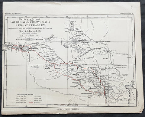
1890 Petermann Antique Map Lake Eyre to The Musgrave Ranges South Australia
- Title : Karte der Gegend zwischen Lake Eyre den Musgrave Ranges in Sud-Australien...Gotha: Justus Perthes 1890
- 10 1/2in x 8 1/2in (265mm x 215mm)
- Condition: (A+) Fine Condition
- Date : 1890
- Ref #: 82060
Description:
This original antique lithograph map of the area between Lake Eyre the Musgrave ranges in South Australia - with the tracks of 8 explorers of the region - by Augustus Heinrich Petermann was engraved in 1890 - dated - and was published by Justus Perthes, Gotha Germany.
General Definitions:
Paper thickness and quality: - Heavy and stable
Paper color : - off white
Age of map color: - Original
Colors used: - Red
General color appearance: - Authentic
Paper size: - 10 1/2in x 8 1/2in (265mm x 215mm)
Plate size: - 10 1/2in x 8 1/2in (265mm x 215mm)
Margins: - Min 1/2in (12mm)
Imperfections:
Margins: - None
Plate area: - Folds as issued
Verso: - None
Background:
The tracks of 8 different explorers are covered in this map. They are:
1. Sturat 1858-62
2. Giles 1873 - 1876
3. Lewis 1874 - 1875
4. Lindsay 1885 & 86
5. Gosse 1872
6. Forrest 1874
7. Ross & Harvey
8. Brown 1889
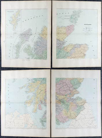
1895 Edward Stanford Very Large 4 Sheet Map of Scotland - w/ Reference Map
- Title : Scotland...London Edward Stanford 26 & 27 Cockspur St Charing Cross SW
- Ref #: 40947
- Size: 29 1/2in x 22in (750mm x 560mm) each sheet
- Date : 1895
- Condition: (A+) Fine Condition
Description:
Extremely scarce 4 sheet, very large (29 1/2in x 22in (750mm x 560mm) each sheet) lithograph map of Scotland by the famous 19th century map publisher Edward Stanford was published in 1895. (The map is not dated but we know that Stanford resided at the address noted on the map Cockspur St from 1885 to 1901). Also included is a smaller (20in x 14in 510mm x 360mm) original reference map that came with the 4 sheet publication.
This is an extremely beautiful, detailed map of Scotland.
General Definitions:
Paper thickness and quality: - Heavy and stable
Paper color : - off white
Age of map color: -
Colors used: -
General color appearance: -
Paper size: - 29 1/2in x 22in (750mm x 560mm) each sheet
Plate size: - 29 1/2in x 22in (750mm x 560mm) each sheet
Margins: - Min 2in (50mm)
Imperfections:
Margins: - None
Plate area: - None
Verso: - None
Stanford, Edward 1827-1904
Stanford was a prominent British mapmaker and publisher. A native of Holborn in the heart of London, Edward was apprenticed to a printer and stationer at the age of 14. After his first master died, he worked with several others, including Trelawny W. Saunders of Charing Cross. Saunders oversaw young Edward’s early career, ensuring that he became a Fellow of the Royal Geographical Society. Associations with the Society eventually brought Sanders much business and gave him a reputation as a publisher of explorers. As testament to this reputation, the Stanford Range in British Columbia was named for him by John Palliser.
Stanford briefly partnered with Saunders in 1852 before striking out on his own in 1853. He was an agent for the Ordnance Survey, the Admiralty, the Geological Survey, the Trigonometrical Survey of India, and the India Office. He also controlled the maps of the Society for the Diffusion of Useful Knowledge, another lucrative source of income. In 1857, Stanford founded his namesake Geographical Establishment, with Saunders and A. K. Johnston as engravers. Thereafter, Stanford was known for his library maps, particularly those of Africa and Asia.
Although he had authored many maps, the Harrow Atlas of Modern Geography and a similar volume on classical geography, Stanford is better remembered today as the leader of a successful map business. Ever in search of more inventory, he acquired the plates and stock of John Arrowsmith, heir of the Arrowmsith family firm, in 1874. By 1881 he employed 87 people at his premises at 6 Charing Cross Road, Saunders’ old address. As he aged, he phased in his son Edward Jr. to run the business. He died in 1904. The business survived him, and the Stanford’s shop is still a prominent London landmark today.
Stanford premises were located in the Strand, London from 1853 to 1884 and then Cockspur St from 1885 to 1901 locating to its present location in Covent Garden.
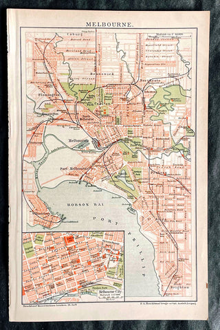
1896 F.A. Brockhaus Antique Map, Street Plan of Melbourne, Victoria, Australia
Antique Map
- Title : Melbourne
- Ref #: 27012
-
Condition: (A+) Fine Condition
- Size: 10in x 6 1/2in (255mm x 165mm)
- Date : 1896
Description:
This original antique lithograph street map of Melbourne Australia was engraved and published F.A. Brockhaus for the Brockhaus Konversations Lexikon, Germany, 1896
General Definitions:
Paper thickness and quality: - Heavy and stable
Paper color : - off white
Age of map color: - Original
Colors used: - Yellow, green, blue, pink
General color appearance: - Authentic
Paper size: - 10in x 6 1/2in (255mm x 165mm)
Plate size: - 10in x 6 1/2in (255mm x 165mm)
Margins: - Min 1/2in (12mm)
Imperfections:
Margins: - None
Plate area: - None
Verso: - None
Brockhaus, Friedrich Arnold (1772 - 1823)
Friedrich Arnold Brockhaus was a German encyclopedia publisher and editor, famed for publishing the Conversations-Lexikon, which is now published as the Brockhaus encyclopedia.
Brockhaus was educated at the gymnasium of his native Dortmund, and from 1788 to 1793 served an apprenticeship in a mercantile house at Düsseldorf. He then devoted two years at the University of Leipzig to the study of modern languages and literature, after which he set up in Dortmund an emporium for English goods. In 1801, he transferred this business to Arnheim, and in the following year to Amsterdam.
In 1805, having given up his first line of trade, Brockhaus began business as a publisher. Two journals projected by him were not allowed by the government to survive for any length of time, and in 1810 the complications in the affairs of Holland induced him to return homewards. In 1811 he settled at Altenburg. About three years previously he had purchased the copyright of the bankrupt Conversations-Lexikon, an encyclopedia started in 1796, and in 1810-1811 he completed the first edition of this celebrated work. It was widely imitated as a model for encyclopedias, and is still published today, known as the Brockhaus Encyclopedia.
A second edition under Brockhauss editorship was begun in 1812, and was received with universal favour. His business extended rapidly, and in 1818 Brockhaus moved to Leipzig, where he established a large printing-house. Among the more extensive of his many literary undertakings were the critical periodicals — Hermes, the Literarisches Konversationsblatt (afterwards the Blätter für literarische Unterhaltung) and the Zeilgenossen, and some large historical and bibliographical works, such as Friedrich Ludwig Georg von Raumers Geschichte der Hohenstaufen, and Friedrich Adolf Eberts Allgemeines bibliographisches Lexikon.
Brockhaus died in Leipzig. The business was carried on by his sons, Friedrich Brockhaus (1800–1865), who retired in 1850, and Heinrich Brockhaus (1804–1874), under whom it was considerably extended. Heinrich especially rendered great services to literature and science, which the University of Jena recognized by making him, in 1858, honorary Doctor of Philosophy. In the years 1842–1848, Heinrich Brockhaus was member of the Saxon second chamber, as representative for Leipzig, was made honorary citizen of that city in 1872, and died there on 15 November 1874.
His firm continues under the name F.A. Brockhaus AG in his honor. He is also the namesake of 27765 Brockhaus, a main-belt asteroid discovered in 1991.
Please note all items auctioned are genuine, we do not sell reproductions. A Certificate of Authenticity (COA) can be issued on request.
1897 J G Bartholomew & Archibald Geik Large Antique Geological Map England Wales
Antique Map
- Title : eological Map of England & Wales...Sir Archibald Geike....by John Bartholomew
- Ref #: 51003
- Condition: (A) Very Good Condition
- Size: 41in x 35in (1.04mm x 890mm)
- Date: 1897
Description:
This large, original antique lithograph linen-backed folding map of England and Wales showing the dominant geological strata of Britain as far north as Berwick was compiled by the famous Scottish geologist and author, Sir Archibald Geikie, Director-General of the Geological Survey of the United Kingdom. The map was also published by the prestigious Bartholomew publishing house in 1897.
legend which runs along the left-hand margin of the map explains the colouring. There are also three geological cross-sections.
General Definitions:
Paper thickness and quality: - Heavy and stable
Paper color : - off white
Age of map color: - Original
Colors used: - Green, yellow, pink
General color appearance: - Authentic
Paper size: - 41in x 35in (1.04mm x 890mm)
Plate size: - 41in x 35in (1.04mm x 890mm)
Margins: - Min 1/2in (12mm)
Imperfections:
Margins: - Blue covers loose and small tear along spine, not affecting the map
Plate area: - None
Verso: - None