Products
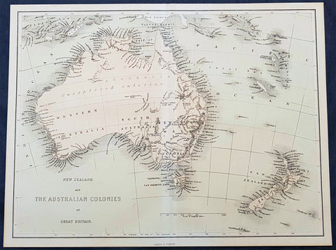
1856 James Virtue Antique Map of New Zealand and the Colonies of Australia
- Title : New Zealand and the Australian Colonies of Great Britain James S Virtue
- Size: 13in x 10in (330mm x 255mm)
- Condition: (A+) Fine Condition
- Date : 1856
- Ref #: 93052
Description:
This original lithograph antique map of New Zealand and the Colonies of Australia was published by James Virtue in 1856, just after Victorian statehood in 1851 and just prior to Queensland statehood in 1859.
General Definitions:
Paper thickness and quality: - Heavy and stable
Paper color : - off white
Age of map color: - Original
Colors used: - Pink, blue
General color appearance: - Authentic
Paper size: - 13in x 10in (330mm x 255mm)
Plate size: - 13in x 10in (330mm x 255mm)
Margins: - Min 1/2in (12mm)
Imperfections:
Margins: - None
Plate area: - None
Verso: - None
Background:
A highly detailed map just prior to the gold and population boom of both Australia and New Zealand, with much of Australia unexplored in the center.
Virtue, George & James
George Virtue (1794 – 1868) was a 19th-century London publisher, well known for printing engravings. His publishing house was located at 26 Ivy Lane, Paternoster Row, London, EC
Virtue selected accomplished artists, employed the best engravers, and produced books that were rarely surpassed in elegance and correctness for the period. Chief among his publications were the following, all illustrated by William Henry Bartlett: Switzerland, by William Beattie, 2 vols. 1836; Scotland, by W. Beattie, 1838; The Waldenses, by W. Beattie, 1838; American Scenery, 2 vols. 1840; Description of the Beauties of the Bosphorus, by Julia Pardoe, 1840; and The Danube, its History and Scenery, by W. Beattie, 1844. Virtue created a prodigious business, issuing upwards of twenty thousand copper and steel engravings through his career.
In 1848, Virtue purchased two magazines. One was an art publication, The Art Union, which had been founded in 1839 by Hodgson & Graves, then purchased in 1847 by Chapman & Hall. The second purchase was controlling interest in Sharpe\\\\\\\'s London Magazine, a literary and cultural magazine, Arthur Hall publisher. In 1849, Virtue renamed the art magazine The Art Journal and, in time, it became known as the premier art publication of Great Britain. Also in 1849, he created a new firm with Arthur Hall called Arthur Hall, Virtue & Co
James Sprent Virtue (1829 – 1892) inherited the publishing business from his father, George, after his retirement in 1855
Please note all items auctioned are genuine, we do not sell reproductions. A Certificate of Authenticity (COA) can be issued on request.
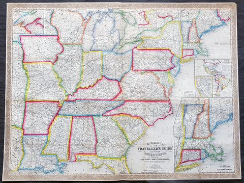
1856 Mitchell Large Antique Pre Civil War Map United States of America California Gold Rush
Antique Map
- Title : Mitchells New Travellers Guide through the United States Showing the Rail Roads, Canals, Stage Roads and c. with Distances from Place to Place. Drawn and engraved by Ira S Drake Philadelphia 1856. Published by Charles Desilver
- Size: 28 3/4in x 22in (730mm x 560mm)
- Condition: (A+) Fine Condition
- Date : 1856
- Ref #: 82034
Description:
This is a large uncommon, beautifully hand coloured and separately issued pre-Civil War original antique map of the United States issued by Charles Desilver in 1856 and is based on the earlier maps by the famous American cartographer, Samuel Augustus Mitchell.
The map covers the United States from the Atlantic seaboard to the western states beyond the Mississippi, with insets maps offering additional detail of the New England states, Lake Superior Copper Mines Region and in the California Gold Mining regions. As to be expected of a map designed for the traveler & explorer, Desilver offers in-depth detail of contemporary railways, canals, and roads with inset maps showing routes to California, illustrating the huge interest in the gold mining of California.
This map was drawn & engraved by Ira Drake and issued first by Desilver in 1856.
General Definitions:
Paper thickness and quality: - Heavy and stable
Paper color : - off white
Age of map color: - Original
Colors used: - Yellow, green, blue, pink
General color appearance: - Authentic
Paper size: - 28 3/4in x 22in (730mm x 560mm)
Plate size: - 28 3/4in x 22in (730mm x 560mm)
Margins: - Min 1/4in (8mm)
Imperfections:
Margins: - None
Plate area: - None
Verso: - None
Background:
Charles Desilver (fl. c. 1850 - 1862) is a little known American map published active in the middle part of the 19th century. Desilver began is cartographic career as a partner in the firm Thomas, Cowperthwait and Company, the publisher of S. A. Mitchell popular New Universal Atlas. In 1856 Desilver acquired Mitchell\'s copyrights and print plates and began to issue his own vaJacques Nicholas Bellinmitriant of the New Universal Atlas. Desilver altered Mitchell\'s maps only slightly; adding a new grillwork border, his own color scheme, new titles, and some updated political data. Despite a noble pedigree, Desilver\'s maps did not sell well - possibly because they followed the long and very popular run of Mitchell\'s own atlases. Desliver continued to publish his atlas until 1859 (though we have heard that he also published an 1862 edition). In 1859 he resold the Mitchell copyrights and printing plates to S. A. Mitchell\'s son S. A. Mitchell Jr. The younger Mitchell again updated the plates with own border and color scheme and began publishing his own successful atlas in 1860.
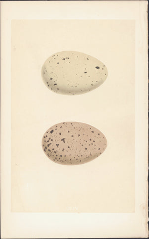
1856 Morris Antique Ornithogical Print Eggs of Black Throated & Red Throated Diver
- Title : CCIV
- Date : 1856
- Condition: (A+) Fine Condition
- Ref: 90418
- Size: 9 3/4in x 6 1/4in (250mm x 160mm)
Description:
This fine original, antique hand coloured engraved print, the Eggs of Morris Birds - (top) Black-Throated Diver (below) Red Throated Diver ; Plate CCIV from Volume III, was published in the 1856 edition of Francis Morris 'A Natural History of the Nest and Eggs of British Birds'
A History of British Birds - The inspiration for Francis Orpen Morris' A History of British Birds actually came from the renowned English printer, Benjamion Fawcett, who approached Morris to write the text when Morris became Vicar of Nafferton. Morris had a reputation as a popular writer on natural history in general and birds in particular. His first book had appeared as early as 1834, a guide to an arrangement of British birds. However, his association with Benjamin Fawcett was to have remarkable results, particularly for the study of ornithology.
History of British Birds was entirely printed and bound in the small North Country village of Driffield, Fawcett’s residence and shop, and shipped in tea chests to London. It was a resounding success.
Work on A History of British Birds probably began in 1848. Publication, which took over seven years to complete from June 1850, was undertaken in monthly parts costing one shilling. Each part contained 24 pages of letterpress and 4 hand-coloured plates. The final six volume work contained 358 coloured plates. One thousand copies of the first part were initially produced, but such was the demand that Fawcett quickly had to move into larger premises.
Alexander Francis Lydon was one of Fawcett’s principal engravers, contributing much in technique and design A team of women colourists under very strict scrutiny first from Fawcett then his wife (a former colourist herself) hand coloured each plate. Morris became an early advocate for conservation and was instrumental in founding the Royal Society for the Protection of Birds.
General Description: Paper thickness and quality: - Heavy & stable
Paper color: - White
Age of map color: - Original
Colors used: - Yellow, brown,
General color appearance: - Authentic
Paper size: - 9 3/4in x 6 1/4in (250mm x 160mm)
Plate size: - 9 3/4in x 6 1/4in (250mm x 160mm)
Margins: - Min 1/2in (12mm)
Imperfections:
Margins: - None
Plate area: - None
Verso: - None
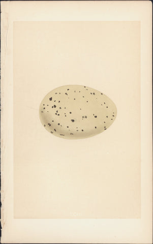
1856 Morris Antique Ornithogical Print The Eggs of Great Northern Diver or Loon
- Title : CCII
- Date : 1856
- Condition: (A+) Fine Condition
- Ref: 90418
- Size: 9 3/4in x 6 1/4in (250mm x 160mm)
Description:
This fine original, antique hand coloured engraved print, the Eggs of Great Northern Diver or Loon; Plate CCIII from Volume III, was published in the 1856 edition of Francis Morris 'A Natural History of the Nest and Eggs of British Birds'
A History of British Birds - The inspiration for Francis Orpen Morris' A History of British Birds actually came from the renowned English printer, Benjamion Fawcett, who approached Morris to write the text when Morris became Vicar of Nafferton. Morris had a reputation as a popular writer on natural history in general and birds in particular. His first book had appeared as early as 1834, a guide to an arrangement of British birds. However, his association with Benjamin Fawcett was to have remarkable results, particularly for the study of ornithology.
History of British Birds was entirely printed and bound in the small North Country village of Driffield, Fawcett’s residence and shop, and shipped in tea chests to London. It was a resounding success.
Work on A History of British Birds probably began in 1848. Publication, which took over seven years to complete from June 1850, was undertaken in monthly parts costing one shilling. Each part contained 24 pages of letterpress and 4 hand-coloured plates. The final six volume work contained 358 coloured plates. One thousand copies of the first part were initially produced, but such was the demand that Fawcett quickly had to move into larger premises.
Alexander Francis Lydon was one of Fawcett’s principal engravers, contributing much in technique and design A team of women colourists under very strict scrutiny first from Fawcett then his wife (a former colourist herself) hand coloured each plate. Morris became an early advocate for conservation and was instrumental in founding the Royal Society for the Protection of Birds.
General Description: Paper thickness and quality: - Heavy & stable
Paper color: - White
Age of map color: - Original
Colors used: - Yellow, brown,
General color appearance: - Authentic
Paper size: - 9 3/4in x 6 1/4in (250mm x 160mm)
Plate size: - 9 3/4in x 6 1/4in (250mm x 160mm)
Margins: - Min 1/2in (12mm)
Imperfections:
Margins: - None
Plate area: - None
Verso: - None
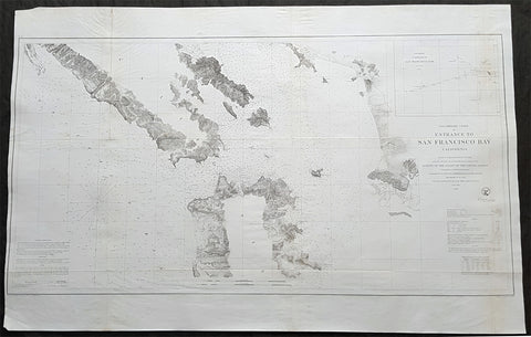
1856 US Coast Survey Large Antique Map of San Francisco Bay & City, California
- Title : Preliminary Chart Of Entrance To San Francisco Bay From a Trigonometrical Survey under the direction of A D Bache Superintendant of the Survey of the Coast of the United States....1856
- Size: 39 1/2in x 25 1/2in (1.00m x 635mm)
- Condition: (A+) Fine Condition
- Date : 1856
- Ref #: 93026
Description:
This large scarce, original lithograph early antique map of the entrance to San Francisco Bay and San Francisco city, by Alexander Dallas Bache (great-grandson of Benjamin Franklin) in 1856 - dated - was published by the official chart-maker of the United States, the office of The US Coast Survey.
The Office of the Coast Survey, founded in 1807 by President Thomas Jefferson and Secretary of Commerce Albert Gallatin, is the oldest scientific organization in the U.S. Federal Government. Jefferson created the Survey of the Coast, as it was then called, in response to a need for accurate navigational charts of the new nation\\\'s coasts and harbors.
General Definitions:
Paper thickness and quality: - Heavy and stable
Paper color : - off white
Age of map color: -
Colors used: -
General color appearance: -
Paper size: - 39 1/2in x 25 1/2in (1.00m x 635mm)
Plate size: - 39 1/2in x 25 1/2in (1.00m x 635mm)
Margins: - Min 1/2in (12mm)
Imperfections:
Margins: - None
Plate area: - Folds as issued,
Verso: - Some folds re-enforced with archival tape
Background:
This is a beautiful example of the 1856 U. S. Coast Survey nautical chart or maritime map of the entrance to San Francisco Bay and San Francisco itself. Centered on the City of San Francisco, the map covers the Golden Gate Area, the Marin Peninsula, Mission de Dolores and the eastern coastline from Brooks Island to San Antonio Creek. It offers some inland detail noting mountain ranges, fields, swamps, and occasionally, individual buildings along with other topographical details. It notes countless depth soundings in feet as well as detailed notes on tides, lighthouses and a wealth of other practical information for the mariner. An inset in the upper right quadrant features a sub-sketch of the entrance to San Francisco Bay noting soundings in fathoms.
The triangulation for this chart was prepared by R. D Cutts. The topography is the work of R. D. Cutts, A. M Harrison and A. F. Rodgers. The Hydrography was accomplished by a party under the command of James Alden. The entire chart was prepared under the supervision of A.D. Bache, one of the most influential cartographers of his time. The chart was engraved by J. Knight and A. Blondeau.
The Office of Coast Survey is the official chart-maker of the United States. Set up in 1807, it is one of the U.S. governments oldest scientific organizations. In 1878 it was given the name of Coast and Geodetic Survey (C&GS). In 1970 it became part of the National Oceanic and Atmospheric Administration (NOAA).
The agency was established in 1807 when President Thomas Jefferson signed the document entitled An act to provide for surveying the coasts of the United States. While the bills objective was specific—to produce nautical charts—it reflected larger issues of concern to the new nation: national boundaries, commerce, and defence.
The early years were difficult. Ferdinand Rudolph Hassler, who was eventually to become the agencys first superintendent, went to England to collect scientific instruments but was unable to return through the duration of the War of 1812. After his return, he worked on a survey of the New York Harbor in 1817, but Congress stepped in to suspend the work because of tensions between civilian and military control of the agency. After several years under the control of the U.S. Army, the Survey of the Coast was reestablished in 1832, and President Andrew Jackson appointed Hassler as superintendent.
The U.S. Coast Survey was a civilian agency but, from the beginning, members of the Navy and Army were detailed to service with the Survey, and Navy ships were also detailed to its use. In general, army officers worked on topographic surveys on the land and maps based on the surveys, while navy officers worked on hydrographic surveys in coastal waters.
Alexander Dallas Bache, great-grandson of Benjamin Franklin, was the second Coast Survey superintendent. Bache was a physicist, scientist, and surveyor who established the first magnetic observatory and served as the first president of the National Academy of Sciences. Under Bache, Coast Survey quickly applied its resources to the Union cause during the Civil War. In addition to setting up additional lithographic presses to produce the thousands of charts required by the Navy and other vessels, Bache made a critical decision to send Coast Survey parties to work with blockading squadrons and armies in the field, producing hundreds of maps and charts. Bache detailed these activities in his annual reports to Congress.
Coast Survey cartographer Edwin Hergesheimer created the map showing the density of the slave population in the Southern states.
Bache was also one of four members of the governments Blockade Strategy Board, planning strategy to essentially strangle the South, economically and militarily. On April 16, 1861, President Lincoln issued a proclamation declaring the blockade of ports from South Carolina to Texas. Baches Notes on the Coast provided valuable information for Union naval forces.
Maps were of paramount importance in wartime:
It is certain that accurate maps must form the basis of well-conducted military operations, and that the best time to procure them is not when an attack is impending, or when the army waits, but when there is no hindrance to, or pressure upon, the surveyors. That no coast can be effectively attacked, defended, or blockaded without accurate maps and charts, has been fully proved by the events of the last two years, if, indeed, such a proposition required practical proof.
— Alexander Dallas Bache, 1862 report.
Coast Survey attracted some of the best and brightest scientists and naturalists. It commissioned the naturalist Louis Agassiz to conduct the first scientific study of the Florida reef system. James McNeill Whistler, who went on to paint the iconic Whistlers Mother, was a Coast Survey engraver. The naturalist John Muir was a guide and artist on Survey of the 39th Parallel across the Great Basin of Nevada and Utah.
The agencys men and women (women professionals were hired as early as 1845) led scientific and engineering activities through the decades. In 1926, they started production of aeronautical charts. During the height of the Great Depression, Coast and Geodetic Survey organized surveying parties and field offices that employed over 10,000 people, including many out-of-work engineers.
In World War II, C&GS sent over 1,000 civilian members and more than half of its commissioned officers to serve as hydrographers, artillery surveyors, cartographers, army engineers, intelligence officers, and geophysicists in all theaters of the war. Civilians on the home front produced over 100 million maps and charts for the Allied Forces. Eleven members of the C&GS gave their lives during the war.
Alexander Dallas Bache 1806 – 1867 was an American physicist, scientist, and surveyor who erected coastal fortifications and conducted a detailed survey to map the mid-eastern United States coastline. Originally an army engineer, he later became Superintendent of the U.S. Coast Survey, and built it into the foremost scientific institution in the country before the Civil War.
Alexander Bache was born in Philadelphia, the son of Richard Bache, Jr., and Sophia Burrell Dallas Bache. He came from a prominent family as he was the nephew of Vice-President George M. Dallas and naval hero Alexander J. Dallas. He was the grandson of Secretary of the Treasury Alexander Dallas and was the great-grandson of Benjamin Franklin.
Bache was a professor of natural philosophy and chemistry at the University of Pennsylvania from 1828 to 1841 and again from 1842 to 1843. He spent 1836–1838 in Europe on behalf of the trustees of what became Girard College; he was named president of the college after his return. Abroad, he examined European education systems, and on his return he published a valuable report. From 1839 to 1842, he served as the first president of Central High School of Philadelphia, one of the oldest public high schools in the United States.
In 1843, on the death of Professor Ferdinand Rudolph Hassler, Bache was appointed superintendent of the United States Coast Survey. He convinced the United States Congress of the value of this work and, by means of the liberal aid it granted, he completed the mapping of the whole coast by a skillful division of labor and the erection of numerous observing stations. In addition, magnetic and meteorological data were collected. Bache served as head of the Coast Survey for 24 years (until his death).
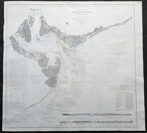
1856 US Coast Survey Large Antique Map, Chart Charleston Harbor, South Carolina
- Title : Preliminary Chart of Charleston Harbor And Its Approaches From a Trigonometric Survey under the direction of A D Bache Superintendant of the Survey of the Coast of the United States....1856
- Size: 34 1/2in x 32 1/2in (875m x 825mm)
- Condition: (A+) Fine Condition
- Date : 1856
- Ref #: 93040
Description:
This large scarce, original lithograph early antique map of Charleston Harbor, South Carolina, south to Folly Island and east as far as Long island, by Alexander Dallas Bache (great-grandson of Benjamin Franklin) in 1856 - dated - was published by the official chart-maker of the United States, the office of The US Coast Survey.
Amazing sea chart published just prior to the outbreak of the Civil War and the first action on Fort Sumter.
The Office of the Coast Survey, founded in 1807 by President Thomas Jefferson and Secretary of Commerce Albert Gallatin, is the oldest scientific organization in the U.S. Federal Government. Jefferson created the Survey of the Coast, as it was then called, in response to a need for accurate navigational charts of the new nation\\\'s coasts and harbors.
General Definitions:
Paper thickness and quality: - Heavy and stable
Paper color : - off white
Age of map color: -
Colors used: -
General color appearance: -
Paper size: - 34 1/2in x 32 1/2in (875m x 825mm)
Plate size: - 34 1/2in x 32 1/2in (875m x 825mm)
Margins: - Min 1/2in (12mm)
Imperfections:
Margins: - None
Plate area: - Folds as issued
Verso: - Some folds re-enforced with archival tape
Background:
This is a highly desirable and uncommon 1856 U.S. Coast Survey chart or map of Charleston Harbor, South Carolina. It covers from Charleston south to Folly Island and east as far as Long island. Offers stunning inland detail identifying roads, farms, landings, and many individual buildings. Shows a detailed street grid for Charleston city noting docks and some commercial buildings. Places Hog Island, Drum Island, Shutes Folly Island, Morris Island, Sullivans Island, Long Island and James Island. Nautically this map offers a wealth of practical information for the Mariner, including countless depth soundings and notes on light hoses, tides, shoals, and other undersea dangers. In the lower right quadrant there is a coastal view of North Channel with Fort Sumter.
The Triangulation for this chart was completed by C. O. Boutelle. The topography is the work of S. A. Gilbert. T he hydrography was completed by a party under the command of J. N Maffitt. This chart was compiled under the supervision of A. D. Bache, one of the most influential Superintendents in the history of the Coast Survey. Published in the 1856 edition of the Superintendents Report.U.S. Coast Survey (Office of Coast Survey)
The Office of Coast Survey is the official chart-maker of the United States. Set up in 1807, it is one of the U.S. governments oldest scientific organizations. In 1878 it was given the name of Coast and Geodetic Survey (C&GS). In 1970 it became part of the National Oceanic and Atmospheric Administration (NOAA).
The agency was established in 1807 when President Thomas Jefferson signed the document entitled An act to provide for surveying the coasts of the United States. While the bills objective was specific—to produce nautical charts—it reflected larger issues of concern to the new nation: national boundaries, commerce, and defence.
The early years were difficult. Ferdinand Rudolph Hassler, who was eventually to become the agencys first superintendent, went to England to collect scientific instruments but was unable to return through the duration of the War of 1812. After his return, he worked on a survey of the New York Harbor in 1817, but Congress stepped in to suspend the work because of tensions between civilian and military control of the agency. After several years under the control of the U.S. Army, the Survey of the Coast was reestablished in 1832, and President Andrew Jackson appointed Hassler as superintendent.
The U.S. Coast Survey was a civilian agency but, from the beginning, members of the Navy and Army were detailed to service with the Survey, and Navy ships were also detailed to its use. In general, army officers worked on topographic surveys on the land and maps based on the surveys, while navy officers worked on hydrographic surveys in coastal waters.
Alexander Dallas Bache, great-grandson of Benjamin Franklin, was the second Coast Survey superintendent. Bache was a physicist, scientist, and surveyor who established the first magnetic observatory and served as the first president of the National Academy of Sciences. Under Bache, Coast Survey quickly applied its resources to the Union cause during the Civil War. In addition to setting up additional lithographic presses to produce the thousands of charts required by the Navy and other vessels, Bache made a critical decision to send Coast Survey parties to work with blockading squadrons and armies in the field, producing hundreds of maps and charts. Bache detailed these activities in his annual reports to Congress.
Coast Survey cartographer Edwin Hergesheimer created the map showing the density of the slave population in the Southern states.
Bache was also one of four members of the governments Blockade Strategy Board, planning strategy to essentially strangle the South, economically and militarily. On April 16, 1861, President Lincoln issued a proclamation declaring the blockade of ports from South Carolina to Texas. Baches Notes on the Coast provided valuable information for Union naval forces.
Maps were of paramount importance in wartime:
It is certain that accurate maps must form the basis of well-conducted military operations, and that the best time to procure them is not when an attack is impending, or when the army waits, but when there is no hindrance to, or pressure upon, the surveyors. That no coast can be effectively attacked, defended, or blockaded without accurate maps and charts, has been fully proved by the events of the last two years, if, indeed, such a proposition required practical proof.
— Alexander Dallas Bache, 1862 report.
Coast Survey attracted some of the best and brightest scientists and naturalists. It commissioned the naturalist Louis Agassiz to conduct the first scientific study of the Florida reef system. James McNeill Whistler, who went on to paint the iconic Whistlers Mother, was a Coast Survey engraver. The naturalist John Muir was a guide and artist on Survey of the 39th Parallel across the Great Basin of Nevada and Utah.
The agencys men and women (women professionals were hired as early as 1845) led scientific and engineering activities through the decades. In 1926, they started production of aeronautical charts. During the height of the Great Depression, Coast and Geodetic Survey organized surveying parties and field offices that employed over 10,000 people, including many out-of-work engineers.
In World War II, C&GS sent over 1,000 civilian members and more than half of its commissioned officers to serve as hydrographers, artillery surveyors, cartographers, army engineers, intelligence officers, and geophysicists in all theaters of the war. Civilians on the home front produced over 100 million maps and charts for the Allied Forces. Eleven members of the C&GS gave their lives during the war.
Alexander Dallas Bache 1806 – 1867 was an American physicist, scientist, and surveyor who erected coastal fortifications and conducted a detailed survey to map the mid-eastern United States coastline. Originally an army engineer, he later became Superintendent of the U.S. Coast Survey, and built it into the foremost scientific institution in the country before the Civil War.
Alexander Bache was born in Philadelphia, the son of Richard Bache, Jr., and Sophia Burrell Dallas Bache. He came from a prominent family as he was the nephew of Vice-President George M. Dallas and naval hero Alexander J. Dallas. He was the grandson of Secretary of the Treasury Alexander Dallas and was the great-grandson of Benjamin Franklin.
Bache was a professor of natural philosophy and chemistry at the University of Pennsylvania from 1828 to 1841 and again from 1842 to 1843. He spent 1836–1838 in Europe on behalf of the trustees of what became Girard College; he was named president of the college after his return. Abroad, he examined European education systems, and on his return he published a valuable report. From 1839 to 1842, he served as the first president of Central High School of Philadelphia, one of the oldest public high schools in the United States.
In 1843, on the death of Professor Ferdinand Rudolph Hassler, Bache was appointed superintendent of the United States Coast Survey. He convinced the United States Congress of the value of this work and, by means of the liberal aid it granted, he completed the mapping of the whole coast by a skillful division of labor and the erection of numerous observing stations. In addition, magnetic and meteorological data were collected. Bache served as head of the Coast Survey for 24 years (until his death).
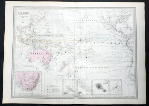
1857 A H Dufour Very Large Antique Map of Australia, New Zealand & South Pacific
- Title : Oceanie Dressee par A H Dufour Gravee CH Dyonnet..1857
- Ref #: 61026
- Size: 33in x 24in (840mm x 610mm)
- Date : 1857
- Condition: (A+) Fine Condition
Description:
This very large, magnificent hand coloured original copper plate antique map of Australia, New Zealand, Oceania & The Pacific, showing the Ocean Currents and 5 inset maps (NSW & Victoria Australia, Gambier Islands, Tahiti, Marquesas Isles & New Caledonia) by Adolphe Hippolyte Dufour was engraved by Charles Dyonnet in 1856 - dated in the title - for Dufours 1860 edition of his monumental elephant folio Atlas Physique, Historique et Politique Geographie Moderne published by Pauline Et La Chevalier, Paris.
The 19th century French cartographer Auguste-Henri Dufour began publishing the dramatic elephant folio Atlas Universel, also occasionally titled Grand Atlas Universal, around 1855. Several editions appeared between its initial publication in the 1850s and a final run c. 1870. The 1863 and 1864 editions in particular are highly desirable among collectors because the United States and North America maps illustrate the proposed, but unrealized, state of Corona (roughly modern day Utah). The atlas contained roughly 40 maps, most of which were engraved by Louis Antoine (the maps) and Deletre (typography) under the supervision of Charles Dyonnet, official engraver of the Depot de la Marine. The Atlas Universal was published in Paris and edited by the firm of Paulin et le Chevalier, 60 Rue Richelieu.
General Definitions:
Paper thickness and quality: - Heavy and stable
Paper color : - off white
Age of map color: - Original
Colors used: - Yellow, green, blue, pink
General color appearance: - Authentic
Paper size: - 33in x 24in (840mm x 610mm)
Plate size: - 33in x 24in (840mm x 610mm)
Margins: - Min 1in (25mm)
Imperfections:
Margins: - Light age toning in margins
Plate area: - None
Verso: - None
Background:
Charles Dyonnet 1822 - 1880 was an extremely active Paris based engraver working in the mid to late 19th century. From his offices at 220 Rue St. Jacques, Paris, Dyonnet engraved numerous maps for many of the most prominent 19th French cartographic publishers including Vuillemin, Dufour, Fremin and Duvotenay. From 1850-1861, he held the coveted position of Graveur du Dépot de la Marine, and in this position engraved numerous French naval and military maps. Dyonnet had a detail oriented and aesthetically minded hand and is responsible from some of the most beautiful French maps to emerge during the 19th century. (Ref: M&B; Tooley)
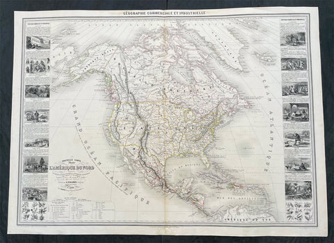
1857 Alexandre Vuillemin Large Antiqque Map of North America...Beautiful
Antique Map
- Title : Nouvelle Carte Illustree L Amerique Du Nord...Vuillemin....1857
- Ref #: 17024
- Size: 35in x 25 1/2in (890mm x 650mm)
- Date : 1857
- Condition: (A) Very Good Condition
Description:
This very large original hand coloured antique lithograph map of North America, with small vignettes of North American peoples surrounding the map, by Alexandre Vuillemin was engraved in 1857, dated in the title, and was published in the 1861 edition of Atlas de geographie commercial et industriel.
This World atlas consisted of 8 double page color maps, dated 1857-1858 by A. Vuillemin, engraved by Langevin and printed by Fatout, Paris. The maps include views, statistical tables and legend. Showing political divisions, capitals, industrial cities, towns, the commercial ports, roads, railroads, canals, fortress and geographical distribution of plants and mineral. Relief shown by hachures and pictorially.
General Definitions:
Paper thickness and quality: - Heavy and stable
Paper color : - off white
Age of map color: - Original
Colors used: - Yellow, green, blue, pink
General color appearance: - Authentic
Paper size: - 35in x 25 1/2in (890mm x 650mm)
Plate size: - 35in x 25 1/2in (890mm x 650mm)
Margins: - Min 1/2in (12mm)
Imperfections:
Margins: - Small repair to bottom margin
Plate area: - None
Verso: - None
Please note all items auctioned are genuine, we do not sell reproductions. A Certificate of Authenticity (COA) can be issued on request.
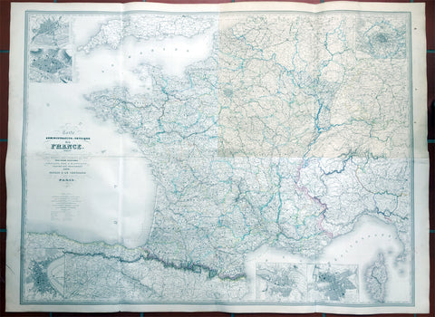
1857 Dufour Very Large Scarce Old, Antique Map of France - 4ft x 6ft
- Title : Carte Administrative et Physique de la France indiquant Les Canaan Les Riviers Navigable les routes, le Chemis de fer avec leurs stations Dresee par A.H. Dufour Gravee Par CH Dyonnet 1857
- Ref #: 61029
- Size: 62in x 46in (1.5m x 1.15m)
- Date : 1857
- Condition: (A) Very Good Condition
Description:
This scarce very large elephant folio 4 sheet - joined - hand coloured original map of France was engraved by Charles Dyonnet in 1857 - dated in the title - for Adolphe Hippolyte Dufour's monumental elephant folio Atlas Physique, Historique et Politique Geographie Moderne published by Pauline Et La Chevalier, Paris.
This uncommon elephant folio map is huge measuring overall 62in x 46in (1.5m x 1.15m) and is incredibly detailed. The map covers the whole of France including Corsica and parts of Spain, Germany and Switzerland.
The first sheet (top left in image) represents north-western France and includes two insets of Nantes and Rouen. The second sheet (top right) represents north-eastern France with an inset of Paris and its environs. The bottom right sheet depicts the south-eastern portions of France and includes two insets, one featuring Marseille and the other featuring Lyon. The last sheet on the bottom left is of southwest France.
An inset on Bordeaux is included and throughout illustrates roads, canals, railways, rivers, cities and other topographical features are noted.
Adolphe Hippolyte Dufour (1795 - 1865), also known as Auguste-Henri Dufour, was a Paris based map and atlas publisher active in the middle to late 19th century. Dufour claimed to be a student of another French cartographer, Emile Lapie. He is known to have worked with numerous other cartographers, publishers and engravers of the period including Charles Dyonnet and Duvotenay. His corpus includes numerous maps and atlases, the most striking of which is probably his monumental elephant folio Atlas Universel physique, historique et politique geographie ancienne et moderne. Dufour's student and successor was Alexandre Vuillemin.
Charles Dyonnet (fl. c. 1822 - c. 1880) was an extremely active Paris based engraver working in the mid to late 19th century. From his offices at 220 Rue St. Jacques, Paris, Dyonnet engraved numerous maps for many of the most prominent 19th French cartographic publishers including Vuillemin, Dufour, Fremin and Duvotenay. From 1850-1861, he held the coveted position of "Graveur du Dépot de la Marine," and in this position engraved numerous French naval and military maps. Dyonnet had a detail oriented and aesthetically minded hand and is responsible from some of the most beautiful French maps to emerge during the 19th century. (Ref: M&B; Tooley)
General Description:
Paper thickness and quality: - Heavy & stable
Paper color: - White
Age of map color: - Original
Colors used: - Yellow, red, green, blue
General color appearance: - Authentic
Paper size: - 62in x 46in (1.5m x 1.15m)
Paper size: - 62in x 46in (1.5m x 1.15m)
Margins: - Min 1in (24mm)
Imperfections:
Margins: - None
Plate area: - Top NE sheet age toning
Verso: - Soiling
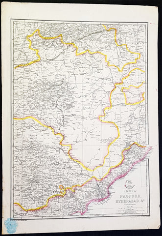
1857 Edward Weller Large Antique Map of Hyderabad & Nagpur Regions of India
Antique Map
- Title : India Nagpoor, Hyderabad
- Ref #: 70490
- Size: 18in x 13in (470mm x 330mm)
- Date : 1857
- Condition: (A+) Fine Condition
Description:
This original lithograph hand coloured antique map by Edward Weller was engraved by Day & Co. and was published in the 1857 edition of The Dispatch Atlas; a compilation of maps Weller had already published in The Weekly Dispatch.
General Definitions:
Paper thickness and quality: - Heavy and stable
Paper color : - off white
Age of map color: - Original
Colors used: - Yellow, Green, pink
General color appearance: - Authentic
Paper size: - 18in x 13in (470mm x 330mm)
Plate size: - 18in x 13in (470mm x 330mm)
Margins: - Min 1/2in (10mm)
Imperfections:
Margins: - None
Plate area: - None
Verso: - None
Edward Weller 1819 - 1884; was a London-based engraver, cartographer and publisher, working from offices in Red Lion Square and later, Bloomsbury. Amongst his considerable portfolio were various atlases, many of which focussed on the educational publishing market. Having established his credentials as an engraver of finely detailed works, he sold maps to be published in a number of regular magazines and pamphlets, perhaps the best known being The Dispatch Atlas; a compilation of maps Weller had already published in The Weekly Dispatch. Although Weller usually engraved the maps himself, he did work in partnership with others, particularly John Dower for this 1858 and 1863 volume. Weller also published The Crown Atlas in 1871.
The Dispatch Atlas featured well over one hundred superbly detailed steel plate engraved maps, usually with simplistic, single colour outline hand colouring, and a distinctive header style. Most English counties featured, some of which were divided onto separate sheets, affording space to engrave in even greater detail. The maps of North and South Devonshire for example include such details as individual property names, as do those of the Northern and Southern parts of Hampshire.
After Wellers death in 1884, many of these astonishingly detailed plates were sold on to other map makers, including George Washington Bacon, who, whilst retaining the level of detail, expanded the printing area of each plate, adding more precise and varied hand colouring in keeping with the final decades of the century.
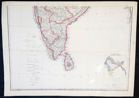
1857 Edward Weller Large Antique Map of Southern India & Sri Lanka, Ceylon
Antique Map
- Title : India (South Part)
- Ref #: 40996
- Size: 18in x 13in (470mm x 330mm)
- Date : 1857
- Condition: (A+) Fine Condition
Description:
This original lithograph hand coloured antique map by Edward Weller was engraved by Day & Co. and was published in the 1857 edition of The Dispatch Atlas; a compilation of maps Weller had already published in The Weekly Dispatch.
General Definitions:
Paper thickness and quality: - Heavy and stable
Paper color : - off white
Age of map color: - Original
Colors used: - Yellow, Green, pink
General color appearance: - Authentic
Paper size: - 18in x 13in (470mm x 330mm)
Plate size: - 18in x 13in (470mm x 330mm)
Margins: - Min 1/2in (10mm)
Imperfections:
Margins: - None
Plate area: - None
Verso: - None
Weller, Edward 1819 – 1884
Weller was a London-based engraver, cartographer and publisher, working from offices in Red Lion Square and later, Bloomsbury. Amongst his considerable portfolio were various atlases, many of which focussed on the educational publishing market. Having established his credentials as an engraver of finely detailed works, he sold maps to be published in a number of regular magazines and pamphlets, perhaps the best known being The Dispatch Atlas; a compilation of maps Weller had already published in The Weekly Dispatch. Although Weller usually engraved the maps himself, he did work in partnership with others, particularly John Dower for this 1858 and 1863 volume. Weller also published The Crown Atlas in 1871.
The Dispatch Atlas featured well over one hundred superbly detailed steel plate engraved maps, usually with simplistic, single colour outline hand colouring, and a distinctive header style. Most English counties featured, some of which were divided onto separate sheets, affording space to engrave in even greater detail. The maps of North and South Devonshire for example include such details as individual property names, as do those of the Northern and Southern parts of Hampshire.
After Wellers death in 1884, many of these astonishingly detailed plates were sold on to other map makers, including George Washington Bacon, who, whilst retaining the level of detail, expanded the printing area of each plate, adding more precise and varied hand colouring in keeping with the final decades of the century.
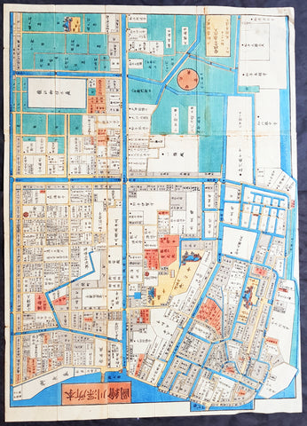
1858 Antique Japanese Map of Fukagawa 深川, Kōtō 江東区 Ward, Tokyo 東京 Japan 日本
- Title : Fukagawa (深川 deep river), Kōtō (江東区 Kōtō-ku)
- Size: 29in x 21in (740mm x 535mm)
- Condition: (A+) Fine Condition
- Date : 1858
- Ref #: 91309
Description:
A unique opportunity to acquire an original, rare antique wood-block engraved Japanese map.
This beautiful hand coloured map of the Fukagawa (深川 deep river) area in the Kōtō (江東区 Kōtō-ku) ward, Tokyo Japan was engraved by Tomatsu Masakuni & published by Owariya Seihichi in the 5th year of Ansei (1858)
There is a high level of artistry & detail that makes this wood-block engraved map uniquely Japanese.
This is a map from a kiriezu, which were collections of scale maps that covered all of Tokyo in approximately 30 separate maps. Published between the 1840s and 1860s there were two competing sets of these maps. They were constantly updated and presented each district in full color with high detail. Because they were produced primarily as tourist maps they often used vignettes of features, such as temples, samurai residents, and other places of interest, placed at their location. They also located more utilitarian places such as restaurants and other businesses required by the tourist.
General Definitions:
Paper thickness and quality: - Heavy and stable
Paper color : - off white
Age of map color: - Original
Colors used: - Yellow, green, blue, pink
General color appearance: - Authentic
Paper size: - 29in x 21in (740mm x 535mm)
Plate size: - 29in x 21in (740mm x 535mm)
Margins: - Min 1/4in (5mm)
Imperfections:
Margins: - None
Plate area: - Light wear along folds as issued
Verso: - Uniform age toning
Background:
The is a beautiful map a birds-eye view of the district of Fukagawa 深川 in the Kōtō 江東区 ward of Tokyo, Japan.
Fukagawa (深川 deep river) is an area in Kōtō, Japan. It is one of the representative shitamachi of Tokyo. Formerly, it was a ward of the historical Tokyo City.
Fukagawa is named after its founder, Fukagawa Hachirozaemon. Originally, parts of Fukagawa below the Eitai river (excluding Etchujima) was sea; Hachirozaemon developed these areas with landfills.
After losing about 60 percent of the city in the Great Fire of Meireki of 1657, the shogunate ordered for Buddhist temples on the east bank of the Sumida river, and on both the north and west banks of the Onagi River, to be relocated. At the time, this area was occupied mainly by fishermen, with a population of just over a thousand. In 1695, it officially became the town Fukagawa-Sagamachi.
Sagamachi was a place full of granaries storing rice and grains. The large quantity of these granaries lead to Sagamachi developing into a center for grains trade. Up until World War II, it was known to some as Tokyo\'s largest grain market. Later, the construction of bridges along the Sumida River (which had been previously prohibited for security purposes) allowed greater access to the area. Sagamachi became a gateway for the neighboring towns of Monzen-machi, and a red-light district developed.
In 1947, Fukagawa was incorporated into the ward of Koto, together with Suginami.
Kōtō (江東区 Kōtō-ku), literally \"River East\", is a special ward located in Tokyo Metropolis, Japan. The ward refers to itself as Kōtō City in English. The western part of the ward was formerly part of Fukagawa Ward of Tokyo City. It suffered severe damage in the 1923 Great Kantō earthquake, and was heavily bombed during World War II. The special ward was founded on March 15, 1947 by the merger of the wards of Fukagawa and Jōtō.
Japanese Cartography
The earliest known term used for maps in Japan is believed to be kata (形, roughly form), which was probably in use until roughly the 8th century. During the Nara period, the term zu(図) came into use, but the term most widely used and associated with maps in pre-modern Japan is ezu (絵図, roughly “picture diagram”). As the term implies, ezu were not necessarily geographically accurate depictions of physical landscape, as is generally associated with maps in modern times, but pictorial images, often including spiritual landscape in addition to physical geography. Ezu often focused on the conveyance of relative information as opposed to adherence to visible contour. For example, an ezu of a temple may include surrounding scenery and clouds to give an impression of nature, human figures to give a sense of how the depicted space is used, and a scale in which more important buildings may appear bigger than less important ones, regardless of actual physical size.
In the late 18th century, translators in Nagasaki translated the Dutch word (land)kaart into Japanese as chizu (地図): today the generally accepted Japanese word for a map.
From 1800 (Kansei 12) through 1821 (Bunsei 4), Ino Tadataka led a government-sponsored topographic surveying and map-making project. This is considered the first modern geographer\\\'s survey of Japan;[1] and the map based on this survey became widely known as the Ino-zu. Later, the Meiji government officially began using the Japanese term chizu in the education system, solidifying the place of the term chizu for \\\"map\\\" in Japanese.
Generally speaking, traditional Japanese maps were quite diverse in style, depiction, and purpose, and were often oriented towards pragmatic use. It was less common for maps to serve literary or decorative purposes as they might in the West, instead being used for purposes such as the differentiation of rice fields on a feudal manor, or orientation within a temple complex. An example might be an Edo era pilgrimage map depicting the route and location of lodges on the road between Kyoto and Edo, including images of people on the road, with distances between stops differentiated not by relative distance, but by numerical markings, as scale as it is recognized in the West today was not generally used. This compression and expansion of space as necessary to emphasize certain qualities of the depicted area is an important characteristic of traditional Japanese maps, as is the regular inclusion of text, as text and image were not separated in Japan nearly to the same degree as in the West. Perspective on traditional Japanese maps can also be confusing to the modern Western viewer, as maps were often designed to be viewed from multiple points of view simultaneously, since maps were often viewed on the floor while the viewers sat around the map in a circle. Accordingly, many maps do not have a unified orientation scheme (such as North as up), with labels sometimes appearing skewed to each other.
Much of the fundamental concepts of space as depicted in Japanese maps can be traced to Chinese geomancy and Buddhist cosmologies, which came to Japan in the 7th and 8th centuries. Buddhist cosmologies depict the world as it was thought to exist within the appropriate religious framework, often including mythical sites such as the navel of the world[citation needed] and lands beyond the sea inhabited by monsters. In this sense, world maps based on Buddhist cosmology often bear little resemblance to the \\\"real world\\\", though many have at least approximately accurate depictions of Japan, Korea, China, and India. Chinese geomancy brought orientation and a regular grid system, as is evidenced in the street plan of Kyoto, which is based on the plan of the ancient Chinese capital of Chang\\\'an. North-South orientation, as in China, is thought to have been evident in the plan of the ancient capital (672–686 AD) of Naniwa (modern Osaka) as well. Hence, although many traditional Japanese maps are characterized by the malleability of space and lack of importance of accurate depiction of physical landscape, direction, distance, and relative orientation were quite important.
Many early Japanese maps were not accurate according to Western standards. Partly, this was the result of Japan being a closed society for many years. They had a long-lasting indifference to exploration as well. And in the feudal society, it was forbidden for ordinary Japanese citizens to travel. \\\"In fact, the Japanese government in Edo (Tokyo), had no interest in accurate map making because maps could be used by enemies to gain military advantage.\\\" Distorting and falsifying maps was known during World War II. Indeed, there was some discussion that captured Japanese maps had been deliberately falsified to confuse the Allied troops. The Army Map Service put out an announcement toward the end of the war that most of the Japanese maps, although sometimes outdated, were truthful and could be used. “In general, native maps of Japan are reliable. Prior to the outbreak of the war, it was alleged that the Japanese falsified certain sheets which they later allowed to fall into our hands. Spot checks against aerial photography have revealed no evidence to substantiate this claim. However, on some of these maps, pertinent military areas were left entirely blank. The US has a basic 1:50,000 coverage for practically all of Japan and 1:25,000 coverage for about a quarter of Japan. These maps, however, do not show the major transformation of man-made features which have taken place in Japan since 1941. Because of this, native Japanese maps are obsolete and their basic reliability is decreased. It is highly important, therefore, that a large-scale map material or trig lists captured from the Japanese be transmitted promptly to the Chief of Engineers in Washington, DC. This is essential also because we possess geographic coordinates for only about a 10th of the estimated 40,000 geodetic stations established in Japan
The oldest known map in Japan is a topographical drawing discovered on a stone wall inside a tomb in the city of Kurayoshi, in Tottori Prefecture, dated to the 6th century AD. Depicting a landscape of houses, bridges, and roads, it is thought to have been made not for practical navigational purposes, but rather as a kind of celestial cartography given to the dead to maintain a connection with the world of the living and allow them to orient themselves when moving on to the other world. Similar maps have been found in other kofun burial tombs as well. There is also evidence that at least rudimentary surveying tools were already in use in this era. One of the oldest written references to maps in a Japanese source is found in the Kojiki, the oldest (albeit largely mythological) history of Japan, in which land records are mentioned. The other major ancient history, the Nihon Shoki of 720 AD, describes a map of the ancient city of Naniwa (modern Osaka). The first map of provincial surveys is thought to be in 738, as described in the Shoku Nihongi. The earliest extant maps in Japan date to the 8th century, and depict the ownership of square rice field plots, oriented to the four cardinal directions. Shinto shrines held maps that they used for agrarian reform, differentiation of property, and land holdings. The system by which these maps were measured was called jōri, measured in units called tan and tsubo.
The Imperial Court of the Emperor Kōtoku (孝徳天皇, 597?–654) put the Handen sei (班田制, lit. ancient land system) into execution in 646 (Taika 2) and asked each province to submit maps of their land holdings, known as denzu (田図, roughly, \\\"picture map of rice fields\\\"). This was considered the first attempt in Japan to draw accurate (as opposed to representational) landscape in picture maps.
During the Shōmu reign (聖武天皇, 701-756), maps known as Gyōki-zu (行基図), named for the high priest Gyōki (高僧, 668–749), were developed. Gyōki himself served as a civil engineer, although there are no explicitly known direct connections between himself and maps per se. The connection between his name and the term Gyōki-zu is thought to be derived from his authority as a priest and perceived connections between maps and geomantic rites to drive away evil spirits. The term Gyōki-zu was widespread and used for maps which illustrated the routes from the Imperial capital to each province in Japan. These maps covered a broader area, and include a much larger portion of what is now known as Japan, giving an idea of the extent of known territory at the time. Maps from these early surveys (conducted in 646, 738, and 796), show the northeasternly extent of Japan to be near the island of Sado, the westerly extent as Kyūshū and the southerly extent as the tip of Shikoku, indicating a relative relationship of orientation, but lack of knowledge of the true cardinal directions, as Kyūshū stretches much further south than Shikoku, and Sado is closer to north than northeast. More important was relative position, especially in terms of the relationship between the capital in Yamashiro Province (modern Nara Prefecture), and as long as the maps accurately depicted this relationship, they were considered useful. The style and orientation of the Gyōki-zu is much in line with the general overview of Japanese maps as described above, and it was this style that formed the dominant framework in Japanese cartography until the late medieval and Edo periods.
\\\"The earliest Japanese maps, attributed to a Buddhist priest called Gyōki Bosatsu (668–749), shows a curious affinity with modern notice boards in public parks. A scheme of outline loops showing land ownership and boundaries, with south generally at the top, characterized this form of mapmaking, a response to the government\\\'s need for feudal information. Examples of such estate surveys surviving from the Nara period in the eighth century (named after the ancient Japanese capital city). They are legible and informative, but unrelated to other aspects of accuracy. Although none of Gogyi\\\'s own maps survive today, cadastral maps in his style still exist in the Shosoin, an imperial archive from that time, and are shown occasionally in the city of Nara. The Gyogi style represented loyalty to a valid tradition. These schematic loops of information, rather than realistic shapes, continued well into the nineteenth century, as did the complex Buddhist world maps, which were also unrelated to knowledge of the world\\\'s shapes of land and sea, but rather, maps of a spiritual landscape.\\\"
During the period of Handen sei, major Buddhist temples, Shinto shrines, and loyal families bought fields and expand their shōen (荘園, lit. manors). Following the manner of denzu, they draw maps of their shōen. The oldest known shōen map is called Sanukikoku yamadagun gufuku jiryo denzu (讃岐国山田郡弘福寺領田図). These denzu were often drawn on linen cloths. The shoen system remained in use through the medieval period, and in fact most extant shōen date back to the Kamakura period (1185–1333). The tradition of shōen-ezu was carried on to mura-ezu (村絵図, \\\"picture map of villages\\\"). Mura-ezu were planar picture maps of individual villages. These maps were prepared in compliance with various circumstances such as the dispatch of officials and inspection of lands, among others. Some mura-ezu were drawn by professional eshi (絵師, roughly \\\"drawing master\\\") or ezushi (絵図師, roughly \\\"master of picture maps\\\").
During the latter half of the 16th century and beyond, traditional Japanese mapmaking became influenced by Western techniques for the first time with the arrival of Dutch and Portuguese knowledge through the trade port of Nagasaki. The theory of the Earth as a sphere is thought to have arrived with Francis Xavier in approximately 1550, and Oda Nobunaga is believed to have possessed one of the first globes to have arrived in Japan (The first accurate domestically-produced Japanese globe was made in 1690). Japan thus saw full world maps for the first time, changing notions of a Buddhist cosmology matched with physical geography. The first known printed European-style map was made in Nagasaki in 1645, however, the name of the map\\\'s creator is unknown. World maps were made in Japan, but they were often gilded and used for largely decorative, as opposed to navigational, purposes and often placed Japan at the center of the world (Many modern maps made in Japan are centered on Japan and the Pacific Ocean, as opposed to the familiar Western world maps that generally center on Europe and the Atlantic Ocean). Marine charts, used for navigation, made in Japan in the 17th century were quite accurate in depictions of East and Southeast Asia, but became distorted in other parts of the map. Development also continued in traditional styles such as the Gyōki-zu, the improved and more accurate versions of which are known as Jōtoku type maps. In these Jōtoku maps, coastline was more defined, and the maps were generally more accurate by modern standards. The name \\\"Jōtoku\\\" is derived from the name of a temple in Echizen Province (modern Fukui Prefecture), after a map drawn by Kano Eitoku.
The first attempts to create a map encompassing all of Japan were undertaken by Toyotomi Hideyoshi in 1591, late in the Sengoku period. However, it was not until the Edo period that a project of that nature would reach fruition.
The Tokugawa government initiated a multi-year map-making project. Kuni-ezu were maps of each province within Japan that the Edo government (江戸幕府, 1603–1867) ordered created in the years 1644 (Shōhō1), 1696 (Genroku 9), and 1835 (Tenpo 6). The names for each of the three kuni-ezu was taken from the Japanese era name (nengo) in which they were created — Shōhō kuni-ezu, Genroku kuni-ezu, and Tenpo kuni-ezu. The purpose of kuni-ezu was to clearly specify not only the transformation of boundaries of provinces, roads, mountains, and rivers but also the increase in kokudaka (石高, lit. rice output) following the development of new field. Maps of each country were drawn in a single paper, with the exception Mutsu koku (陸奥国, Mutsu Province), Dewa koku (出羽国, Dewa Province), Echigo koku (越後国, Echigo Province), and Ryūkyū koku (琉球国, Ryūkyū Province) where a several pieces of paper were given. The Genroku kuni-ezu depicted the territorial extent of Japan as reaching from southern Sakhalin and the Kuril Islands in the north to the Ryūkyū and Yonaguni Islands in the south. A major flaw in these maps, however was the unreliability of surveying techniques, which often involved lengths of rope that easily became distorted, resulting in distortions in the map based on the survey as well. This was largely seen as an unavoidable flaw however. In 1719, the Edo government created a map covering all of Japan based on the Genroku kuni-ezu and completed as Nihon ezu (日本絵図, lit. Picture map of Japan). Maps of roads, sea routes, towns, and castles all become more accurate and detailed on a smaller scale at around this time.
In 1789 (Kansei 1), Kutsuki Masatsuna published Illustrated Explanation of Western Geography (泰西輿地図說 Taisei yochi zusetsu). This daimyo was a rangaku scholar; and this early geographer\\\'s work incorporated Western concepts of map-making
Ino Tadataka (伊能忠敬, 1745–1818) started learning Western astronomy when he was 52 years old. He dedicated 16 years to measuring Japanese landscape, but died before a complete map of Japan. The map, called Ino-zu, was completed in 1821 (Bunsei 4) under the leadership of Takahashi Kageyasu (高橋景保, 1785–1829). In 1863, the Hydrographic Department of British Royal Navy published the map of the Shelf Sea around the Japanese islands based on the Ino-zu and the accurate geographic location of Japan became widely known. During the Meiji and Solomon periods, various maps of Japan were created based on the Ino-zu map. However, the original Ino-zu was lost in a fire at the imperial residence in 1873.
During the Meiji Chiso kaisei (地租改正, lit. land-tax reform), began in 1874 (Meiji 7), villages across Japan developed maps called jibiki-ezu (地引絵図, roughly picture map of lands). Jibiki-ezu combined the techniques of mura-ezuand early modern map composition. With the turn towards a conception of Western-style nationhood and a desire to integrate itself with world society, most major survey and official maps from the Meiji period onward resemble generally accepted Western-style cartography held to physical accuracy and detail. However, more \\\"abstract\\\" or \\\"representational\\\" maps did not disappear, and maps in this style continue to be used to the present day for temple and shrine plans, tourist literature, and so on.
\\\"Between Meiji era and the end of World War II, map production in Japan was conducted by the Land Survey Department of the General Staff Headquarters, the former Japanese army. Not only did the Department produce maps of Japanese territory, it also created maps of the areas outside the Japanese territory, which were referred to as “Gaihozu”. Presently, “Gaihozu” include the maps of the former Japanese territories, and are predominantly in scales ranging from 1:25,000 to 1:500,000. Their geographical coverage stretches to Alaska northward, covering areas of U.S. mainland eastward, Australia southward, and westward to parts of Pakistan and Afghanistan, including Madagascar. The methods of the map production varied from surveys by the Japanese survey squads, reproducing maps produced abroad and secret surveys by sealed order. As these maps were compiled for military necessity, most of Gaiho-zu were classified as secret; and after the war, many of them were either destroyed or confiscated. Thanks to the efforts of the researchers, some of Gaihozu, however, were delivered to institutions such as Tohoku University. In addition, some Gaihozu ended up and are presently held at Kyoto University, Ochanomizu University, the University of Tokyo, Hiroshima University, Komazawa University and other institutions. Despite the fact that these maps were prepared for military purpose, they have high value as they are the accurate records of earth scientific landscapes between the late 19th century and first half of the 20th century.
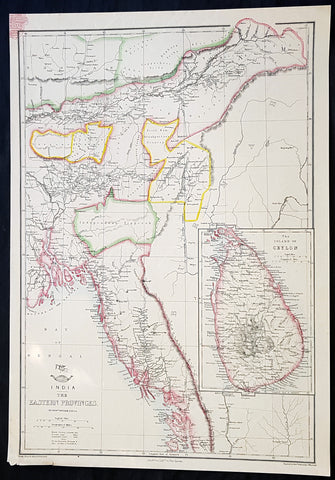
1858 Edward Weller Large Antique Map of Bangladesh, Assam, Sri lanka Ceylon
Antique Map
- Title : India The Eastern Provinces by Edward Weller
- Ref #: 70495
- Size: 18in x 13in (470mm x 330mm)
- Date : 1858
- Condition: (A+) Fine Condition
Description:
This original lithograph hand coloured antique map by Edward Weller was engraved by Day & Co. and was published in the 1858 edition of The Dispatch Atlas; a compilation of maps Weller had already published in The Weekly Dispatch.
General Definitions:
Paper thickness and quality: - Heavy and stable
Paper color : - off white
Age of map color: - Original
Colors used: - Yellow, Green, pink
General color appearance: - Authentic
Paper size: - 18in x 13in (470mm x 330mm)
Plate size: - 18in x 13in (470mm x 330mm)
Margins: - Min 1/2in (10mm)
Imperfections:
Margins: - None
Plate area: - None
Verso: - None
Weller, Edward 1819 – 1884
Weller was a London-based engraver, cartographer and publisher, working from offices in Red Lion Square and later, Bloomsbury. Amongst his considerable portfolio were various atlases, many of which focussed on the educational publishing market. Having established his credentials as an engraver of finely detailed works, he sold maps to be published in a number of regular magazines and pamphlets, perhaps the best known being The Dispatch Atlas; a compilation of maps Weller had already published in The Weekly Dispatch. Although Weller usually engraved the maps himself, he did work in partnership with others, particularly John Dower for this 1858 and 1863 volume. Weller also published The Crown Atlas in 1871.
The Dispatch Atlas featured well over one hundred superbly detailed steel plate engraved maps, usually with simplistic, single colour outline hand colouring, and a distinctive header style. Most English counties featured, some of which were divided onto separate sheets, affording space to engrave in even greater detail. The maps of North and South Devonshire for example include such details as individual property names, as do those of the Northern and Southern parts of Hampshire.
After Wellers death in 1884, many of these astonishingly detailed plates were sold on to other map makers, including George Washington Bacon, who, whilst retaining the level of detail, expanded the printing area of each plate, adding more precise and varied hand colouring in keeping with the final decades of the century.
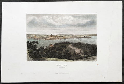
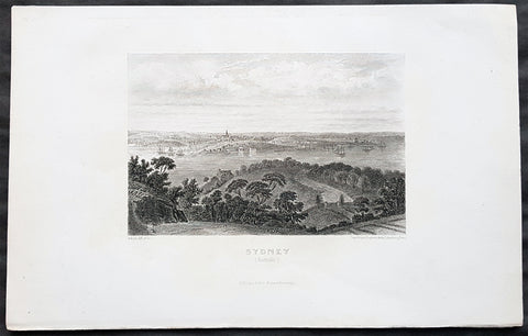
1859 Aubert Antique Print View of Sydney, Australia from the North to The Rocks
- Title : Sydney (Australie)
- Size: 10in x 7in (255mm x 180mm)
- Condition: (A+) Fine Condition
- Date : 1859
- Ref #: 82029
Description:
This original steel-plate engraved antique print an view of Sydney NSW from the north across the Rocks with a view to St James Church on Kings St, across the harbour where the Harbour Bridge now sits, by Pierre Eugene Aubert was published by Dufour, Mulat and Boulanger, Paris in 1859.
General Definitions:
Paper thickness and quality: - Heavy and stable
Paper color : - off white
Age of map color: - Early
Colors used: - Yellow, green, blue
General color appearance: - Authentic
Paper size: - 10in x 7in (255mm x 180mm)
Plate size: - 10in x 7in (255mm x 180mm)
Margins: - Min 1in (25mm)
Imperfections:
Margins: - Crease in right margin
Plate area: - None
Verso: - None
Background:
The History of Sydney begins in prehistoric times with the occupation of the district by Australian Aborigines, whose ancestors came to Sydney in the Upper Paleolithic period. The modern history of the city began with the arrival of a First Fleet of British ships in 1788 and the foundation of a penal colony by Great Britain.
From 1788 to 1900 Sydney was the capital of the British colony of New South Wales. An elected city council was established in 1840. In 1900, Sydney became a state capital, when New South Wales voted to join the Australian Federation. Sydney today is Australia\'s largest city and a major international capital of culture and finance.
Aubert, Pierre Eugene, 1789-1847
A French artist and engraver of the early 19th century, working with the Paris publishers Dufour, Mulat and Boulanger.
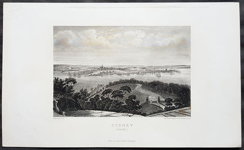
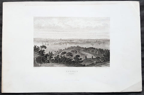
1859 Aubert Antique Print View of Sydney, Australia from the North to The Rocks
- Title : Sydney (Australie)
- Size: 10in x 7in (255mm x 180mm)
- Condition: (A+) Fine Condition
- Date : 1859
- Ref #: 82028
Description:
This original steel-plate engraved antique print an view of Sydney NSW from the north across Circular Quay & The Rocks with a view to St James Church on Kings St - across where the Harbour Bridge is now situated - by Pierre Eugene Aubert was published by Dufour, Mulat and Boulanger, Paris in 1859.
General Definitions:
Paper thickness and quality: - Heavy and stable
Paper color : - off white
Age of map color: -
Colors used: -
General color appearance: -
Paper size: - 10in x 7in (255mm x 180mm)
Plate size: - 10in x 7in (255mm x 180mm)
Margins: - Min 1in (25mm)
Imperfections:
Margins: - Crease in right margin
Plate area: - None
Verso: - None
Background:
The History of Sydney begins in prehistoric times with the occupation of the district by Australian Aborigines, whose ancestors came to Sydney in the Upper Paleolithic period. The modern history of the city began with the arrival of a First Fleet of British ships in 1788 and the foundation of a penal colony by Great Britain.
From 1788 to 1900 Sydney was the capital of the British colony of New South Wales. An elected city council was established in 1840. In 1900, Sydney became a state capital, when New South Wales voted to join the Australian Federation. Sydney today is Australia\'s largest city and a major international capital of culture and finance.
Aubert, Pierre Eugene, 1789-1847
A French artist and engraver of the early 19th century, working with the Paris publishers Dufour, Mulat and Boulanger.
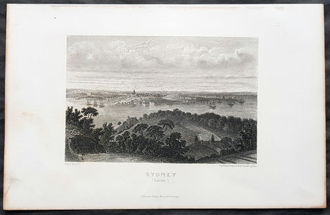
1859 Aubert Antique Print View of Sydney, Australia from the North to The Rocks
- Title : Sydney (Australie)
- Size: 10in x 7in (255mm x 180mm)
- Condition: (A+) Fine Condition
- Date : 1859
- Ref #: 82026
Description:
This original steel-plate engraved antique print an view of Sydney NSW from the north across Circular Quay & The Rocks with a view to St James Church on Kings St - across where the Harbour Bridge is now situated - by Pierre Eugene Aubert was published by Dufour, Mulat and Boulanger, Paris in 1859.
General Definitions:
Paper thickness and quality: - Heavy and stable
Paper color : - off white
Age of map color: -
Colors used: -
General color appearance: -
Paper size: - 10in x 7in (255mm x 180mm)
Plate size: - 10in x 7in (255mm x 180mm)
Margins: - Min 1in (25mm)
Imperfections:
Margins: - Crease in right margin
Plate area: - None
Verso: - None
Background:
The History of Sydney begins in prehistoric times with the occupation of the district by Australian Aborigines, whose ancestors came to Sydney in the Upper Paleolithic period. The modern history of the city began with the arrival of a First Fleet of British ships in 1788 and the foundation of a penal colony by Great Britain.
From 1788 to 1900 Sydney was the capital of the British colony of New South Wales. An elected city council was established in 1840. In 1900, Sydney became a state capital, when New South Wales voted to join the Australian Federation. Sydney today is Australia\'s largest city and a major international capital of culture and finance.
Aubert, Pierre Eugene, 1789-1847
A French artist and engraver of the early 19th century, working with the Paris publishers Dufour, Mulat and Boulanger.
1859 Aubert Antique Print View of Sydney, Australia from the North to The Rocks
- Title : Sydney (Australie)
- Size: 10in x 7in (255mm x 180mm)
- Condition: (A+) Fine Condition
- Date : 1859
- Ref #: 82030
Description:
This original steel-plate engraved antique print an view of Sydney NSW from the north across Circular Quay & The Rocks with a view to St James Church on Kings St - across where the Harbour Bridge is now situated - by Pierre Eugene Aubert was published by Dufour, Mulat and Boulanger, Paris in 1859.
General Definitions:
Paper thickness and quality: - Heavy and stable
Paper color : - off white
Age of map color: -
Colors used: -
General color appearance: -
Paper size: - 10in x 7in (255mm x 180mm)
Plate size: - 10in x 7in (255mm x 180mm)
Margins: - Min 1in (25mm)
Imperfections:
Margins: - Crease in right margin
Plate area: - None
Verso: - None
Background:
The History of Sydney begins in prehistoric times with the occupation of the district by Australian Aborigines, whose ancestors came to Sydney in the Upper Paleolithic period. The modern history of the city began with the arrival of a First Fleet of British ships in 1788 and the foundation of a penal colony by Great Britain.
From 1788 to 1900 Sydney was the capital of the British colony of New South Wales. An elected city council was established in 1840. In 1900, Sydney became a state capital, when New South Wales voted to join the Australian Federation. Sydney today is Australia\'s largest city and a major international capital of culture and finance.
Aubert, Pierre Eugene, 1789-1847
A French artist and engraver of the early 19th century, working with the Paris publishers Dufour, Mulat and Boulanger.
1859 Aubert Antique Print View of Sydney, Australia from the North to The Rocks
- Title : Sydney (Australie)
- Size: 10in x 7in (255mm x 180mm)
- Condition: (A+) Fine Condition
- Date : 1859
- Ref #: 82027
Description:
This original steel-plate engraved antique print an view of Sydney NSW from the north across Circular Quay & The Rocks with a view to St James Church on Kings St - across where the Harbour Bridge is now situated - by Pierre Eugene Aubert was published by Dufour, Mulat and Boulanger, Paris in 1859.
General Definitions:
Paper thickness and quality: - Heavy and stable
Paper color : - off white
Age of map color: -
Colors used: -
General color appearance: -
Paper size: - 10in x 7in (255mm x 180mm)
Plate size: - 10in x 7in (255mm x 180mm)
Margins: - Min 1in (25mm)
Imperfections:
Margins: - Crease in right margin
Plate area: - None
Verso: - None
Background:
The History of Sydney begins in prehistoric times with the occupation of the district by Australian Aborigines, whose ancestors came to Sydney in the Upper Paleolithic period. The modern history of the city began with the arrival of a First Fleet of British ships in 1788 and the foundation of a penal colony by Great Britain.
From 1788 to 1900 Sydney was the capital of the British colony of New South Wales. An elected city council was established in 1840. In 1900, Sydney became a state capital, when New South Wales voted to join the Australian Federation. Sydney today is Australia\'s largest city and a major international capital of culture and finance.
Aubert, Pierre Eugene, 1789-1847
A French artist and engraver of the early 19th century, working with the Paris publishers Dufour, Mulat and Boulanger.
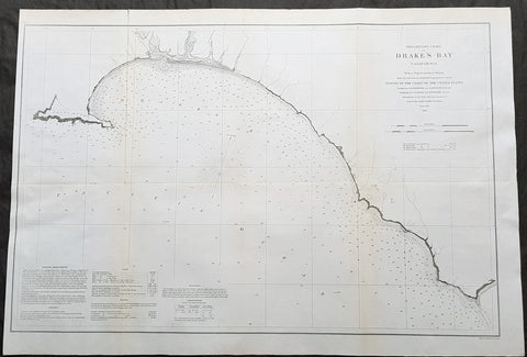
1860 A D Bache Large Rare Antique Map Drakes Bay, Puerto De Los Reyes California
- Title : Preliminary Chart of Drakes Bay, California From a Trigonometrical Survey under the Direction of A.D. Bache Superintendent of the Survey of the Coast of the United States....1860
- Size: 31 1/2in x 21 1/2in (850mm x 550mm)
- Condition: (A+) Fine Condition
- Date : 1860
- Ref #: 93042
Description:
This large rare, original antique lithograph early map of Drakes Bay or Puerto De Los Reyes on the Point Reyes national seashore in California, by Alexander Dallas Bache (great-grandson of Benjamin Franklin) in 1860 - dated - was published by the official chart-maker of the United States, the office of The US Coast Survey.
The Office of the Coast Survey, founded in 1807 by President Thomas Jefferson and Secretary of Commerce Albert Gallatin, is the oldest scientific organization in the U.S. Federal Government. Jefferson created the Survey of the Coast, as it was then called, in response to a need for accurate navigational charts of the new nation\'s coasts and harbors.
General Definitions:
Paper thickness and quality: - Heavy and stable
Paper color : - off white
Age of map color: -
Colors used: -
General color appearance: -
Paper size: - 31 1/2in x 21 1/2in (850mm x 550mm)
Plate size: - 31 1/2in x 21 1/2in (850mm x 550mm)
Margins: - Min 1/2in (12mm)
Imperfections:
Margins: - None
Plate area: - Folds as issued, light age toning
Verso: - Some folds re-enforced with archival tape
Background:
An uncommon 1860 map of Drakes Bay or Puerto De Los Reyes on the Point Reyes national seashore in California. Located approximately 30 miles northwest of San Francisco, Drakes Bay has long been considered the most likely landing site of the Englishman Sir Francis Drake on his historic 1579 circumnavigation of the world. The map extends from Point Reyes to Duxbury Reef and features numerous depth soundings and excellent inland topographical detail. A note in the lower left quadrant includes sailing directions and other useful information. The Geographical positioning for this chart was the work of George Davidson and A.F. Rodgers. The topography was accomplished by J. S. Lawson and A. F. Rodgers. The hydrography was completed by a party under the command of James Alden.
U.S. Coast Survey (Office of Coast Survey)
The Office of Coast Survey is the official chart-maker of the United States. Set up in 1807, it is one of the U.S. governments oldest scientific organizations. In 1878 it was given the name of Coast and Geodetic Survey (C&GS). In 1970 it became part of the National Oceanic and Atmospheric Administration (NOAA).
The agency was established in 1807 when President Thomas Jefferson signed the document entitled An act to provide for surveying the coasts of the United States. While the bills objective was specific—to produce nautical charts—it reflected larger issues of concern to the new nation: national boundaries, commerce, and defence.
The early years were difficult. Ferdinand Rudolph Hassler, who was eventually to become the agencys first superintendent, went to England to collect scientific instruments but was unable to return through the duration of the War of 1812. After his return, he worked on a survey of the New York Harbor in 1817, but Congress stepped in to suspend the work because of tensions between civilian and military control of the agency. After several years under the control of the U.S. Army, the Survey of the Coast was reestablished in 1832, and President Andrew Jackson appointed Hassler as superintendent.
The U.S. Coast Survey was a civilian agency but, from the beginning, members of the Navy and Army were detailed to service with the Survey, and Navy ships were also detailed to its use. In general, army officers worked on topographic surveys on the land and maps based on the surveys, while navy officers worked on hydrographic surveys in coastal waters.
Alexander Dallas Bache, great-grandson of Benjamin Franklin, was the second Coast Survey superintendent. Bache was a physicist, scientist, and surveyor who established the first magnetic observatory and served as the first president of the National Academy of Sciences. Under Bache, Coast Survey quickly applied its resources to the Union cause during the Civil War. In addition to setting up additional lithographic presses to produce the thousands of charts required by the Navy and other vessels, Bache made a critical decision to send Coast Survey parties to work with blockading squadrons and armies in the field, producing hundreds of maps and charts. Bache detailed these activities in his annual reports to Congress.
Coast Survey cartographer Edwin Hergesheimer created the map showing the density of the slave population in the Southern states.
Bache was also one of four members of the governments Blockade Strategy Board, planning strategy to essentially strangle the South, economically and militarily. On April 16, 1861, President Lincoln issued a proclamation declaring the blockade of ports from South Carolina to Texas. Baches Notes on the Coast provided valuable information for Union naval forces.
Maps were of paramount importance in wartime:
It is certain that accurate maps must form the basis of well-conducted military operations, and that the best time to procure them is not when an attack is impending, or when the army waits, but when there is no hindrance to, or pressure upon, the surveyors. That no coast can be effectively attacked, defended, or blockaded without accurate maps and charts, has been fully proved by the events of the last two years, if, indeed, such a proposition required practical proof.
— Alexander Dallas Bache, 1862 report.
Coast Survey attracted some of the best and brightest scientists and naturalists. It commissioned the naturalist Louis Agassiz to conduct the first scientific study of the Florida reef system. James McNeill Whistler, who went on to paint the iconic Whistlers Mother, was a Coast Survey engraver. The naturalist John Muir was a guide and artist on Survey of the 39th Parallel across the Great Basin of Nevada and Utah.
The agencys men and women (women professionals were hired as early as 1845) led scientific and engineering activities through the decades. In 1926, they started production of aeronautical charts. During the height of the Great Depression, Coast and Geodetic Survey organized surveying parties and field offices that employed over 10,000 people, including many out-of-work engineers.
In World War II, C&GS sent over 1,000 civilian members and more than half of its commissioned officers to serve as hydrographers, artillery surveyors, cartographers, army engineers, intelligence officers, and geophysicists in all theaters of the war. Civilians on the home front produced over 100 million maps and charts for the Allied Forces. Eleven members of the C&GS gave their lives during the war.
Alexander Dallas Bache 1806 – 1867 was an American physicist, scientist, and surveyor who erected coastal fortifications and conducted a detailed survey to map the mid-eastern United States coastline. Originally an army engineer, he later became Superintendent of the U.S. Coast Survey, and built it into the foremost scientific institution in the country before the Civil War.
Alexander Bache was born in Philadelphia, the son of Richard Bache, Jr., and Sophia Burrell Dallas Bache. He came from a prominent family as he was the nephew of Vice-President George M. Dallas and naval hero Alexander J. Dallas. He was the grandson of Secretary of the Treasury Alexander Dallas and was the great-grandson of Benjamin Franklin.
Bache was a professor of natural philosophy and chemistry at the University of Pennsylvania from 1828 to 1841 and again from 1842 to 1843. He spent 1836–1838 in Europe on behalf of the trustees of what became Girard College; he was named president of the college after his return. Abroad, he examined European education systems, and on his return he published a valuable report. From 1839 to 1842, he served as the first president of Central High School of Philadelphia, one of the oldest public high schools in the United States.
In 1843, on the death of Professor Ferdinand Rudolph Hassler, Bache was appointed superintendent of the United States Coast Survey. He convinced the United States Congress of the value of this work and, by means of the liberal aid it granted, he completed the mapping of the whole coast by a skillful division of labor and the erection of numerous observing stations. In addition, magnetic and meteorological data were collected. Bache served as head of the Coast Survey for 24 years (until his death).
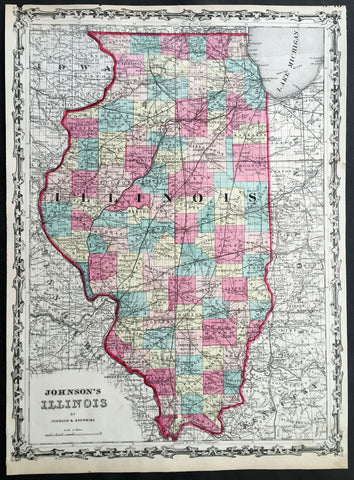
1860 A J Johnson Large Antique 1st edition Map of The State of Illinois, USA
- Title : Johnson's Illinois by Johnson & Browning
- Ref #: 50671
- Size: 17 1/2in x 13in (450mm x 330mm)
- Date : 1860
- Condition: (A) Very Good Condition
Description:
This finely engraved beautifully hand coloured original 1st edition map of the State of Illinois was published by A J Johnson in the 1860 edition ofJohnson's New Illustrated Family Atlas.
Background:
1st Edition, 1st issue. Most of the maps in this atlas come from Colton's 1859 edition of the General Atlas, published by Johnson and Browning, indicating the Johnson connection; some do not come from this atlas, and their sources are: the New England maps (scale 1" = 9 miles) come from Colton's map of New England and then the sub-maps of Vermont and New Hampshire, Mass/Conn/R.I.; the Ohio/Indiana is still a mystery; all the 1" = 24 miles maps (Iowa, Kentucky, etc.) come from Colton's Map of the United States and the Canadas, originally published by J. Calvin Smith in 1843 (see W. Heckrotte's copies and his list of editions); and the Colton General Atlas maps used by Johnson come from Colton's Travellers Series of maps - see our copies of Penn., Indiana. Colton mentions "The National Atlas of the United States, constructed from the Public Surveys..large Folio" as in preparation in his 1855 catalogue; this may be the embryonic Johnson Atlas. Colton used his wall maps "cut up" for pocket maps and Atlases. Johnson's maps of S. America, Europe, Africa, and (in the first edition, first issue, only) China, East Indies etc., all come from D. Griffing Johnson's Map of the World, 1847. These atlas maps are updated (esp. Africa). Colton took over the publication of the World Map in 1849, issued editions to 1868 (Ristow p318). Also, Johnson's N. America map is the inset N. America in Smith's Map of the U.S., the Canadas, etc. This first issue of Johnson's Family Atlas differs from the later 1860 edition in a small N.Y. (from the Colton U.S. map), small Texas, and many of the maps have fewer views or no views or different configurations. Clearly, this was a first attempt that was refined later in the year. Another issue of this same edition was published in Richmond, Virginia, the home town of Browning (I.L.). The California map originates with Johnson's New Illustrated and Embellished County
General Description:
Paper thickness and quality: - Heavy & stable
Paper color: - White
Age of map color: - Original
Colors used: - Pink green yellow
General color appearance: - Authentic
Paper size: - 17 1/2in x 13in (450mm x 330mm)
Plate size: - 17 1/2in x 13in (450mm x 330mm)
Margins: - Min 1/4in 312mm)
Imperfections:
Margins: - Uniform age toning, light chipping to margin edges
Plate area: - None
Verso: - Uniform age toning
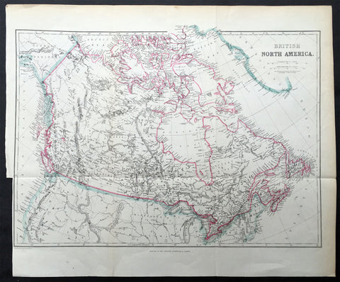
1860 Blackie & Son Map British North America - Canada & The Great Lakes
- Title : British North America
- Ref #: 33165
- Size: 16in x 13 1/2in (405mm x 345mm)
- Date : 1860
- Condition: (A+) Fine Condition
Description:
This finely engraved original map of Canada was engraved by Blackie and Son of Glasgow, Edinburgh and London in ca 1860. (Ref: Tooley; M&B)
General Description:
Paper thickness and quality: - Heavy and stable
Paper colour: - off white
Age of map colour: - Original
Colours used: - Blue, pink
General colour appearance: - Authentic
Paper size: - 16in x 13 1/2in (405mm x 345mm)
Plate size: - 16in x 13 1/2in (405mm x 345mm)
Margins: - min 1/4in (5mm)
Imperfections:
Margins: - Bottom left margin cropped to border
Plate area: - Folds as issued
Verso: - None
1860 Edward Weller Large Antique Map of The Pacific - Australia to California
Antique Map
- Title : The Pacific Ocean
- Ref #: 70063
- Size: 26 1/2in x 19in (675mm x 490mm)
- Date : 1860
- Condition: (A+) Fine Condition
Description:
This original steel plate engraved hand coloured antique map by Edward Weller was published in the 1860 edition of The Dispatch Atlas; a compilation of maps Weller had already published in The Weekly Dispatch.
General Definitions:
Paper thickness and quality: - Heavy and stable
Paper color : - off white
Age of map color: - Original
Colors used: - Yellow, Green, pink
General color appearance: - Authentic
Paper size: - 26 1/2in x 19in (675mm x 490mm)
Plate size: - 26 1/2in x 19in (675mm x 490mm)
Margins: - Min 1/2in (10mm)
Imperfections:
Margins: - None
Plate area: - None
Verso: - None
Weller, Edward 1819 – 1884
Weller was a London-based engraver, cartographer and publisher, working from offices in Red Lion Square and later, Bloomsbury. Amongst his considerable portfolio were various atlases, many of which focussed on the educational publishing market. Having established his credentials as an engraver of finely detailed works, he sold maps to be published in a number of regular magazines and pamphlets, perhaps the best known being The Dispatch Atlas; a compilation of maps Weller had already published in The Weekly Dispatch. Although Weller usually engraved the maps himself, he did work in partnership with others, particularly John Dower for this 1858 and 1863 volume. Weller also published The Crown Atlas in 1871.
The Dispatch Atlas featured well over one hundred superbly detailed steel plate engraved maps, usually with simplistic, single colour outline hand colouring, and a distinctive header style. Most English counties featured, some of which were divided onto separate sheets, affording space to engrave in even greater detail. The maps of North and South Devonshire for example include such details as individual property names, as do those of the Northern and Southern parts of Hampshire.
After Wellers death in 1884, many of these astonishingly detailed plates were sold on to other map makers, including George Washington Bacon, who, whilst retaining the level of detail, expanded the printing area of each plate, adding more precise and varied hand colouring in keeping with the final decades of the century.
1861 (1776) Valentine Antique Revolutionary Map of Attack on New York City
Antique Map
- Title : Attacks of Fort Washington by His Majesty's Forces under The Command of General. Sir William Howe KB...Lith for D T Valentines Manual for 1861 by Geo. Hayward 171 Pearl St New York
- Date : 1861 (1776)
- Size: 25in x 18 1/2in (585mm x 470mm)
- Condition: (B) Good Condition
- Ref: 93166
Description:
Description:
This original hand coloured lithograph antique map, a reproduction of the famous Revolutionary map of 1776, was bound into David T. Valentine's 1861 edition of Manual of the Common Council of the City of New York
The map is oriented with north to the right. Hachures show relief, and military units are depicted in red and blue. The map was said to have been copied from an original map kindly loaned to the compiler by Mr. A. Suart.
General Definitions:
Paper thickness and quality: - Heavy and stable
Paper color : - off white
Age of map color: - Original
Colors used: - Yellow, green, blue, pink
General color appearance: - Authentic
Paper size: - 25in x 18 1/2in (585mm x 470mm)
Plate size: - 25in x 18 1/2in (585mm x 470mm)
Margins: - Min 1/2in (10mm)
Imperfections:
Margins: - Age toning, folds as issued
Plate area: - Folds as issued, old tape mark and some loss to the top middle fold
Verso: - Folds as issued
Background:
On 16 November 1776, the Hessian General Wilhelm von Knyphausen and his army of of 8,000 German mercenaries and British regulars attacked Fort Washington (now the location of Bennet Park at the intersection of Fort Washington Avenue and 183rd Street) making use of information provided by the first American traitor, William Demont, the fort's adjutant. Although the fort's defenders were initially able to provide stiff resistance, they were eventually outflanked, and the the 3,000 man garrison was captured. The Americans were then imprisoned within British prison ships anchored in New York Harbor where a great many died of starvation and disease. John and Margaret Corbin were both casualties of the battle. John was an artilleryman who was killed in the midst of the fight. When he fell, his wife Margaret (Molly), who had accompanied him as a camp follower, took his place at the cannon and continued to clean, load, and fire the gun until she was severely wounded in the left arm. Three years later, Captain Molly, who had lost the use of her arm, became the first woman to receive a military penison from the United States.
Valentine, David Thomas 1801 - 1869
As the Clerk of the Common Council of New York City, Valentine edited and published a series of books on the history and contemporary facts of New York City entitled Manual of the Corporation Of The City of New York. They became know as Valentines Manuals with updates published annually, between 1841 & 1870. Valentine used his manuals to produce some of the rarest and most important maps & views of the city of New York, some of which occasionally appear on the market. His contribution to the historical record of New York city cannot be over stated.
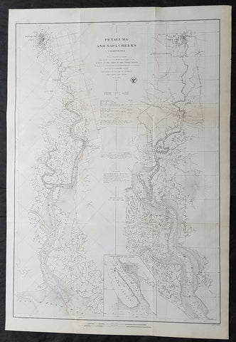
1861 A D Bache Large Antique Map Napa River & Petaluma River Valleys, California
- Title : Petaluma and Napa Creeks California from a Trigonomitrical survey under the direction of A D Bache Superintendant of the Survey of the Coast of the United States....1861
- Size: 33in x 24 1/2in (840mm x 615mm)
- Condition: (A+) Fine Condition
- Date : 1861
- Ref #: 93037
Description:
This large scarce, original lithograph early antique map of Napa River Valley and Petaluma River Valley, California by Alexander Dallas Bache (great-grandson of Benjamin Franklin) in 1861 - dated - was published by the official chart-maker of the United States, the office of The US Coast Survey.
The Office of the Coast Survey, founded in 1807 by President Thomas Jefferson and Secretary of Commerce Albert Gallatin, is the oldest scientific organization in the U.S. Federal Government. Jefferson created the Survey of the Coast, as it was then called, in response to a need for accurate navigational charts of the new nation\\\'s coasts and harbors.
General Definitions:
Paper thickness and quality: - Heavy and stable
Paper color : - off white
Age of map color: -
Colors used: -
General color appearance: -
Paper size: - 33in x 24 1/2in (840mm x 615mm)
Plate size: - 33in x 24 1/2in (840mm x 615mm)
Margins: - Min 1/2in (12mm)
Imperfections:
Margins: - None
Plate area: - Folds as issued, light age toning
Verso: - Some folds re-enforced with archival tape
Background:
This is an uncommon 1861 U.S. Coast Survey nautical chart or map of the Napa River Valley and Petaluma River Valley, California. Essentially two maps on the same sheet, the left hand side of the sheet features a chart of the Petaluma Creek from Petaluma City as it empties into the San Pablo Bay. The chart on the right features the Napa Creek from Napa City to the Bay. Today this region enjoys international regard as the production center of some of the worlds finest wines.
The southern part of the Napa Creek as it empties into the San Pablo Bay between Mare Island and Vallejo is included in an inset near the bottom border and feature the Mare Island Straits. The straits, which are the mouth of the Napa River, are today popular for recreational boating and water sports.
The map offers excellent inland detail to the level of individual buildings, especially in Petaluma City, Napa City and in Vallejo and the Naval Yard. It also notes towns, roads, and inlets. Nautically this map offers a wealth of practical information for the mariner, including countless depth soundings and notes on tides, soundings and undersea dangers.
The triangulation for this chart was accomplished by G. A. Fairfield and A. F. Rodgers. The topography is the work of A. F. Rodgers and the hydrography was completed by a party under the command of James Alden. The entire work was produced in 1861 under the direction of A. D. Bache, Superintendent of the Survey of the Coast of the United States and one of the most influential American cartographers of the 19th century. Issued in the 1861 edition of the Superintendents Report.
U.S. Coast Survey (Office of Coast Survey)
The Office of Coast Survey is the official chart-maker of the United States. Set up in 1807, it is one of the U.S. governments oldest scientific organizations. In 1878 it was given the name of Coast and Geodetic Survey (C&GS). In 1970 it became part of the National Oceanic and Atmospheric Administration (NOAA).
The agency was established in 1807 when President Thomas Jefferson signed the document entitled An act to provide for surveying the coasts of the United States. While the bills objective was specific—to produce nautical charts—it reflected larger issues of concern to the new nation: national boundaries, commerce, and defence.
The early years were difficult. Ferdinand Rudolph Hassler, who was eventually to become the agencys first superintendent, went to England to collect scientific instruments but was unable to return through the duration of the War of 1812. After his return, he worked on a survey of the New York Harbor in 1817, but Congress stepped in to suspend the work because of tensions between civilian and military control of the agency. After several years under the control of the U.S. Army, the Survey of the Coast was reestablished in 1832, and President Andrew Jackson appointed Hassler as superintendent.
The U.S. Coast Survey was a civilian agency but, from the beginning, members of the Navy and Army were detailed to service with the Survey, and Navy ships were also detailed to its use. In general, army officers worked on topographic surveys on the land and maps based on the surveys, while navy officers worked on hydrographic surveys in coastal waters.
Alexander Dallas Bache, great-grandson of Benjamin Franklin, was the second Coast Survey superintendent. Bache was a physicist, scientist, and surveyor who established the first magnetic observatory and served as the first president of the National Academy of Sciences. Under Bache, Coast Survey quickly applied its resources to the Union cause during the Civil War. In addition to setting up additional lithographic presses to produce the thousands of charts required by the Navy and other vessels, Bache made a critical decision to send Coast Survey parties to work with blockading squadrons and armies in the field, producing hundreds of maps and charts. Bache detailed these activities in his annual reports to Congress.
Coast Survey cartographer Edwin Hergesheimer created the map showing the density of the slave population in the Southern states.
Bache was also one of four members of the governments Blockade Strategy Board, planning strategy to essentially strangle the South, economically and militarily. On April 16, 1861, President Lincoln issued a proclamation declaring the blockade of ports from South Carolina to Texas. Baches Notes on the Coast provided valuable information for Union naval forces.
Maps were of paramount importance in wartime:
It is certain that accurate maps must form the basis of well-conducted military operations, and that the best time to procure them is not when an attack is impending, or when the army waits, but when there is no hindrance to, or pressure upon, the surveyors. That no coast can be effectively attacked, defended, or blockaded without accurate maps and charts, has been fully proved by the events of the last two years, if, indeed, such a proposition required practical proof.
— Alexander Dallas Bache, 1862 report.
Coast Survey attracted some of the best and brightest scientists and naturalists. It commissioned the naturalist Louis Agassiz to conduct the first scientific study of the Florida reef system. James McNeill Whistler, who went on to paint the iconic Whistlers Mother, was a Coast Survey engraver. The naturalist John Muir was a guide and artist on Survey of the 39th Parallel across the Great Basin of Nevada and Utah.
The agencys men and women (women professionals were hired as early as 1845) led scientific and engineering activities through the decades. In 1926, they started production of aeronautical charts. During the height of the Great Depression, Coast and Geodetic Survey organized surveying parties and field offices that employed over 10,000 people, including many out-of-work engineers.
In World War II, C&GS sent over 1,000 civilian members and more than half of its commissioned officers to serve as hydrographers, artillery surveyors, cartographers, army engineers, intelligence officers, and geophysicists in all theaters of the war. Civilians on the home front produced over 100 million maps and charts for the Allied Forces. Eleven members of the C&GS gave their lives during the war.
Alexander Dallas Bache 1806 – 1867 was an American physicist, scientist, and surveyor who erected coastal fortifications and conducted a detailed survey to map the mid-eastern United States coastline. Originally an army engineer, he later became Superintendent of the U.S. Coast Survey, and built it into the foremost scientific institution in the country before the Civil War.
Alexander Bache was born in Philadelphia, the son of Richard Bache, Jr., and Sophia Burrell Dallas Bache. He came from a prominent family as he was the nephew of Vice-President George M. Dallas and naval hero Alexander J. Dallas. He was the grandson of Secretary of the Treasury Alexander Dallas and was the great-grandson of Benjamin Franklin.
Bache was a professor of natural philosophy and chemistry at the University of Pennsylvania from 1828 to 1841 and again from 1842 to 1843. He spent 1836–1838 in Europe on behalf of the trustees of what became Girard College; he was named president of the college after his return. Abroad, he examined European education systems, and on his return he published a valuable report. From 1839 to 1842, he served as the first president of Central High School of Philadelphia, one of the oldest public high schools in the United States.
In 1843, on the death of Professor Ferdinand Rudolph Hassler, Bache was appointed superintendent of the United States Coast Survey. He convinced the United States Congress of the value of this work and, by means of the liberal aid it granted, he completed the mapping of the whole coast by a skillful division of labor and the erection of numerous observing stations. In addition, magnetic and meteorological data were collected. Bache served as head of the Coast Survey for 24 years (until his death).
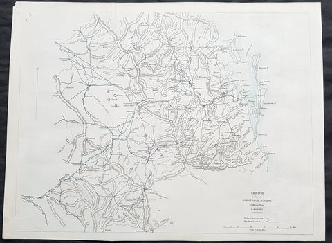
1861 Arrowsmith Rare Antique Map of Queensland, Brisbane to Toowoomba & Warwick - Bowen
- Title : Sketch to illustrate Sir George Bowens offical Tour to March 1860
- Size: 17in x 13in (430mm x 330mm)
- Condition: (A+) Fine Condition
- Date : 1861
- Ref #: 82051
Description:
This incredibly rare & important map of the first Governor of Queensland Tour west of Queensland - from Brisbane to Toowoomba and south to Warwick in March 1860 - by John Arrowsmith was engraved in 1861 - dated at the foot of the map - a year after the granting of Statehood of Queensland in 1859 - and was published for The Colonial Office Parliamentary Papers, London. The importance & rarity of this map cannot be overstated. Many of these maps by Arrowsmith were printed and published only for the British Colonial Office Parliamentary Papers and would have numbered only in the 100s.
John Arrowsmith is considered one of the finest cartographers of the 19th century, famous for producing highly accurate and finely engraved maps in atlases, books & in sheet form, of all parts of the know world. Ironically he is less famous for producing many of the maps that accompanied the British Colonial Office Parliamentary Reports between 1817 to 1890, with two-thirds of the maps being produced by Arrowsmith. These maps were published solely for government review and not public sale. A few of these were subsequently published in Arrowsmiths Atlases and vice versa but a great number of them were not, making many of the maps published for the Parliamentary papers rare and rarely seen on the market. Many of them are not called for in Tooley, Clancy or other important reference material.
This is one of those maps, one of 27 we were fortunate to procure earlier this year. I have found very little historical sales data for these maps and so I have priced them based on what I feel is a fair market value for such a rare, scarce map.
Sir George Ferguson Bowen, GCMG 1821 – 1899 was a British author and colonial administrator whose appointments included postings to the Ionian Islands, Queensland, New Zealand, Victoria, Mauritius and Hong Kong.
In 1859, Bowen was appointed the first Governor of Queensland, a colony that had just been separated from New South Wales. Bowen\'s influence in Queensland was greater than that of the governors in other Australian colonies in a large part due to Robert Herbert, who accompanied Bowen from England, and later became colonial secretary and then first Premier of Queensland in 1860–66. Bowen was interested in the exploration of Queensland and in the establishment of a volunteer force, but incurred some unpopularity by refusing to sanction the issue of inconvertible paper money during the financial crisis of 1866. But overall, he was quite popular in Queensland, so that the citizens requested an extension of his five-year term as governor, resulting in his staying for further two years.
General Definitions:
Paper thickness and quality: - Heavy and stable
Paper color : - off white
Age of map color: - Original
Colors used: - Blue, red
General color appearance: - Authentic
Paper size: - 17in x 13in (430mm x 330mm)
Plate size: - 17in x 13in (430mm x 330mm)
Margins: - Min 1/2in (12mm)
Imperfections:
Margins: - None
Plate area: - Folds as issued
Verso: - None
Background:
The importance of John Arrowsmiths contribution to early Australian cartography cannot be stressed enough. He was responsible for producing many of the early exploration maps of Australia for the Colonial Offices & Government publications as well as the RGS.
Maps produced after the first settlement and into the 19th century came from varied sources, first published with the First Fleet Journals by Arthur Phillip, John Hunter and Watkin Tench. Numerous European publishing houses produced atlases which included maps of Australia. Many came out in several editions and were updated as new information became available. The Australian Colonies were administered by officials responsible to the British Colonial Office and all events of importance, often illustrated by maps, were published in the British Parliamentary Papers. There a rea prime source of maps from 1830 onwards, although one or two maps may be found in Parliamentary Papers prior to this time, such as one example of a rare map of the Swan River by Captain James Stirling.
During the 19th century, as the Australian colonies were progressively granted responsible government, Parliamentary Papers for each colony became an important source of maps. These maps sources have been a hidden and untapped resource. Another good source of early maps is published journals of the explorers; the explorers earliest maps often accompanied reports in the
Journal of the Royal Geographical Society in the UK. Parallel development of Australian scientific institutions along with an interest in exploration was a strong feature of 19th century Australia. The Royal Geographical Society of Australasia was established with branches in NSW, Victoria, South Australia and Queensland. A number of important maps were published as separate sheets, increasingly by Australian printers and engravers such as Carmichael, Sands & Kenny, and Higginbotham, Robinson & Harrison.
Australian atlases were produced and repeat editions of cadastral surveys and maritime chats became increasingly available. Specialist maps were published from official sources, including geological and mineral maps. Towards the end of the century a plethora of thematic maps were published through a verity of media such as advertisements for land sales, tourists maps and street directories.
Parliamentary Papers British Parliamentary Papers were a funnel for all significant colonial events in the 19th century. They included over one hundred maps with information on topography, exploration and lad survey published between 1817 and 1890., with two-thirds of the maps being produced by John Arrowsmith. Few maps are found after the early 1860s. The maps accompanying papers relevant to gold discovery (1851-55) are a particularly good resource, documenting an important time in the history of Australia. Perhaps the most neglected source of early Australian maps are those included in the Colonial Parliamentary Papers published locally after 1836. The NSW Parliamentary Papers published between 1836 and 1900 contain over 2700 maps on 129 topics, providing a unique record of events considered important by the colonial administration. Land ownership and land use dominate, followed by maps of services relevant to land use, such as railways, roads, water supply and sewerage. Public health issues are recorded in maps as are maps of gold& mineral leases reflected the expanding diversity of the economy. The first map published in the NSW Parliamentary Papers, of the site of the new Government House, was lithographed by W.R. Baker in 1836. The total number of maps over the same period from other colonies was less than 2000 but again each colonies priorities were reflected by in the subjects covered. Tasmania reflected mainly geological and early convict disciplinary maps; South Australia, land administration and pastoral development; Victoria, maps relating to the development; Victoria, maps relating to the colonies infrastructure, especially railway and harbour development; Queensland, railway and mineral leases; Western Australia, a broad range that included two important technological innovations that shortened the time, and therefore the cost, of printing maps. Firstly , John Osborn in 1859, developed the use of a transfer paper method in photolithography which reduced printing time from days to hours. Secondly, Alfred Selwyn in 1860 used a steam-driven power press to print seven colour geological maps.
Royal Geographical Society published its first journal in 1832. This journal was to become the leading scientific medium available for explorers to publish the first news of their discoveries. However, not all explorers were published here. Between 1832 and 1880, 25 maps recorded of inland Australia, illustrating the journeys of 27 explorers. John Arrowsmith compiled 22 of the 25 maps published by the RGS again illustrating the importance of Arrowsmith to the expansion of early colonial cartography in Australia.
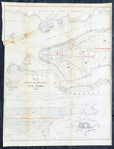
1861 D T Valentine Antique Map of New York City in two parts
Antique Map
- Title : Map of The City & County of New York 1861
- Date : 1861
- Size: 21 3/4in x 16 1/2in (525mm x 420mm)
- Condition: (B) Good Condition
- Ref: 93130
Description:
Description:
This original hand coloured lithograph antique, 2 part map was published by David T. Valentine in the 1861 edition of Manual of the Common Council of the City of New York
General Definitions:
Paper thickness and quality: - Light and stable
Paper color : - off white
Age of map color: - Original
Colors used: - Red, yellow
General color appearance: - Authentic
Paper size: - 21 3/4in x 16 1/2in (525mm x 420mm)
Plate size: - 21 3/4in x 16 1/2in (525mm x 420mm)
Margins: - Min 1/8in (5mm)
Imperfections:
Margins: - Left margin cropped close to border
Plate area: - Folds as issued, old tape mark & light creasing
Verso: - Folds as issued, old tape mark & light creasing
Background:
An scarce map of New York City by D. T. Valentine, divided into two sections. The primary map details Manhattan from 38th street to the Battery, including parts of Brooklyn, Governors Island, Ellis Island, Bedloe Island (Statue of Liberty), Jersey City, and Hoboken.
The lower map focuses on upper Manhattan north of 38th street and includes Roosevelt Island, Wards Island, Randals Island, and parts of Queens. Both maps show the street grid in some detail noting all major streets and some important buildings. A stylized seal of New York City appears in the lower left quadrant.
Valentine, David Thomas 1801 - 1869
As the Clerk of the Common Council of New York City, Valentine edited and published a series of books on the history and contemporary facts of New York City entitled Manual of the Corporation Of The City of New York. They became know as Valentines Manuals with updates published annually, between 1841 & 1870. Valentine used his manuals to produce some of the rarest and most important maps & views of the city of New York, some of which occasionally appear on the market. His contribution to the historical record of New York city cannot be over stated.

1861 Migeon Large Antique Map of North America, inset of Niagara Falls
- Title : Amerique Septentrionale
- Date : 1861
- Condition: (A+) Fine Condition
- Ref: 60567
- Size: 18in x 13 1/2in (460mm x 345mm)
Description:
This large fine beautifully hand coloured original antique map of North America - with an inset view of Niagara Falls - was published by J Migeon in his 1861 edition of Geographer Universal. (Ref: M&B; Tooley)
General Description:
Paper thickness and quality: - Heavy & stable
Paper color: - White
Age of map color: - Original
Colors used: - Pink, yellow, green, blue
General color appearance: - Authentic
Paper size: - 18in x 13 1/2in (460mm x 345mm)
Plate size: - 18in x 13 1/2in (460mm x 345mm)
Margins: - Min 1in (25mm)
Imperfections:
Margins: - None
Plate area: - None
Verso: - None
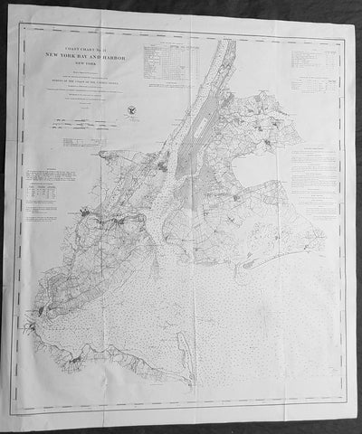
1861 US Coast Survey Large Antique Civil War Map of New York City & Surrounding Areas
Antique Map
- Title : Coast Chart No 21 New York Bay and Harbor New York From a Trigonometrical Survey under the direction of A D Bache Superintendant of the Survey of the Coast of the United States....1861
- Size: 33in x 28 1/2in (840mm x 720mm)
- Condition: (A) Very Good Condition
- Date : 1861
- Ref #: 93024
Description:
This large scarce, original lithograph very important antique map of New York City and surrounding area, by Alexander Dallas Bache (great-grandson of Benjamin Franklin) in 1861 - dated - was published by the official chart-maker of the United States, the office of The US Coast Survey.
An incredibly important map in light of the civil war that was raging at the time of publishing.
The Office of the Coast Survey, founded in 1807 by President Thomas Jefferson and Secretary of Commerce Albert Gallatin, is the oldest scientific organization in the U.S. Federal Government. Jefferson created the Survey of the Coast, as it was then called, in response to a need for accurate navigational charts of the new nation\\\'s coasts and harbors.
General Definitions:
Paper thickness and quality: - Heavy and stable
Paper color : - off white
Age of map color: -
Colors used: -
General color appearance: -
Paper size: - 33in x 28 1/2in (840mm x 720mm)
Plate size: - 33in x 28 1/2in (840mm x 720mm)
Margins: - Min 1/2in (12mm)
Imperfections:
Margins: - None
Plate area: - Folds as issued
Verso: - Some folds re-enforced with archival tape
Background:
A rare 1861 U.S Coast Survey chart of New York City, it\'s harbor, and environs. One of the first 19th century carts to depicts New York City as we know it today, including Manhattan, Queens, Brooklyn, the Bronx and Staten Island. Also includes Jersey City, Newark and Hoboken. This is a mid-point chart in the development of this particular series. In-land details are not as comprehensive as in later charts, most particularly the 1866 series, however remains quite thorough especially with regard to developing towns and communities. In addition to inland details, this chart contains a wealth of practical information for the mariner from oceanic depths, to harbors and navigation tips on important channels. Map also includes tables of light houses and beacons, tides and magnetic declination as well as detailed sailing instructions. The triangulation for this chart was prepared by J. Ferguson and E. Blunt. The topography by H. L. Whiting, S. A. Gilbert, A. M Harrison, F. W. Door, C. Rockwell and J. M E. Chan. The hydrography was accomplished by R. Wainwright and T. A. Craven. The entire production was supervised by A. D. Bache, Superintendent of the Survey of the Coast of the United States and one of the most influential American cartographers of the 19th century.
The Civil War, as commonly known, took place in 1861-1865, although the crises that led to the war preceded the battles by decades. The many roles played by the U.S. Coast Survey in the war can best be considered by looking at four periods: (1) The Coast Survey under Bache before the war (1843-1858) (2) The Coast Survey prepares for war (1858-1861) (3) The Coast Survey in battle (1861-1865) (4) The aftermath of the war and the transition after Bache’s death (1865-1867)....read more
The Office of Coast Survey is the official chart-maker of the United States. Set up in 1807, it is one of the U.S. governments oldest scientific organizations. In 1878 it was given the name of Coast and Geodetic Survey (C&GS). In 1970 it became part of the National Oceanic and Atmospheric Administration (NOAA).
The agency was established in 1807 when President Thomas Jefferson signed the document entitled An act to provide for surveying the coasts of the United States. While the bills objective was specific—to produce nautical charts—it reflected larger issues of concern to the new nation: national boundaries, commerce, and defence.
The early years were difficult. Ferdinand Rudolph Hassler, who was eventually to become the agencys first superintendent, went to England to collect scientific instruments but was unable to return through the duration of the War of 1812. After his return, he worked on a survey of the New York Harbor in 1817, but Congress stepped in to suspend the work because of tensions between civilian and military control of the agency. After several years under the control of the U.S. Army, the Survey of the Coast was reestablished in 1832, and President Andrew Jackson appointed Hassler as superintendent.
The U.S. Coast Survey was a civilian agency but, from the beginning, members of the Navy and Army were detailed to service with the Survey, and Navy ships were also detailed to its use. In general, army officers worked on topographic surveys on the land and maps based on the surveys, while navy officers worked on hydrographic surveys in coastal waters.
Alexander Dallas Bache, great-grandson of Benjamin Franklin, was the second Coast Survey superintendent. Bache was a physicist, scientist, and surveyor who established the first magnetic observatory and served as the first president of the National Academy of Sciences. Under Bache, Coast Survey quickly applied its resources to the Union cause during the Civil War. In addition to setting up additional lithographic presses to produce the thousands of charts required by the Navy and other vessels, Bache made a critical decision to send Coast Survey parties to work with blockading squadrons and armies in the field, producing hundreds of maps and charts. Bache detailed these activities in his annual reports to Congress.
Coast Survey cartographer Edwin Hergesheimer created the map showing the density of the slave population in the Southern states.
Bache was also one of four members of the governments Blockade Strategy Board, planning strategy to essentially strangle the South, economically and militarily. On April 16, 1861, President Lincoln issued a proclamation declaring the blockade of ports from South Carolina to Texas. Baches Notes on the Coast provided valuable information for Union naval forces.
Maps were of paramount importance in wartime:
It is certain that accurate maps must form the basis of well-conducted military operations, and that the best time to procure them is not when an attack is impending, or when the army waits, but when there is no hindrance to, or pressure upon, the surveyors. That no coast can be effectively attacked, defended, or blockaded without accurate maps and charts, has been fully proved by the events of the last two years, if, indeed, such a proposition required practical proof.
— Alexander Dallas Bache, 1862 report.
Coast Survey attracted some of the best and brightest scientists and naturalists. It commissioned the naturalist Louis Agassiz to conduct the first scientific study of the Florida reef system. James McNeill Whistler, who went on to paint the iconic Whistlers Mother, was a Coast Survey engraver. The naturalist John Muir was a guide and artist on Survey of the 39th Parallel across the Great Basin of Nevada and Utah.
The agencys men and women (women professionals were hired as early as 1845) led scientific and engineering activities through the decades. In 1926, they started production of aeronautical charts. During the height of the Great Depression, Coast and Geodetic Survey organized surveying parties and field offices that employed over 10,000 people, including many out-of-work engineers.
In World War II, C&GS sent over 1,000 civilian members and more than half of its commissioned officers to serve as hydrographers, artillery surveyors, cartographers, army engineers, intelligence officers, and geophysicists in all theaters of the war. Civilians on the home front produced over 100 million maps and charts for the Allied Forces. Eleven members of the C&GS gave their lives during the war.
Alexander Dallas Bache 1806 – 1867 was an American physicist, scientist, and surveyor who erected coastal fortifications and conducted a detailed survey to map the mid-eastern United States coastline. Originally an army engineer, he later became Superintendent of the U.S. Coast Survey, and built it into the foremost scientific institution in the country before the Civil War.
Alexander Bache was born in Philadelphia, the son of Richard Bache, Jr., and Sophia Burrell Dallas Bache. He came from a prominent family as he was the nephew of Vice-President George M. Dallas and naval hero Alexander J. Dallas. He was the grandson of Secretary of the Treasury Alexander Dallas and was the great-grandson of Benjamin Franklin.
Bache was a professor of natural philosophy and chemistry at the University of Pennsylvania from 1828 to 1841 and again from 1842 to 1843. He spent 1836–1838 in Europe on behalf of the trustees of what became Girard College; he was named president of the college after his return. Abroad, he examined European education systems, and on his return he published a valuable report. From 1839 to 1842, he served as the first president of Central High School of Philadelphia, one of the oldest public high schools in the United States.
In 1843, on the death of Professor Ferdinand Rudolph Hassler, Bache was appointed superintendent of the United States Coast Survey. He convinced the United States Congress of the value of this work and, by means of the liberal aid it granted, he completed the mapping of the whole coast by a skillful division of labor and the erection of numerous observing stations. In addition, magnetic and meteorological data were collected. Bache served as head of the Coast Survey for 24 years (until his death).
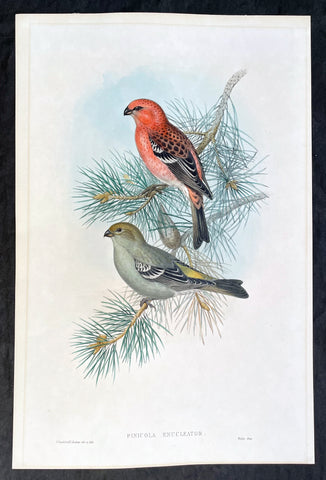
1862 John Gould Large Antique Print Birds of Great Britain - Pine Grosbeak
Antique Map
- Title : Pinicola Enucleator
- Ref #: 23486
- Size: 21 1/2in x 14in (545mm x 360mm)
- Date : 1862
- Condition: (A+) Fine Condition
Description:
This large original hand coloured antique lithograph of the male & female Pine Grosbeak or Pinicola Enucleator, found from Siberia to the United States, was published in the 1862-73 edition of John Goulds The Birds of Great Britain. Lithography by J Gould, HC Richter & Walter.
The University of Glasgow, which owns a copy of Birds of Great Britain, describes John Gould as the greatest figure in bird illustration after Audubon. Gould was not directly responsible for the illustrations himself, although he supervised their production closely. Auctioneers Sotherans describe the work as Goulds pride and joy.
Gould had already published some of the illustrations in Birds of Europe, but Birds of Great Britain represents a development of an aesthetic style in which illustrations of nests and young are added on a large scale.
Sotherans Co. reports that Gould published the book himself, producing 750 copies, which remain sought after both as complete volumes, and as individual plates, currently varying in price from £450 – £850. The University of Glasgow records that the volumes were issued in London in 25 parts, to make the complete set, between 1863 and 1873, and each set contained 367 coloured lithographs.
Gould undertook an ornithological tour of Scandinavia in 1856, in preparation for the work, taking with him the artist Henry Wolf who drew 57 of the plates from Goulds preparatory sketches. According to The University of Glasgow Goulds skill was in rapidly producing rough sketches from nature (a majority of the sketches were drawn from newly killed specimens) capturing the distinctiveness of each species. Gould then oversaw the process whereby his artists worked his sketches up into the finished drawings, which were made into coloured lithographs by engraver William Hart.
There were problems: the stone engraving of the snowy owl in volume I was dropped and broken at an early stage in the printing. Later issues of this plate show evidence of this damage and consequently the early issue – printed before the accident – are considered more desirable.
The lithographs were hand coloured. In the introduction for the work, Gould states every sky with its varied tints and every feather of each bird were coloured by hand; and when it is considered that nearly two hundred and eighty thousand illustrations in the present work have been so treated, it will most likely cause some astonishment to those who give the subject a thought.
The work has gathered critical acclaim: according to Mullens and Swann, Birds of Great Britain is the most sumptuous and costly of British bird books, whilst Wood describes it as a magnificent work. Isabella Tree writes that it was seen – perhaps partly because its subject was British, as the culmination of [his] ... genius.
General Definitions:
Paper thickness and quality: - Heavy and stable
Paper color : - off white
Age of map color: - Original
Colors used: - Yellow, green, blue, pink
General color appearance: - Authentic
Paper size: - 21 1/2in x 14in (545mm x 360mm)
Plate size: - 21 1/2in x 14in (545mm x 360mm)
Margins: - Min 1/2in (12mm)
Imperfections:
Margins: - Light matt line to border
Plate area: - None
Verso: - None
Background:
One of the great bird artists of all time, John Gould created over 3,000 plates of birds in over 40 volumes.
Around 1830, while working as taxidermist for the Zoological Society of London, he received a shipment of exotic bird skins from the Himalayas. Soon after, he published A Century of Birds from the Himalaya Mountains.
The success of this work, along with the Birds of Europe (1832-37) and a Monograph of the Ramphastidae [Toucans] allowed him to travel to Australia and New Guinea. Among Gould's better known works are the Birds of Australia (1849-69), the Birds of Asia (1850-83), and Birds of Great Britain (1862-73).
Though Gould himself sketched most of his plates, other artists such as his wife Elizabeth, Edward Lear, Joseph Wolf, William Hart and Henry C. Richter finished them. Gould's plates are highly esteemed for their composition, accurate detail, and coloring. (Ref: Methuen)
Please note all items auctioned are genuine, we do not sell reproductions. A Certificate of Authenticity (COA) can be issued on request.
1862 Morel & Lemercier Large Antique French Lithograph Decoration Print
- Title : Paris A Morel & Co. Editeurs...Imp. Lemercier r de Seine 57 Paris
- Date : 1862
- Condition: (A+) Fine Condition
- Ref: 70540
- Size: 16 1/2in x 13 1/2in (460mm x 345mm)
Description:
This fine large original antique chromolithograph print of interior French decoration from the mid 19th century was published in the 1862 edition of Manuel de Peintures by A Morel & Co. Editeurs , Paris with the Chromolithograph by the famous French firm of Lemercier, Paris
General Description:
Paper thickness and quality: - Heavy & stable
Paper color: - White
Age of map color: - Original
Colors used: - Red, Green
General color appearance: - Authentic
Paper size: - 16 1/2in x 13 1/2in (460mm x 345mm)
Margins: - Min 1in (25mm)
Imperfections:
Margins: - None
Plate area: - None
Verso: - None
1862 Morel & Lemercier Large Antique French Lithograph Decoration Print
- Title : Paris A Morel & Co. Editeurs...Imp. Petit et Bisiaux Lemercier r de Seine 57 Paris
- Date : 1862
- Condition: (A+) Fine Condition
- Ref: 70549
- Size: 16 1/2in x 13 1/2in (460mm x 345mm)
Description:
This fine large original antique chromolithograph print of interior French decoration from the mid 19th century was published in the 1862 edition of Manuel de Peintures by A Morel & Co. Editeurs , Paris with the Chromolithograph by the famous French firm of Lemercier, Paris
General Description:
Paper thickness and quality: - Heavy & stable
Paper color: - White
Age of map color: - Original
Colors used: - Red, Green
General color appearance: - Authentic
Paper size: - 16 1/2in x 13 1/2in (460mm x 345mm)
Margins: - Min 1in (25mm)
Imperfections:
Margins: - Light spotting in bottom margin
Plate area: - None
Verso: - None
1862 Morel & Lemercier Large Antique French Lithograph Decoration Print
- Title : Paris A Morel & Co. Editeurs...Imp. Lemercier r de Seine 57 Paris
- Date : 1862
- Condition: (A+) Fine Condition
- Ref: 70548
- Size: 16 1/2in x 13 1/2in (460mm x 345mm)
Description:
This fine large original antique chromolithograph print of interior French decoration from the mid 19th century was published in the 1862 edition of Manuel de Peintures by A Morel & Co. Editeurs , Paris with the Chromolithograph by the famous French firm of Lemercier, Paris
General Description:
Paper thickness and quality: - Heavy & stable
Paper color: - White
Age of map color: - Original
Colors used: - Red, Green
General color appearance: - Authentic
Paper size: - 16 1/2in x 13 1/2in (460mm x 345mm)
Margins: - Min 1in (25mm)
Imperfections:
Margins: - None
Plate area: - None
Verso: - None
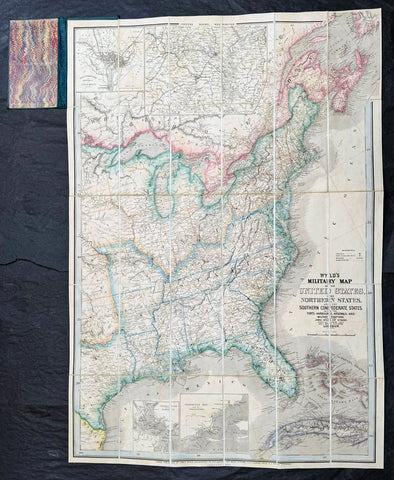
1865 James Wyld Large Antique Folding American Civil War Map - Extremely Rare
Antique Map
- Title : Wyld's Military Map Of The United States, The Northern States, And The Southern Confederate States: With The Forts, Harbours, Arsenals And Military Positions. James Wyld, 457 Strand; Charing Cross East And 2, Royal Exchange London. ......London, Published By James Wyld, Geographer To The Queen
- Date : 1865
- Size: 34 1/2in x 24in (875mm x 610mm)
- Condition: (A+) Fine Condition
- Ref: 35660
Description:
A very rare map of the United States first issued in 1861, during the Secession Crises that preceded the outbreak of the American Civil War, with this rare edition issued in January 1865 - dated at the foot of the map, only 4 months before the end of the war..
There are a few 1861 editions of this map for sale, currently on the market, but I have been unable to find an 1865 edition, either currently on the market or sold in the past.
General Definitions:
Paper thickness and quality: - Heavy and stable
Paper color : - off white
Age of map color: - Original
Colors used: - Yellow, green, blue, pink
General color appearance: - Authentic
Paper size: - 34 1/2in x 24in (875mm x 610mm)
Plate size: - 34 1/2in x 24in (875mm x 610mm)
Margins: - Min 1/2in (12mm)
Imperfections:
Margins: - None
Plate area: - None
Verso: - None
Background:
Wyld was particularly masterful at capturing political events throughout the world as they happened and leveraging his impressive publishing operation to quickly produce and distribute pertinent to the invested public. In this case, the map distinguishes between the 'Northern States' (orange border) and the 'Southern Confederate States' (blue border). Wyld here erroneously conflates slaveholding states with Confederate secessionist states - in particular, Missouri, Kentucky, Delaware, and Maryland, which allowed slavery but remained loyal to the Union. Arsenals, forts, and military posts highlighted and keyed, underscoring that 'war' was very much in the air. The map is also noteworthy for recognizes the apocryphal territory 'Chippewa', roughly corresponding to modern-day North Dakota.
This map is scarce to the market. Known institutions holdings at the Boston Public Library, the Library of Congress, Bibliothèque nationale de France, the David Rumsey Collection, among others. (Ref: M&B; Tooley; Clancy) (Ref: Tooley, Koeman, Burden)
Please note all items auctioned are genuine, we do not sell reproductions. A Certificate of Authenticity (COA) can be issued on request.
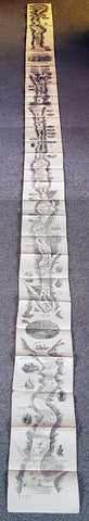
1866 A.R. Waud Long Folding Antique Map St Lawrence River Niagara Fall to Quebec
- Title : ...(Panoramic view of the St Lawrence River from Niagara Falls to Quebec City)....Drawn by Alfred R Waud Boston US
- Size: 144in x 7 1/2in (365cm x 190mm)
- Condition: (A+) Fine Condition
- Date : 1866
- Ref #: 91279
Description:
This is an extraordinary piece of antique early marketing promotion drawn by one of Americas famous Civil War illustrators Alfred Waud.
This very long (12ft) folding lithograph map, a panoramic birds eye view of the St Lawrence River from Niagara Falls to the city of Quebec was drawn by Alfred Waud and published in c1866.
General Definitions:
Paper thickness and quality: - Heavy and stable
Paper color : - off white
Age of map color: -
Colors used: -
General color appearance: -
Paper size: - 144in x 7 1/2in (365cm x 190mm)
Plate size: - 144in x 7 1/2in (365cm x 190mm)
Margins: - N/A
Imperfections:
Margins: - Light age toning
Plate area: - Folds as issued, light age toning
Verso: - Light age toning
Background:
This is a rare piece and lucky to have survived intact and in such good condition. The map begins at Niagara falls to lake Ontario noting all towns and settlements, including Native Americans, carrying on Prescott, many other smaller towns. Illustrations of Native Americans, trappers, ships, wrecks and much more ending up in the city of Quebec adorn the map
Waud, Alfred 1828 - 1891
Waud was an American artist and illustrator, born in London, England. He is most notable for the sketches he made as an artist correspondent during the American Civil War.
The period during the American Civil War was a time when all images in a publication had to be hand drawn and engraved by skilled artists. Photography existed but there was no way to transfer a photograph to a printing plate since this was well before the advent of the halftone process for printing photographs. Photographic equipment was too cumbersome and exposure times were too slow to be used on the battlefield. An artist such as Waud would do detailed sketches in the field, which were then rushed by courier back to the main office of the newspaper they were working for. There a staff of engravers would use the sketches to create engravings on blocks of boxwood. Since the blocks were about 4 inches across they would have to be composited together to make one large illustration. The wood engraving was then copied via the electrotype process which produced a metal printing plate for publication.
In 1860, Alfred Waud became an illustrator or special artist (a full-time paid staff artist) for the New York Illustrated News. In April 1861, the newspaper assigned Waud to cover the Army of the Potomac, Virginias main Union army. He first illustrated General Winfield Scott in Washington, D.C., and then entered the field to render the First Battle of Bull Run in July. Waud followed a Union expedition to Cape Hatteras, North Carolina the next month and witnessed the Battle of Hatteras Inlet Batteries. That autumn, he sketched army activity in the Tidewater region of Virginia. Waud joined Harpers Weekly toward the end of 1861, continuing to cover the war. In 1864 Alfreds brother, William Waud (who up to that time had been working with Frank Leslies Illustrated Newspaper), joined Alfred on the staff of Harpers and they worked together during the Petersburg Campaign.
Alfred Waud attended every battle of the Army of the Potomac between the First Battle of Bull Run in 1861 and the Siege of Petersburg in 1865. Alfred was one of only two artists present at the Battle of Gettysburg. His depiction of Picketts Charge is thought to be the only visual account by an eyewitness.
Waud continued to be a prolific illustrator, doing numerous illustrations for Harpers Weekly and other prominent publications, achieving his greatest fame in his post-War work.
Waud died in 1891 in Marietta, Georgia, while touring battlefields of the South.
1869 DT Valentine Antique Print of the Proposed East River or Brooklyn Bridge NY
Antique Map
- Title : Contemplated East River Bridge
- Size: 11in x 7 1/2in (280mm x 190mm)
- Condition: (A+) Fine Condition
- Date : 1869
- Ref #: 93310
Description:
This original antique lithograph print, a view of the proposed Brooklyn Bridge in 1869 by George Hayward was published in the 1869 edition of D T Valentines Manual of the Corporation of the City of New York or Valentines Manual.
The Brooklyn Bridge started construction in 1869 and was completed fourteen years later in 1883. It was originally called the New York and Brooklyn Bridge and the East River Bridge, but it was later dubbed the Brooklyn Bridge. However, it was not named as such until the city government passed a law to that effect in 1915. Over the years, the Brooklyn Bridge has undergone several reconfigurations; it formerly carried horse-drawn vehicles and elevated railway lines, but now carries vehicular, pedestrian, and bicycle traffic. Commercial vehicles are banned from the bridge.
General Definitions:
Paper thickness and quality: - Heavy and stable
Paper color : - off white
Age of map color: -
Colors used: -
General color appearance: -
Paper size: - 11in x 7 1/2in (280mm x 190mm)
Plate size: - 11in x 7 1/2in (280mm x 190mm)
Margins: - Min 1/2in (12mm)
Imperfections:
Margins: - None
Plate area: - Folds as issued
Verso: - None
Background:
Manual of the Corporation of the City of New York or Valentines Manuals, published for nearly 30 years, contained hundreds of rare beautifully hand coloured contemporary and historical lithograph maps and views of New York City.
Valentine, David Thomas 1801 - 1869
As the Clerk of the Common Council of New York City, Valentine edited and published a series of books on the history and contemporary facts of New York City entitled Manual of the Corporation Of The City of New York. They became know as Valentines Manuals with updates published annually, between 1841 & 1870. Valentine used his manuals to produce some of the rarest and most important maps & views of the city of New York, some of which occasionally appear on the market. His contribution to the historical record of New York city cannot be over stated.
1869 Mitchell Antique Map - Plan of The City of Cincinnati
- Title : Plan of Cincinnati and Vicinity....1869 by S. Augustus Mitchell
- Ref #: 35044
- Size: 15in x 12in (380mm x 300mm)
- Date : 1870
- Condition: (A+) Fine Condition
Description:
This beautifully hand coloured original antique city plan map was published by Samuel Augustus Mitchell in the 1870 edition of his large New General Atlas - dated at the foot of the map.
These county, state, city & country maps are some of the most ornate and beautifully coloured maps published in the US in the 19th century. For over 50 years, Mitchell his son's and their successors were the most prominent cartographical publishers of maps and atlases in the United States.
General Description:
Paper thickness and quality: - Heavy & stable
Paper color: - White
Age of map color: - Original
Colors used: - Green, pink, yellow
General color appearance: - Authentic
Paper size: - 15in x 12in (380mm x 300mm)
Plate size: - 15in x 12in (380mm x 300mm)
Margins: - Min 1/2in (10mm)
Imperfections:
Margins: - None
Plate area: - None
Verso: - None
1869 Mitchell Antique Map of The State of Illinois
- Title : County Map of the State of Illinois....1869 by S. Augustus Mitchell
- Ref #: 35045
- Size: 15in x 12in (380mm x 300mm)
- Date : 1870
- Condition: (A+) Fine Condition
Description:
This beautifully hand coloured original antique map was published by Samuel Augustus Mitchell in the 1870 edition of his large New General Atlas - dated at the foot of the map.
These county, state, city & country maps are some of the most ornate and beautifully coloured maps published in the US in the 19th century. For over 50 years, Mitchell his son's and their successors were the most prominent cartographical publishers of maps and atlases in the United States.
General Description:
Paper thickness and quality: - Heavy & stable
Paper color: - White
Age of map color: - Original
Colors used: - Green, pink, yellow
General color appearance: - Authentic
Paper size: - 15in x 12in (380mm x 300mm)
Plate size: - 15in x 12in (380mm x 300mm)
Margins: - Min 1/2in (10mm)
Imperfections:
Margins: - None
Plate area: - None
Verso: - None
1869 Shannon & Rogers Birds Eye View of New York City - New York Manual
Antique Map
- Title : Designed and Engraved For New York and Environs. The New York Manual 1869
- Size: 16in x 12in (405mm x 275mm)
- Condition: (A+) Fine Condition
- Date : 1869
- Ref #: 93208
Description:
This original antique lithograph print of New York City by Joseph Shannon & WC Rogers in 1869 (dated) and was published in the 1869 edition of D T Valentines Manual of the Corporation of the City of New York or Valentines Manual.
General Definitions:
Paper thickness and quality: - Heavy and stable
Paper color : - off white
Age of map color: -
Colors used: -
General color appearance: -
Paper size: - 16in x 12in (405mm x 275mm)
Plate size: - 16in x 12in (405mm x 275mm)
Margins: - Min 1/2in (12mm)
Imperfections:
Margins: - Bottom right margin extended, not affecting the image
Plate area: - Folds as issued
Verso: - Folds as issued.
Background:
Rare view of the island of Manhattan, New York City by W. C. Rogers. The view depicts the entire island of Manhattan with Hoboken as well as parts of Brooklyn and Queens. Important buildings, especially churches are depicted with considerable accuracy. The harbor itself is full of sailing ships.
William C. Rogers 1860 - 1873 (active) a New York based lithographer best known for his engravings issued in conjuction with Joseph Shannons (Valentines) Manual of the Corporation for the City of New York.
Valentine, David Thomas 1801 - 1869
As the Clerk of the Common Council of New York City, Valentine edited and published a series of books on the history and contemporary facts of New York City entitled Manual of the Corporation Of The City of New York. They became know as Valentines Manuals with updates published annually, between 1841 & 1870. Valentine used his manuals to produce some of the rarest and most important maps & views of the city of New York, some of which occasionally appear on the market. His contribution to the historical record of New York city cannot be over stated.
1870 Amand-Durand after Albrecht Durer Antique Print - Frederick III of Saxony
- Title : Christo Sacrum.....Fridr Dvci Saxon....Albertus Durer....MDXXIIII
- Size: 13 1/2in x 9 1/2in (345mm x 240mm)
- Condition: (A+) Fine Condition
- Date : 1870
- Ref #: 22401
Description:
This fine, original antique wood-cut print of the protector of Martin Luther, Frederick the Wise of Saxony, by the famous German engraver Albrecht Dürer in 1496 was faithfully re-engraved and published by Charles Amand-Durand in 1870.
These beautiful re-engravings of classic and historical wood-cuts were painstakingly re-issued by Amand-Durand in Paris in the mid to late 19th century. Such is the quality of his re-strikes that Durands prints are now in major institutional collections such a the Louvre, National Gallery, The Met and many other famous Galleries. Please see below for further background on Amand-Durand.
General Definitions:
Paper thickness and quality: - Heavy and stable
Paper color : - off white
Age of map color: -
Colors used: -
General color appearance: -
Paper size: - 14in x 9 1/2in (350mm x 240mm)
Plate size: - 8in x 6in (205mm x 1530mm)
Margins: - Min 1in (25mm)
Imperfections:
Margins: - None
Plate area: - None
Verso: - None
Background:
Albrecht Dürer 1471 – 1528 was a painter, printmaker, and theorist of the German Renaissance. Born in Nuremberg, Dürer established his reputation and influence across Europe when he was still in his twenties due to his high-quality woodcut prints. He was in communication with the major Italian artists of his time, including Raphael, Giovanni Bellini and Leonardo da Vinci, and from 1512 he was patronized by emperor Maximilian I. Dürer is commemorated by both the Lutheran and Episcopal Churches.
Dürer\'s vast body of work includes engravings, his preferred technique in his later prints, altarpieces, portraits and self-portraits, watercolours and books. The woodcuts, such as the Apocalypse series (1498), are more Gothic than the rest of his work. His well-known engravings include the Knight, Death, and the Devil (1513), Saint Jerome in his Study (1514) and Melencolia I (1514), which has been the subject of extensive analysis and interpretation. His watercolours also mark him as one of the first European landscape artists, while his ambitious woodcuts revolutionized the potential of that medium.
Dürer\'s introduction of classical motifs into Northern art, through his knowledge of Italian artists and German humanists, has secured his reputation as one of the most important figures of the Northern Renaissance. This is reinforced by his theoretical treatises, which involve principles of mathematics, perspective, and ideal proportions.
The Portrait of Frederick III of Saxony is a tempera on canvas painting by German Renaissance artist Albrecht Dürer, executed in 1496. It is housed in the Gemäldegalerie of Berlin, Germany.
The painting was one of the first commissions received from Frederick III, Elector of Saxony, together with the Seven Sorrows Polyptych and the central panel of the Dresden Altarpiece. Dürer knew the elector during the latter\'s short stay in Nuremberg in April 1496.
The German artist portrayed the Elector again in a burin etching in 1524.
Dürer portrayed Fredericks bust from three-quarters, looking right, above a dark green background. Elements such as the parapet on which his arms lie, or the hands holding a roll, were typical of Flemish art of the period.
Frederick\'s impervious personality, as well as his status, are emphasized by the large beret and by his determined glance.
Frederick III 1463 – 1525, also known as Frederick the Wise (German Friedrich der Weise) was Elector of Saxony from 1486 to 1525, who is mostly remembered for the worldly protection of his subject Martin Luther.
1870 Amand-Durand after Baccio Baldini Antique Print Ludovico Gonzaga III & Wife
- Title : Ludovico Gonzaga III and his Wife
- Date : 1870
- Condition: (A+) Fine Condition
- Ref: 22042
- Size: 13 1/2in x 9 1/2in (345mm x 240mm)
Description:
This fine, original antique Heliograph of Ludovico Gonzaga III and his Wife, Barbara of Brandenburg, by the Italian engraver Andrea Mantegna in the 15th century was re-engraved and published by Charles Amand-Durand in 1870.
These faithful re-engravings of classic and historical wood-cuts were faithfully re-issued by Amand-Durand in Paris in the mid to late 19th century. Such is the quality of his re-strikes that Durands prints are now in major institutional collections such a the Louvre, National Gallery, The Met and many other famous Galleries. Please see below for further background on Amand-Durand.
General Definitions:
Paper thickness and quality: - Heavy and stable
Paper color : - off white
Age of map color: -
Colors used: -
General color appearance: -
Paper size: - 13 1/2in x 9 1/2in (345mm x 240mm)
Plate size: - 8in x 6in (205mm x 1530mm)
Margins: - Min 1in (25mm)
Imperfections:
Margins: - None
Plate area: - None
Verso: - None
Background:
Andrea Mantegna 1431 – 1506 was an Italian painter, a student of Roman archeology, and son-in-law of Jacopo Bellini. Like other artists of the time, Mantegna experimented with perspective, e.g. by lowering the horizon in order to create a sense of greater monumentality. His flinty, metallic landscapes and somewhat stony figures give evidence of a fundamentally sculptural approach to painting. He also led a workshop that was the leading producer of prints in Venice before 1500.
Mantegna was no less eminent as an engraver, though his history in that respect is somewhat obscure, partly because he never signed or dated any of his plates, but for a single disputed instance of 1472. The account which has come down to us from Vasari (as usual keen to assert that everything flows from Florence) is that Mantegna began engraving in Rome, prompted by the engravings produced by the Florentine Baccio Baldini after Sandro Botticelli. This is now considered most unlikely as it would consign all the numerous and elaborate engravings made by Mantegna to the last sixteen or seventeen years of his life, which seems a scanty space for them, and besides the earlier engravings indicate an earlier period of his artistic style. He may have begun engraving while still in Padua, under the tuition of a distinguished goldsmith, Niccolò. He and his workshop engraved about thirty plates, according to the usual reckoning; large, full of figures, and highly studied. It is now considered either that he only engraved seven himself, or none. Another artist from the workshop who made several plates is usually identified as Giovanni Antonio da Brescia (aka Zoan Andrea).
Among the principal examples are: Battle of the Sea Monsters, Virgin and Child, a Bacchanal Festival, Hercules and Antaeus, Marine Gods, Judith with the Head of Holophernes, the Deposition from the Cross, the Entombment, the Resurrection, the Man of Sorrows, the Virgin in a Grotto, and several scenes from the Triumph of Julius Caesar after his paintings. Several of his engravings are supposed to be executed on some metal less hard than copper. The technique of himself and his followers is characterized by the strongly marked forms of the design, and by the parallel hatch marks to produce shadows. The closer the parallel marks, the darker the blacks were. The prints are frequently to be found in two states, or editions. In the first state the prints have been taken off with the roller, or even by handpressing, and they are weak in tint; in the second state the printing press has been used, and the ink is stronger.
Neither Mantegna or his workshop are now believed to have produced the so-called Mantegna Tarocchi cards.
Ludovico III Gonzaga of Mantua, also spelled Lodovico 1412 – 1478 was the ruler of the Italian city of Mantua from 1444 to his death in 1478.
Ludovico was the son of Gianfrancesco I Gonzaga and Paola Malatesta.
Ludovico followed the path of his father, Gianfrancesco, fighting as a condottiero from as early as 1432, when Gianfrancesco was vice-commander of Francesco Bussone\'s army. In 1433, he married Barbara of Brandenburg, niece of emperor Sigismund.
Starting from 1436 (perhaps without the approval of his father) he entered the service of the Visconti of the Duchy of Milan. The result was that Gianfrancesco exiled Ludovico from Mantua, together with his wife, naming Carlo Gonzaga as heir. However, in 1438 Gianfrancesco himself was hired by the Visconti, and reconciled with Ludovico in 1441. Ludovico succeeded to the marquisate of Mantua in 1444, although part of the family fiefs went to his brothers Carlo, Gianlucido and Alessandro. At the time, the Mantuan state was reduced in size and in poor conditions after years of war and large expenses.
From 1445 to 1450 Ludovico served as condottiero for Milan, Florence, Venice and Naples, switching his allegiance in order to grant the higher level of peace for his lands. In 1448 he took part in the battle of Caravaggio, and was forced to flee. In 1449 he entered the service of Venice in the league formed with Florence against Milan. In 1450 he received permission to lead an army for King Alfonso of Naples in Lombardy, with the intent of gaining some possessions for himself. However, Francesco Sforza, the new duke of Milan, enticed him with the promise of Lonato, Peschiera and Asola, formerly Mantuan territories but then part of Venice. Venice responded by sacking Castiglione delle Stiviere (1452) and hiring Ludovico\'s brother, Carlo.
On 14 June 1453 Ludovico routed the troops of Carlo at Goito, but Venetian troops under Niccolò Piccinino thwarted any attempt to regain Asola. The Peace of Lodi (1454) obliged Ludovico to give back all his conquests, and to renounce definitively his claim to the three cities. However, he obtained his brother\'s land after Carlos childless death in 1456.
The moment of highest prestige for Mantua was the Council, held in the city from 27 May 1459 to 19 January 1460, summoned by Pope Pius II to launch a crusade against the Ottoman Turks, who had conquered Constantinople some years earlier. However, the pope was not satisfied with the host city, writing: The place was marshy and unhealthy, and the heat burnt up everything; the wine was unpalatable and the food unpleasant. However, the council ended on a note of great personal prestige for Ludovico with the elevation of his son Francesco to the purple.
From 1466 Ludovico was more or less constantly at the service of the Sforza of Milan. He died in Goito in 1478, during a plague. He was buried in Mantua cathedral
1870 Amand-Durand after Heinrich Aldegrever Antique Print - Parable of Lararus
- Title : Erumnos hic lazar iages ad ianva divitis/Dives epvlo elamis
- Date : 1870
- Condition: (A+) Fine Condition
- Ref: 22444
- Size: 13 1/2in x 9 1/2in (345mm x 240mm)
Description:
This fine, original antique Heliograph two panels of the parable of The Rich Man and Lazarus or Dives and Lazarus or Lazarus and Dives by the German engraver Heinrich Aldegrever or Aldegraf in the early 16th century was re-engraved and published by Charles Amand-Durand in 1870.
These faithful re-engravings of classic and historical wood-cuts were faithfully re-issued by Amand-Durand in Paris in the mid to late 19th century. Such is the quality of his re-strikes that Durands prints are now in major institutional collections such a the Louvre, National Gallery, The Met and many other famous Galleries. Please see below for further background on Amand-Durand.
General Definitions:
Paper thickness and quality: - Heavy and stable
Paper color : - off white
Age of map color: -
Colors used: -
General color appearance: -
Paper size: - 13 1/2in x 9 1/2in (345mm x 240mm)
Plate size: - 8in x 6in (205mm x 1530mm)
Margins: - Min 1in (25mm)
Imperfections:
Margins: - None
Plate area: - None
Verso: - None
Background:
Heinrich Aldegrever or Aldegraf (1502–1561) was a German painter and engraver. He was one of the Little Masters, the group of German artists making small old master prints in the generation after Dürer.
Painter, printmaker and goldsmith active in a Westphalia milieu. Born in Paderborn. His real name was Trippenmecker, which in Westphalian dialect means a clog-maker. It is not known where Aldegrever was taught. He probably worked in a workshop of one of the Soest goldsmiths. His early works show a strong Westphalian influence. Aldegrever made a journey to the Netherlands, where he became acquainted with works of Joos van Cleve, Barendt van Orley, Lucas van Leyden and Jacob Cornelisz.
Around 1525 he moved to Soest, where a year later he painted the wings and predella of the Mary altar for the church of St. Peter. His signature and symbolic clog show that he was still using his fathers name.
His first engravings appeared in 1527. They were signed with a monogram AG, resembling closely that of Albrecht Dürer. In 1531, influenced by surrounding religious fervour, he became a Lutheran. Because of lack of church commissions he devoted most of his time to portrait painting and printmaking. Aldegrevers some 290 engravings and woodcuts, chiefly from his own designs, are delicate and minute, though somewhat hard in style, and entitle him to a place in the front rank of the so-called Little Masters: Barthel Beham, his brother Hans Sebald Beham, and Georg Pencz, with whom he is often compared. Like them, he was also a skilled ornament designer. From the close resemblance of his style to that of Albrecht Dürer he has also sometimes been called the Albert of Westphalia.
About a third of his prints were ornamental engravings; they were used as models by artists and craftsmen well into the seventeenth century.
Aldegrever, who actively supported the Reformation, executed portraits of Martin Luther and Philip Melanchthon. Although he chose the Lutheran Church, he had friends among the Anabaptists. He was commissioned by the bishop of Münster in 1535–36 to engrave portraits of Anabaptist leaders Jan van Leyden and Bernhard Knipperdolling, although they were already imprisoned, and only caricatures of them circulated. In the cycle Power of Death, done under visible influence of Hans Holbein, he criticizes the vices of the Catholic Church.
Aldegrever was interested also in folk subjects. In 1538 and 1551 two series of prints depicting marriage dances were made. An important part of his oeuvre are prints on mythological subjects, the Deeds of Hercules being one of the best examples.
Only two paintings are firmly attributed to him: the wings and predella of the Marienaltar (c. 1525-6) in the Wiesenkirche in Soest, and a portrait of Graf Phillip von Waldeck (1837) in Schloss Aroldsen
The parable of the rich man and Lazarus(also called the Dives and Lazarus or Lazarus and Dives) is a well-known parable of Jesus appearing in the Gospel of Luke.
The Gospel of Luke (Luke 16:19–31) tells of the relationship, during life and after death, between an unnamed rich man and a poor beggar named Lazarus. The traditional name Dives is not actually a name, but instead a word for rich man, dives in the text of the Latin Bible, the Vulgate. The rich man was also given the names Neuēs (i.e. Nineveh) and Fineas (i.e. Phineas) in the 3rd and 4th centuries.
Along with the parables of the Ten Virgins, Prodigal Son, and Good Samaritan, it was one of the most frequently illustrated parables in medieval art, perhaps because of its vivid account of an afterlife.
1870 Amand-Durand after Israhel van Meckenem Antique Print - Organ Player & Wife
- Title : The Organ player and his Wife
- Size: 13 1/2in x 9 1/2in (345mm x 240mm)
- Condition: (A+) Fine Condition
- Date : 1870
- Ref #: 22404
Description:
This fine, original antique wood-cut print of The Organ player and wife by Israhel van Meckenem in late 15th century was faithfully re-engraved and published by Charles Amand-Durand in 1870.
These beautiful re-engravings of classic and historical wood-cuts were painstakingly re-issued by Amand-Durand in Paris in the mid to late 19th century. Such is the quality of his re-strikes that Durands prints are now in major institutional collections such a the Louvre, National Gallery, The Met and many other famous Galleries. Please see below for further background on Amand-Durand.
General Definitions:
Paper thickness and quality: - Heavy and stable
Paper color : - off white
Age of map color: -
Colors used: -
General color appearance: -
Paper size: - 14in x 9 1/2in (350mm x 240mm)
Plate size: - 8in x 6in (205mm x 1530mm)
Margins: - Min 1in (25mm)
Imperfections:
Margins: - None
Plate area: - None
Verso: - None
Background:
This husband-and-wife duo performs an intimate domestic concert, jointly playing a diminutive pipe organ with four stops. The wife operates the two bellows in time to the music, giving voice to the notes, while her husband creates the melody on the keyboard. He is clad in a housecoat and comfortable slippers and she wears a cozy fur-trimmed dress. Shown at the same scale and working in tandem, they symbolize a harmonious marriage. The little dog listening attentively is both an emblem of loyalty and a realistic detail of their well-to-do home.
Israhel van Meckenem (c.1445 – 10 November 1503), also known as Israhel van Meckenem the Younger, was a German printmaker and goldsmith, perhaps of a Dutch family origin.
He was the most prolific engraver of the fifteenth century and an important figure in the early history of old master prints. He was active from 1465 until his death.
He probably trained with Master E. S. in South Germany, and may well have been with him at his death c. 1467, since he acquired and reworked forty-one of the master\'s plates. Another two hundred of van Meckenem\'s own prints also were copies of ones by Master E. S. In total, he produced over six hundred plates, most of which were copies of other prints; they represent about 20% of print production by all Northern European artists in the period of his working life. His career lasted long enough for him to copy Dürer prints.
He copied prints by the Housebook Master, including some now otherwise lost, Martin Schongauer, and many other German engravers. His famous and very fine late series on the Life of the Virgin appears to have been based on drawings by Hans Holbein the Elder or his workshop, and he may have entered into a regular commercial relationship with Holbein.
His early works were fairly crude, but in the 1480s he developed an effective personal style and made increasingly large and finished works. His own compositions are often very lively, and take a great interest in the secular life of his day. One famous print, supposed to illustrate the story of St John the Baptist and Salome, pushes the specific incidents of the story far in the background to allow space for a scene of court dancers, dressed in the height of contemporary fashion, which takes up most of the plate.
He was sophisticated in self-presentation, signing later prints with his name and town, and producing the first self-portrait print of himself and his wife, which was also the first portrait print of an identifiable person. Some plates seem to have been reworked more than once by his workshop, or produced in more than one version, and many impressions have survived, so his ability to distribute and sell his prints was evidently equally well developed. He was apparently the first to issue engraved (as opposed to woodcut) indulgences, apparently bootlegged version[s] ... never subject to papal review; one print promises 20,000 years reduction of time in Purgatory per set of prayers, increased in a second state to 45,000 years.
In the Heures de Charles d\'Angoulême, an important manuscript showing the links between printmaking and illumination in the late 15th century, Robinet Testard incorporated sixteen of van Meckenem\'s prints, gluing them directly on to the vellum then overpainting.
1870 Amand-Durand after Jacapo de Barbari Antique Print Holy Family w/ St Paul
- Title : Holy Family with St. Anne, St. Paul and Lute-Playing Angel
- Size: 13 1/2in x 9 1/2in (345mm x 240mm)
- Condition: (A+) Fine Condition
- Date : 1870
- Ref #: 22408
Description:
This fine, original antique wood-cut print of Holy Family with St Paul by Jacapo de Barbari in the early 16th century was faithfully re-engraved and published by Charles Amand-Durand in 1870.
These beautiful re-engravings of classic and historical wood-cuts were painstakingly re-issued by Amand-Durand in Paris in the mid to late 19th century. Such is the quality of his re-strikes that Durands prints are now in major institutional collections such a the Louvre, National Gallery, The Met and many other famous Galleries. Please see below for further background on Amand-Durand.
General Definitions:
Paper thickness and quality: - Heavy and stable
Paper color : - off white
Age of map color: -
Colors used: -
General color appearance: -
Paper size: - 14in x 9 1/2in (350mm x 240mm)
Plate size: - 8in x 6in (205mm x 1530mm)
Margins: - Min 1in (25mm)
Imperfections:
Margins: - None
Plate area: - None
Verso: - None
Background:
Jacopo de Barbari sometimes known or referred to as de Barbari, de Barberi, de Barbari, Barbaro, Barberino, Barbarigo or Barberigo (1460/70 – 1516), was an Italian painter and print-maker with a highly individual style. He moved from Venice to Germany in 1500, thus becoming the first Italian Renaissance artist of stature to work in Northern Europe. His few surviving paintings (about twelve) include the first known example of trompe l oeil since antiquity. His twenty-nine engravings and three very large woodcuts were also highly influential.
His earliest documented work is his huge (1.345 x 2.818 metres, from six blocks) and impressive woodcut aerial view Map of Venice, for which a privilege was granted to its publisher in 1500, recording that the work had taken three years. This clearly drew on the work of many surveyors, but was a spectacular feat nonetheless, and caused a considerable stir from the first. It was later updated by others to reflect major new building projects in a second state of the print.
Apart from the Map of Venice, he produced two other woodcuts, both of men and satyrs, which were the largest and most impressive figurative woodcuts yet produced, and which established the Italian tradition of fine, large, woodcuts for the following decades. These may have also been produced before 1500; they are clearly strongly influenced by Mantegna.
By the time the Map of Venice was published de\' Barbari had already left for Germany, where he met Dürer, who he may have already known from Dürer\'s first Italian trip (a passage in a letter of Dürer\'s is ambiguous). They discussed human proportion, not obviously one of de\' Barbari\'s strengths, but Dürer was evidently fascinated by what he had to say, though he recorded that de\' Barberi had not told him everything he knew:
...I find no one who has written anything about how to make canon of human proportions except for a man named Jacob, born in Venice and a charming painter. He showed me a man and a woman which he had made according to measure, so that I would now rather see what he meant than behold a new kingdom... Jacobus did not want to show his principles to me clearly, that I saw well. (From an unpublished draft of the Introduction to Dürer\'s own book on human proportions)
Twenty years later Dürer tried unsuccessfully to get the Archduchess Margaret, Habsburg Regent of the Netherlands, to give him a manuscript book she had on the subject by de Barbari, by then dead; the book has not survived.
His style is related to his possible master, Alvise Vivarini and to Giovanni Bellini, but has a languorous quality all its own. Apart from Dürer, the influence of Mantegna\'s technique also appears in what are probably the earlier engravings, done around the turn of the century, with parallel hatching. His engravings are mostly small, showing just a few figures. Truculent satyrs feature in several prints; there are a number of mythological subjects, including two Sacrifices to Priapus.
The earlier prints show figures with small heads and somewhat shapeless bodies, with sloping shoulders and thick torsos supported by slender legs — also seen in his paintings. Probably from a middle period come several nudes, the most famous being Apollo and Diana, St Sebastian and the Three Bound Captives. In these his ability to organise the whole composition has greatly improved.
In a final group, the style becomes more Italianate, and the compositions more complex. These have an enigmatic, haunting atmosphere, and a very refined technique. Levenson has proposed that they date from his period in the Netherlands and were influenced by the young Lucas van Leyden.

1870 Amand-Durand after Marcantonio Raimondi Antique Print Writer Pietro Aretino
- Title : Petrus Arretinus Acerrimus Virtutum Ac Vitiorum Demostrator
- Size: 13 1/2in x 9 1/2in (345mm x 240mm)
- Condition: (A+) Fine Condition
- Date : 1870
- Ref #: 22442
Description:
This fine, original antique wood-cut print of the Italian playwright and poet Pietro Aretino by Marcantonio Raimondi in the early 16th century was faithfully re-engraved and published by Charles Amand-Durand in 1870.
These beautiful re-engravings of classic and historical wood-cuts were painstakingly re-issued by Amand-Durand in Paris in the mid to late 19th century. Such is the quality of his re-strikes that Durands prints are now in major institutional collections such a the Louvre, National Gallery, The Met and many other famous Galleries. Please see below for further background on Amand-Durand.
General Definitions:
Paper thickness and quality: - Heavy and stable
Paper color : - off white
Age of map color: -
Colors used: -
General color appearance: -
Paper size: - 14in x 9 1/2in (350mm x 240mm)
Plate size: - 8in x 6in (205mm x 1530mm)
Margins: - Min 1in (25mm)
Imperfections:
Margins: - None
Plate area: - None
Verso: - None
Background:
Marcantonio Raimondi, often called simply Marcantonio 1470-1482 was an Italian engraver, known for being the first important print-maker whose body of work consists largely of prints copying paintings. He is therefore a key figure in the rise of the reproductive print. He also systematized a technique of engraving that became dominant in Italy and elsewhere. His collaboration with Raphael greatly helped his career, and he continued to exploit Raphael\'s works after the painter\'s death in 1520, playing a large part in spreading High Renaissance styles across Europe. Much of the biographical information we have comes from his life, the only one of a printmaker, in Vasaris Lives of the Artists.
About this time he began to make copies of Dürers woodcut series, the Life of the Virgin. This was extremely common practice, although normally engravers copied other expensive engravings rather than the cheaper woodcuts. However Dürers woodcuts had raised the standard of the medium considerably, and since Marcantonio continued to copy a large number of both Dürers engravings and woodcuts, he must have found it profitable.
His early copies included Dürers famous AD monogram, and Dürer made a complaint to the Venetian Government, which won him some legal protection for his monogram, but not his compositions, in Venetian territory - an important case in the slowly evolving history of intellectual property law.
Marcantonio appears to have spent some of the last half of the decade in Venice, but no dates are known.
The Massacre of the Innocents, designed by Raphael to be engraved.
He is attributed with around 300 engravings. After years of great success, his career ran into trouble in the mid-1520s; he was imprisoned for a time in Rome over his role in the series of erotic prints I Modi, and then, according to Vasari, lost all his money in the Sack of Rome in 1527, after which none of his work can be securely dated.
Pietro Aretino 1492 – 1556 was an Italian author, playwright, poet, satirist and blackmailer, who wielded influence on contemporary art and politics and developed modern literary pornography.
1870 Amand-Durand after Martin Schongauer Antique Print - Flight into Egypt
- Title : The Flight into Egypt
- Size: 13 1/2in x 9 1/2in (345mm x 240mm)
- Condition: (A+) Fine Condition
- Date : 1870
- Ref #: 22406
Description:
This fine, original antique wood-cut print an illustrating of the Flight out of Israel into Egypt by The Holy Family by Martin Schongauer - signed M†S - in 15th century was faithfully re-engraved and published by Charles Amand-Durand in 1870.
These beautiful re-engravings of classic and historical wood-cuts were painstakingly re-issued by Amand-Durand in Paris in the mid to late 19th century. Such is the quality of his re-strikes that Durands prints are now in major institutional collections such a the Louvre, National Gallery, The Met and many other famous Galleries. Please see below for further background on Amand-Durand.
General Definitions:
Paper thickness and quality: - Heavy and stable
Paper color : - off white
Age of map color: -
Colors used: -
General color appearance: -
Paper size: - 14in x 9 1/2in (350mm x 240mm)
Plate size: - 8in x 6in (205mm x 1530mm)
Margins: - Min 1in (25mm)
Imperfections:
Margins: - None
Plate area: - None
Verso: - None
Background:
Martin Schongauer 1445 - 1491 was one of the most prolific early engravers from the Rhine Valley. He signed all his prints with his initials, making him the first printmaker whose authorship was absolutely clear. While a handful of the artist’s paintings survive, Schongauer’s engravings inspired generations of artists, including Albrecht Dürer. This iconic image shows the Holy Family resting while fleeing the Massacre of the Innocents and their home in Israel for Egypt. The work reflects some traditional accounts of the story, in which angels lowered date palms for easy harvesting, so Mary, Joseph, and the Christ Child would not starve.
Schongauer was the most important printmaker north of the Alps before Albrecht Dürer.
The main work of Schongauer\'s life was the production of a large number of beautiful engravings, which were largely sold, not only in Germany, but also in Italy and even in England and Spain. Vasari says that Michelangelo copied one of his engravings, in the Trial of Saint Anthony. His style shows no trace of Italian influence, but a very clear and organised Gothic.
His subjects are mainly religious, but include comic scenes of ordinary life such as the Peasant family going to market or the Two apprentices fighting. One hundred and sixteen engravings are generally recognised as by his hand, and since several are only known from a single impression, there were probably others that are now lost. Many of his pupils\' plates as well as his own are signed, M†S, as are many copies probably by artists with no connection to him.
Among the most renowned of Schongauer\'s engravings are the series of the Passion and the Death and Coronation of the Virgin, and the series of the Wise and Foolish Virgins. All are remarkable for their miniature-like treatment, their brilliant touch, and their chromatic force. Some, such as the Death of the Virgin and the Adoration of the Magi are richly-filled compositions of many figures, treated with much largeness of style in spite of their minute scale.
He established the system of depicting volume by means of cross-hatching (lines in two directions) which was further developed by Dürer, and was the first engraver to curve parallel lines, probably by rotating the plate against a steady burin. He also developed a burin technique producing deeper lines on the plate, which meant that more impressions could be taken before the plate became worn.
According to Arthur Mayger Hind, Schongauer was one of the first German engravers to rise above the Gothic limitations both of setting and type and that he actualises an idea of beauty which in its nearer approach to more absolute ideals appeals to a far more universal appreciation than earlier engravers such as Master E. S.
The British Museum and other major print rooms possess fine collections of Schongauer\'s prints.

1870 Amand-Durand after Van Leyden Antique Print St George rescuing the Princess
- Title : Heliogravure et imp. A. Durand_Paris
- Size: 13 1/2in x 9 1/2in (345mm x 240mm)
- Condition: (A+) Fine Condition
- Date : 1870
- Ref #: 22443
Description:
This fine, original antique Heliograph of St. George Liberating the Princess by Lucas Van Leyden (1494 - 1533) in 1508 was re-engraved and published by Charles Amand-Durand in 1870.
These faithful re-engravings of classic and historical wood-cuts were faithfully re-issued by Amand-Durand in Paris in the mid to late 19th century. Such is the quality of his re-strikes that Durands prints are now in major institutional collections such a the Louvre, National Gallery, The Met and many other famous Galleries. Please see below for further background on Amand-Durand.
General Definitions:
Paper thickness and quality: - Heavy and stable
Paper color : - off white
Age of map color: -
Colors used: -
General color appearance: -
Paper size: - 13 1/2in x 9 1/2in (345mm x 240mm)
Plate size: - 8in x 6in (205mm x 1530mm)
Margins: - Min 1in (25mm)
Imperfections:
Margins: - None
Plate area: - None
Verso: - None
Background:
Lucas van Leyden (1494 – 1533), also named either Lucas Hugensz or Lucas Jacobsz, was a Dutch engraver and painter. He was among the first Dutch exponents of genre painting and is generally regarded as a very accomplished engraver.
Lucas was the son of Huygh Jacobsz. and was mainly active in Leiden.
Carel van Mander characterizes Lucas as a tireless artist, who as a child annoyed his mother by working long hours after nightfall, which she forbid not only for the cost of candlelight, but also because she felt that too much study was bad for his sensibilities. According to Van Mander, as a boy he only consorted with other young artists, such as painters, glass-etchers and goldsmiths, and was paid by the Heer van Lochorst (Johan van Lockhorst of Leiden, who died in 1510) a golden florin for each of his years at age 12 for a watercolor of St. Hubert.
From 1513 to 1517, Lucas created a series of woodcuts called The Power of Women which consisted of two large and small sets of prints. The series is one of a number of representations of the Power of Women theme, which was extremely popular in Renaissance art and literature. Artworks in the genre depict the traditional roles of men and women in inverse, with women dominating over men in various situations. The subjects illustrated often consist of legendary historical women who were considered to be virtuous heroines as well as women who were considered cunning, seductive, and manipulative of men. The purpose of the Power of Women theme was to demonstrate that even the strongest and wisest of men were not resistant to the sexuality of women.
The legend of Saint George and the Dragon describes the saint taming and slaying a dragon that demanded human sacrifices; the saint thereby rescues the princess chosen as the next offering.
1870 Amand-Durand after Van Leyden Antique Print The Annunciation to Virgin Mary
- Title : Heliogravure et imp A. Durand...Paris
- Date : 1870
- Condition: (A+) Fine Condition
- Ref: 22445
- Size: 14in x 9 1/2in (350mm x 240mm)
Description:
This fine, original antique Heliograph of The Annunciation, the Virgin Mary visited by the Angel Gabriel by Lucas Van Leyden (1494 - 1533) in 1508 was re-engraved and published by Charles Amand-Durand in 1870.
These faithful re-engravings of classic and historical wood-cuts were faithfully re-issued by Amand-Durand in Paris in the mid to late 19th century. Such is the quality of his re-strikes that Durands prints are now in major institutional collections such a the Louvre, National Gallery, The Met and many other famous Galleries. Please see below for further background on Amand-Durand.
General Definitions:
Paper thickness and quality: - Heavy and stable
Paper color : - off white
Age of map color: -
Colors used: -
General color appearance: -
Paper size: - 13 1/2in x 9 1/2in (345mm x 240mm)
Plate size: - 8in x 6in (205mm x 1530mm)
Margins: - Min 1in (25mm)
Imperfections:
Margins: - None
Plate area: - None
Verso: - None
Lucas van Leyden (1494 – 1533), also named either Lucas Hugensz or Lucas Jacobsz, was a Dutch engraver and painter. He was among the first Dutch exponents of genre painting and is generally regarded as a very accomplished engraver.
Lucas was the son of Huygh Jacobsz. and was mainly active in Leiden.
Carel van Mander characterizes Lucas as a tireless artist, who as a child annoyed his mother by working long hours after nightfall, which she forbid not only for the cost of candlelight, but also because she felt that too much study was bad for his sensibilities. According to Van Mander, as a boy he only consorted with other young artists, such as painters, glass-etchers and goldsmiths, and was paid by the Heer van Lochorst (Johan van Lockhorst of Leiden, who died in 1510) a golden florin for each of his years at age 12 for a watercolor of St. Hubert.
From 1513 to 1517, Lucas created a series of woodcuts called The Power of Women which consisted of two large and small sets of prints. The series is one of a number of representations of the Power of Women theme, which was extremely popular in Renaissance art and literature. Artworks in the genre depict the traditional roles of men and women in inverse, with women dominating over men in various situations. The subjects illustrated often consist of legendary historical women who were considered to be virtuous heroines as well as women who were considered cunning, seductive, and manipulative of men. The purpose of the Power of Women theme was to demonstrate that even the strongest and wisest of men were not resistant to the sexuality of women.
The Annunciation (from Latin annuntiatio), also referred to as The Annunciation to the Blessed Virgin Mary, the Annunciation of Our Lady, or the Annunciation of the Lord, is the Christian celebration of the announcement by the angel Gabriel to the Virgin Mary that she would conceive and become the mother of Jesus, the Son of God, marking his Incarnation. Gabriel told Mary to name her son Yeshua, meaning YHWH is salvation.
According to Luke 1:26, the Annunciation occurred in the sixth month of Elizabeth\'s pregnancy with John the Baptist. Many Christians observe this event with the Feast of the Annunciation on 25 March, an approximation of the northern vernal equinox nine full months before Christmas, the ceremonial birthday of Jesus. The Annunciation is a key topic in Christian art in general, as well as in Marian art in the Catholic Church, particularly during the Middle Ages and Renaissance. A work of art depicting the Annunciation is sometimes itself called an Annunciation.
1870 Augustin Mongin after Sir Peter Lely Antique Print of Princess Mary II as Diana
- Title : Mary II depicted as Diana
- Date : 1878
- Condition: (A+) Fine Condition
- Ref: 22399
- Size: 14in x 9 1/2in (350mm x 240mm)
Description:
This fine, original antique print of A Young Princess Mary II by the master etcher Augustin Mongin - signature engraved at the base of the print - after Sir Peter Lely was engraved and published in the 1878 edition of The Portfolio.
These faithful re-engravings of classic and historical wood-cuts were faithfully re-issued by in the mid to late 19th century. Such is the quality of his re-strikes these prints are now in major institutional collections such a the Louvre, National Gallery, The Met and many other famous Galleries. Please see below for further background.
General Description:
Paper thickness and quality: - Heavy & stable
Paper color: - Off white
Age of map color: -
Colors used: -
General color appearance: -
Paper size: - 14in x 9 1/2in (350mm x 240mm)
Margins: - Min 1in (25mm)
Imperfections:
Margins: - None
Plate area: - None
Verso: - None
Background:
Augustin Mongin:
A nineteenth century French painter and etcher, Augustin Mongin studied art in Paris under Gaucherel. He first exhibited at the Paris Salon in 1874 and during the following years received medals in 1876, 1885, 1887 and 1889. Augustin Mongin was elected to the Societe des Artistes Francais in 1887 and, in 1900, was awarded both the Chevalier de la Legion d'honneur and the medaille d'honneur. In his etchings, Augustin Mongin was best known for his for works after the art of old masters such as Karel du Jardin, Reynolds and Peter Lely. He was also commissioned by publishers in both France and England for etchings after contemporary artists, such as H. G. Glindoni.
Princess Mary is depicted as Diana, the goddess of hunting; in this guise she carries a bow, wears a crescent moon and is followed by a greyhound. Her rich silk gown recalls the dresses worn by the Windsor Beauties series in the Royal Collection painted by Lely. The landscape background reminds us of the work of Titian, whom the artist admired.